How to make a <div> occupy the entire page width but leave a gap of a few pixels on each side in CSS?

Asked

Viewed 68,840 times

28

I’m trying to make a header that should fill the entire page width, but leaving a 5px gap on each side. For example:

| ::::::::::::::: |
| ::::::::::::::: |

In this case the Pipes are the maximum page width and the two dots are one <div> that should occupy that space, so that when the browser window is resized it still occupies that whole range, leaving 5px gaps on both sides.

This is what I tried to do:

#header {
    height: 70px;
    width: 100%;
    margin-top: -10px;
    margin-bottom: 5px;
    padding-right: 5px;
    padding-left: 5px;
    background-color: gray;
    border-radius: 0px 0px 10px 10px;
    position: fixed;
    z-index: 1;
}

But that was the result:

inserir a descrição da imagem aqui

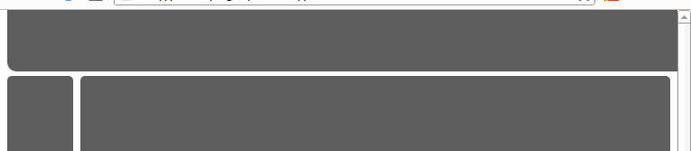
As you can see he ignored the gaps on the right and left, because when I remove the lines below it is the same way.

padding-right: 5px;
padding-left: 5px;

What I do?


HTML code of the page:

<!DOCTYPE html>
<html>
    <head>
        <link type="text/css" rel="stylesheet" href="stylesheet.css"/>
        <title></title>
    </head>
    <body>
        <div id="header"></div>
        <div class="left"></div>
        <div class="right"></div>
        <div id="footer"></div>
    </body>
</html>

The CSS code:

#header {
    height: 70px;
    width: 100%;
    margin-top: -10px;
    margin-bottom: 5px;
    margin-right: 50px;
    margin-left: 50px;
    background-color: gray;
    border-radius: 0px 0px 10px 10px;
    position: fixed;
    z-index: 1;
}

.left {
    display: inline-block;
    height: 700px;
    width: 10%;
    margin-top: 65px;
    background-color: gray;
    border-radius: 5px;
    float: left;
}

.right {
    display: inline-block;
    height: 700px;
    width: 89%;
    margin-top: 65px;
    margin-bottom: 5px;
    background-color: gray;
    border-radius: 5px;
    float: right;
}

#footer {
    height: 70px;
    background-color: gray;
    border-radius: 5px;
    clear: both;
}
  • The position:fixed is it really a requirement? That is, you want the header not to scroll with the rest of the page? If so, Voc6e already has two correct answers. If I can give up position:fixed, there are simpler solutions.

10 answers

28


The image shows four distinct regions, the content, the spacing, the edge and the edges. What is important to note here is that the spacing is within element and will only reduce the area used by the content. What I believe you’re trying to do is pertaining to the margins, which are outside the element.

Try using this:

margin-left: 5px;
margin-right: 5px;

Padding is only visible in rendering when there is some content. Try putting text inside the div to better see the effect.

Another problem is the use of position: fixed; (the same applies to position: absolute;). They cause the element to be disconnected from the entire page layout structure and not affect any other element, but also not affected by it. In this situation the element does not take into account its margin and takes the width: 100%; literally. That is, if your screen has 1000px, the div will have this size, making the margin on the left just move it a little to the right, causing it to exit the screen and hiding the right margin. Ideally you restructure your page so that position: fixed; is not necessary. I have two solutions:

  1. Take into account the margin manually:

    width: calc(100% - 100px);
    

    Note: calc() is part of CSS3 and not supported by some older browsers and mobile phones.

  2. Remove the position: fixed; and the width: 100%; and apply its effect using a trick with the lower margin:

    /*width: 100%;*/
    /*position: fixed;*/
    margin-bottom: -60px;
    

Example: Jsfiddle.

  • 3

    Remembering that calc() is CSS3, may not work in older browsers

  • 3

    DO NOT use Calc your layout will look horrible on mobile phones.

  • it really is not the best option to use Calc() in this case, even excluding old browsers from the issue, on mobiles the result will not be pleasant.

9

Use your first code, just add the property border-box. This property will make your padding do not increase the given size for the element. And it works from IE8.

#header {
    height: 70px;
    width: 100%;
    margin-top: -10px;
    margin-bottom: 5px;
    padding-right: 5px;
    padding-left: 5px;
    background-color: gray;
    border-radius: 0px 0px 10px 10px;
    position: fixed;
    z-index: 1;

    -webkit-box-sizing: border-box;
       -moz-box-sizing: border-box;
    -ms-box-sizing: border-box;
        box-sizing: border-box;
}
  • 1

    Taking into consideration all types of devices that can access this answer really is better

6

When dealing with elements that are positioned fixed (position:fixed), we can make use of the properties left and right to adjust their spacing relative to the page without having to manipulate the box-model and guaranteeing the 5 pixels in any device.

For your particular case:

Example in Jsfiddle

#header {
    height: 70px;
    margin: -10px 0 5px;
    background-color: gray;
    border-radius: 0px 0px 10px 10px;
    position: fixed;
    right: 5px;
    left: 5px;
    z-index: 1;
}

Withdrawal of property margin-right, margin-left and width.
Added the properties left:5px and right:5px.

6

The problem here is that you want to have the top menu (#header) with position: fixed and this makes CSS consider 100% of the maximum screen width.

So the solution I see is to use percentage everywhere, and reset the padding and margin to play safe.

What I used was:

margin-left: 2%;
margin-right: 2%;

and made the width of #header to 96%.

So the CSS part completes:

* {
    padding:0px;
    margin:0px;
}

#header {
    height: 70px;
    width: 96%;
    margin-top: -10px;
    margin-bottom: 5px;
    background-color: black;
    border-radius: 0px 0px 10px 10px;
    position: fixed;
    margin-left: 2%;
    margin-right: 2%;
    z-index: 1;
}
.left {
    display: inline-block;
    height: 700px;
    width: 10%;
    margin-top: 65px;
    background-color: gray;
    border-radius: 5px;
    float: left;
    margin-left: 2%;

}
.right {

    margin-right: 2%;
    display: inline-block;
    height: 700px;
    width: 85%;
    margin-top: 65px;
    margin-bottom: 5px;
    background-color: gray;
    border-radius: 5px;
    float: right;
}
#footer {
    margin-left: 2%;
    margin-right: 2%;
    height: 70px;
    background-color: gray;
    border-radius: 5px;
    clear: both;
}

Example

4

In elements positioned with Fixed or Absolute you can use the properties left right top to adjust the dimensions. In your case, you wouldn’t need to add width:100%; in the div, just set

left:5px;
right:5px;

To inform you that the element should be positioned at 5px distance from the sides and it will automatically have the width required for this.

Do not use Calc if you need IE<9 support

Example: Using positioned elements

  • Please explain your answer better. Give a more complete example.

3

There is a quiet way to do this, using only CSS with the box-Sizing property.

Take the example:

#header {
    height: 70px;
    width: 100%;
    padding: 0 5px;
    box-sizing:border-box;
    -ms-box-sizing:border-box;
    -moz-box-sizing:border-box;
    -webkit-box-sizing:border-box;
}

One thing you need beware, is that this way if you are going to add a background, it will show in padding area.

0

The estate left can also be used.

Use left: 0; footer/div, will occupy the entire left bank, leaving no spaces.

-2

I’m picking it up right now for CSS ('again'), precisely to position elements on the full screen width, in mobile layouts. The solution that worked for me so far was to apply the property width for 100%. However, the primordial for which there was no automatic overflow bar and so the elements were really positioned with the fixed total width, I had to declare the properties in flex-box right on the tag body of the CSS.

@media(min-width: 160px) and (max-width: 480px){

    body{
        display: flex;
        flex-direction: column;
        flex-shrink: 1;
    }

-2

.teste{
background:red;
width:100%;
margin: auto 5px auto 0px;
padding: 8px 0;
}
<div class='teste'>Teste</div>

-5

var largura = $(window).width();

$('.div').css({width: largura - 10});
css {
  margin-left: 5px;
  margin-right: 5px;
}

Browser other questions tagged

You are not signed in. Login or sign up in order to post.