7
I’m having trouble trying to leave some divs self adjustable vertically.
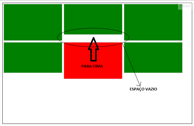
There is the space needed for the div stay exactly below the one above it, but it does not rise, there is an empty space between the two. :'(
7
I’m having trouble trying to leave some divs self adjustable vertically.
There is the space needed for the div stay exactly below the one above it, but it does not rise, there is an empty space between the two. :'(
6
There is a Javascript named after Isotope that can be used for this:
Configuration is very simple, following your own model:
<script type="text/javascript">
    $(document).ready(function(e) {
        $('.container').isotope();
    });
</script>
Full Html Code
<!DOCTYPE HTML>
<html>
<head>
<meta charset="utf-8">
<title>Untitled Document</title>
        <script type="text/javascript" src="http://ajax.googleapis.com/ajax/libs/jquery/1.5.1/jquery.min.js"></script>
        <script type="text/javascript" src="http://isotope.metafizzy.co/isotope.pkgd.js"></script>
        <script type="text/javascript">
            $(document).ready(function(e) {
                $('.container').isotope();
            });
        </script>
        <style>
            *, html {
                margin:0;
                padding:0;
            }
           .container {
                width: 650px;
                height: 400px;
                margin-left: auto;
                margin-right: auto;
                border: 1px solid black;
            }

            .box {
                width: 192px;
                margin: 2.5px;
                border: 1px solid #c8c8c8;
                float: left;
                background-color: green;
            }

            .box-1, .box-3, .box-5 {
                height: 120px;
            }

            .box-2, .box-4, .box-6 {
                height: 100px;
            }

            .box-5 {
                background-color: red !important;
            }
        </style>
    </head>
    <body>
        <div class="container">
            <div class="box box-1"></div>
            <div class="box box-2"></div>
            <div class="box box-3"></div>
            <div class="box box-4"></div>
            <div class="box box-5"></div>
            <div class="box box-6"></div>
        </div>
    </body>
</body>
Example: Demo
Has multiple settings all documented on the website itself.
In addition to this has the Masonry which can be called in the same way as in the first example:
<script type="text/javascript" src="http://ajax.googleapis.com/ajax/libs/jquery/1.5.1/jquery.min.js"></script>
<script type="text/javascript" src="http://masonry.desandro.com/masonry.pkgd.min.js"></script>
<script type="text/javascript" language="javascript">
    $(document).ready(function(e) {
          $('.container').masonry();
    });
</script>
Example: Demo
Masonry owns his Github and its documentation.
very good the plugins, the question was not mine but served me also the answer!
3
I usually see this structure in portals and in this case it seems that to work the structure emphasizing the columns of a grid is the best way, because in each column we would have the blocks arranged one after the other without appearing the "holes" in the layout.
I made a quick draft on the solution, note:
http://codepen.io/marcosfreitas/pen/BKuvp
By the way, the columns did not behave very well with the "display: inline-block", so I used the "float: left" that adjusts better.
Congratulations, your option is much better because it does not use framework or plugin javascript
Thank you. Currently we can do better and organize this structure with css3 flex-box in several ways. See this visual guide: https://scotch.io/tutorials/a-visual-guide-to-css3-flexbox-properties
That’s it!!!!!!
1
I use the Masonry
Installing by the Bower
bower install masonry --save
Or CDN
<script src="https://unpkg.com/masonry-layout@4/dist/masonry.pkgd.js"></script>
Using: Jquery
$('.grid').masonry({
  // options...
  itemSelector: '.grid-item',
  columnWidth: 200
});
Using Attributes in HTML
<div class="grid" data-masonry='{ "itemSelector": ".grid-item", "columnWidth": 200 }'>
  <div class="grid-item"></div>
  <div class="grid-item"></div>
  ...
</div>
An example of how the result is: http://codepen.io/desandro/pen/RPKgEN
Browser other questions tagged html css front-end
You are not signed in. Login or sign up in order to post.
Can you explain better what you mean by "fit"?
– Sergio
@Sergio I hope I have clarified the doubt.
– Phellipe Lins
I don’t know exactly why (I’m waiting for someone to answer with this), but remove the
float: leftand use onlydisplay: inline-blockin boxes. Also take the fixed container size, leave the automatic height. I think this is the goal: http://jsfiddle.net/37TBy/3/– Guilherme Bernal
@Guilhermebernal , I edited again putting an explanatory image that matches the goal.
– Phellipe Lins
This can easily be done through flexbox, I recommend researching and studying the subject. https://www.w3schools.com/css/css3_flexbox.asp
– Daniel Santos