7
I have seen that in some registers, they are using the button a lot toggle.
Someone would know how to do it?
7
I have seen that in some registers, they are using the button a lot toggle.
Someone would know how to do it?
10
I suggest separating the question into two and having a question aside for the server part. I believe there are plenty of examples of how to do.
Note: I ended up making a component of this in React on Github
The client side part you can do as in the example below:
var estado = document.getElementById('estado');
$('#onoff1').on('change', function() {
    var el = this;
    estado.innerHTML = el.checked ? 'ligado' : 'desligado';

    // aqui podes juntar a lógica do ajax
    $.ajax({
        url: "some.php",
        data: {
            estado: this.checked
        }
    }).done(function(msg) {
        if (msg == 'failed') return el.checked = !el.checked; // caso o servidor retorne "failed" mudar o estado do botão
        else alert("Info gravada: " + msg);
    });
});
.onoff input.toggle {
display: none;
}
.onoff input.toggle + label {
display: inline-block;
position: relative;
box-shadow: inset 0 0 0px 1px #d5d5d5;
height: 60px;
width: 100px;
border-radius: 30px;
}
.onoff input.toggle + label:before {
content: "";
display: block;
height: 60px;
width: 60px;
border-radius: 30px;
background: rgba(19, 191, 17, 0);
transition: 0.1s ease-in-out;
}
.onoff input.toggle + label:after {
content: "";
position: absolute;
height: 60px;
width: 60px;
top: 0;
left: 0px;
border-radius: 30px;
background: #fff;
box-shadow: inset 0 0 0 1px rgba(0, 0, 0, 0.2), 0 2px 4px rgba(0, 0, 0, 0.2);
transition: 0.1s ease-in-out;
}
.onoff input.toggle:checked + label:before {
width: 100px;
background: #13bf11;
}
.onoff input.toggle:checked + label:after {
left: 40px;
box-shadow: inset 0 0 0 1px #13bf11, 0 2px 4px rgba(0, 0, 0, 0.2);
}<script src="https://ajax.googleapis.com/ajax/libs/jquery/2.1.1/jquery.min.js"></script>
<div class="onoff">
<input type="checkbox" class="toggle" id="onoff1">
<label for="onoff1"></label>
</div>
<p id="estado">desligado</p>The change and color part of the button is HTML + CSS only. Javascript would only be to know when the button changes and send to the server.
The biggest problem is whether the server recognized the command (for example, if Ajax is unsuccessful, or the server actively refuses the change, either by permission or qq else, restore toggle to the previous position). I realize that this is one of the biggest problems in these Ajax applications, and in the angular and similar ones. The person thinks that changed the given by the feedback on the screen, but on the server is still the old data.
@Bacco well seen. I think this question should separate the logic of the server and browser. I will join this logic in the browser part.
@Bacco is also a good variant. It would also be possible to add a mockery to avoid too many clicks and allow shuffling the result. I’ll wait for the AP comment in the meantime.
Congratulations @Sergio Great Response +1
It worked perfectly. Thank you very much!
Just a question about sending data this way to the server. And Flood, what about it? Even with a mockery, it is still possible, and without a "Submit", even if by ajax, there would be no way to use any captcha (since the requests are sent by a simple on/off). In my view the only output is a limit of requests, but then we started to complicate what could be simplified only with a button "send".
@Renancavalieri a captcha is an option, I would say more indicated when the on/off change is "definitive". A mockery to prevent too immediate multiple clicks is also an option. It depends on case to case, but personally I think elements that change their appearance visually (this, a select or a checkbox) should not be manipulated and prevented from changing state, because of UX.
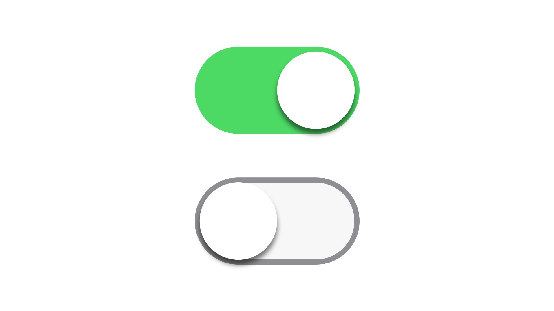
8
An example with pure CSS would be like this https://codepen.io/andreasstorm/pen/ZGjNwZ, I made a more simplified version https://codepen.io/brcontainer/pen/RpdgLz, its legal is that it works according to the attribute (property) checked and disabled thus adapting the behavior :checked and :disabled
Thus remaining:
body {
    background: #eee;
}

.toggle {
    margin-bottom: 40px;
}

.toggle > input {
    display: none;
}

.toggle > label {
    position: relative;
    display: block;
    height: 20px;
    width: 44px;
    background: #898989;
    border-radius: 100px;
    cursor: pointer;
    transition: all 0.3s ease;
}
.toggle > label:after {
    position: absolute;
    left: -2px;
    top: -3px;
    display: block;
    width: 26px;
    height: 26px;
    border-radius: 100px;
    background: #fff;
    box-shadow: 0px 3px 3px rgba(0,0,0,0.05);
    content: '';
    transition: all 0.3s ease;
}
.toggle > label:active:after {
    transform: scale(1.15, 0.85);
}
.toggle > input:checked ~ label {
    background: #6fbeb5;
}
.toggle > input:checked ~ label:after {
    left: 20px;
    background: #179588;
}
.toggle > input:disabled ~ label {
    background: #d5d5d5;
    pointer-events: none;
}
.toggle > input:disabled ~ label:after {
    background: #bcbdbc;
}
<div class="toggle">
<input type="checkbox" id="foo">
<label for="foo"></label>
</div>
<div class="toggle">
<input type="checkbox" id="bar" checked>
<label for="bar"></label>
</div>
<div class="toggle">
<input type="checkbox" id="baz" disabled>
<label for="baz"></label>
</div>To look similar to iOS
body {
    background: #eee;
}

.toggle {
    margin-bottom: 20px;
}

.toggle > input {
    display: none;
}

.toggle > label {
    position: relative;
    display: block;
    height: 28px;
    width: 52px;
    background-color: #f7f7f7;
    border: 1px #a2e3e6 solid;
    border-radius: 100px;
    cursor: pointer;
    transition: all 0.3s ease;
}
.toggle > label:after {
    position: absolute;
    left: 1px;
    top: 1px;
    display: block;
    width: 26px;
    height: 26px;
    border-radius: 100px;
    background: #fff;
    box-shadow: 0px 3px 3px rgba(0,0,0,0.05);
    content: '';
    transition: all 0.3s ease;
}
.toggle > label:active:after {
    transform: scale(1.15, 0.85);
}
.toggle > input:checked ~ label {
    background-color: #4cda64;
    border-color: #4cda64;
}
.toggle > input:checked ~ label:after {
    left: 25px;
}
.toggle > input:disabled ~ label {
    background-color: #d5d5d5;
    pointer-events: none;
}
.toggle > input:disabled ~ label:after {
    background-color: rgba(255, 255, 255, 0.3);
}
<div class="toggle">
<input type="checkbox" id="foo">
<label for="foo"></label>
</div>
<div class="toggle">
<input type="checkbox" id="bar" checked>
<label for="bar"></label>
</div>
<div class="toggle">
<input type="checkbox" id="baz" disabled>
<label for="baz"></label>
</div>Beautiful this css. Thanks for sharing your answer.
@Matheusmiranda I really appreciate =)
Browser other questions tagged javascript jquery html css
You are not signed in. Login or sign up in order to post.
A suggestion without the tag
<label>and more simplified https://answall.com/q/277235/3635– Guilherme Nascimento