22
Is there any way to simulate a higher resolution screen to check how a website behaves? I currently use 1440x900 and need to test the interface at higher resolutions.
22
Is there any way to simulate a higher resolution screen to check how a website behaves? I currently use 1440x900 and need to test the interface at higher resolutions.
20
In the browser Chrome and Firefox there are options in the development tools that already come native with browsers to work with specific resolutions. Below are the tutorials on how to activate such tools.
Chrome
In Google Chrome there is an Emulator option in Devtools, where you can simulate several features in your browser.
To activate, open your Devtools, (press F12, or right click and inspect element).
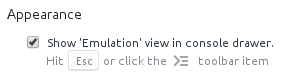
In the upper right corner, it has a gear symbol  , click on it and in the General menu, topic Appearance activate the first option "Show 'Emulation' view in console".
Close the options, at the top on the left button of the gear, which looks like a list, click on it. 
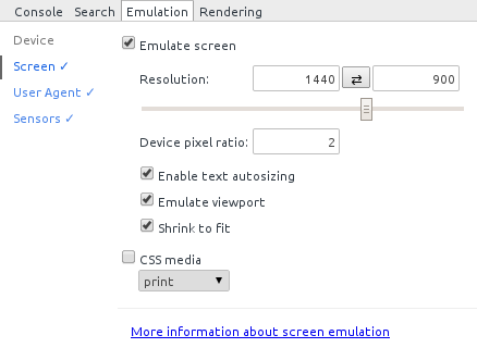
In the bottom menu that appeared select "Emulation"  in the topic "Screen" you can configure the data of your desired resolution and the pixel ratio so that if your resolution is smaller you will be comfortable viewing even if you have more pixels than your monitor.
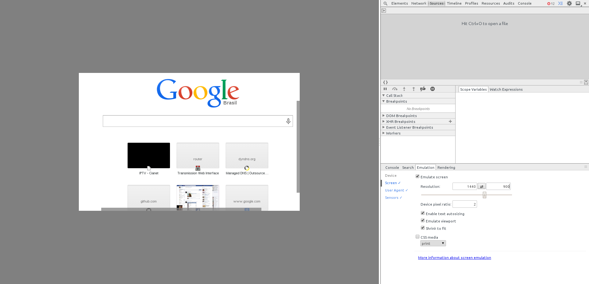
Demonstration of the desired resolution in a browser running in native Full HD resolution, but emulating 1440x900, but changing the pixel density you can emulate resolutions larger than the one you are using:
This feature was created to work with mobile devices, on official page you can get more details.
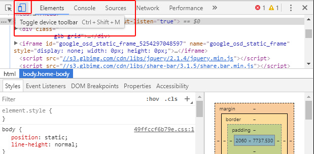
Firefox
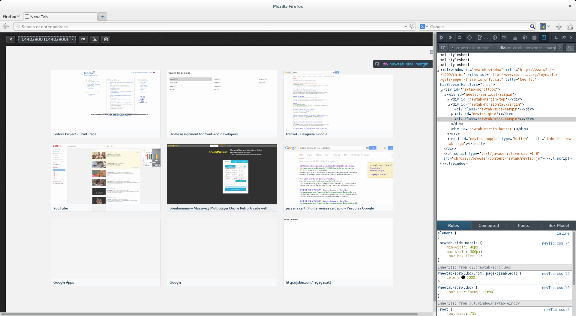
You can also emulate in firefox, open the code inspector and activate the "Responsive Design Icon"  in the upper right-hand side.
Or through the sequence of keys Ctrl+Shift+M (Windows)
Add the desired resolution in the top left menu that will appear. The result can be seen in the image below:
3
This has some solutions depending on the machine you are using.
For example, video drivers from Video Media allow you to add custom resolutions bigger than your monitor, generating a horizontal and vertical scroll across the desktop.
Another possibility is to connect an additional monitor to the video card (this works for various types of card and manufacturer) and extend the desktop on both, horizontally, by enlarging the browser screen.
The advantage of using these first two features is that simulating only within the browser sometimes does not correspond to the reality of a really large desktop.
Another possibility is to use the browser zoom. For example, the key - in the Opera, or Ctrl - in Chrome, Iron and similar lower the screen zoom, serving for some types of evaluation as well.
Other than that there are sites like the View Like Us, allowing a simulation of resolutions other than your own.
Probably a good evaluation can mix more than one of these techniques.
1
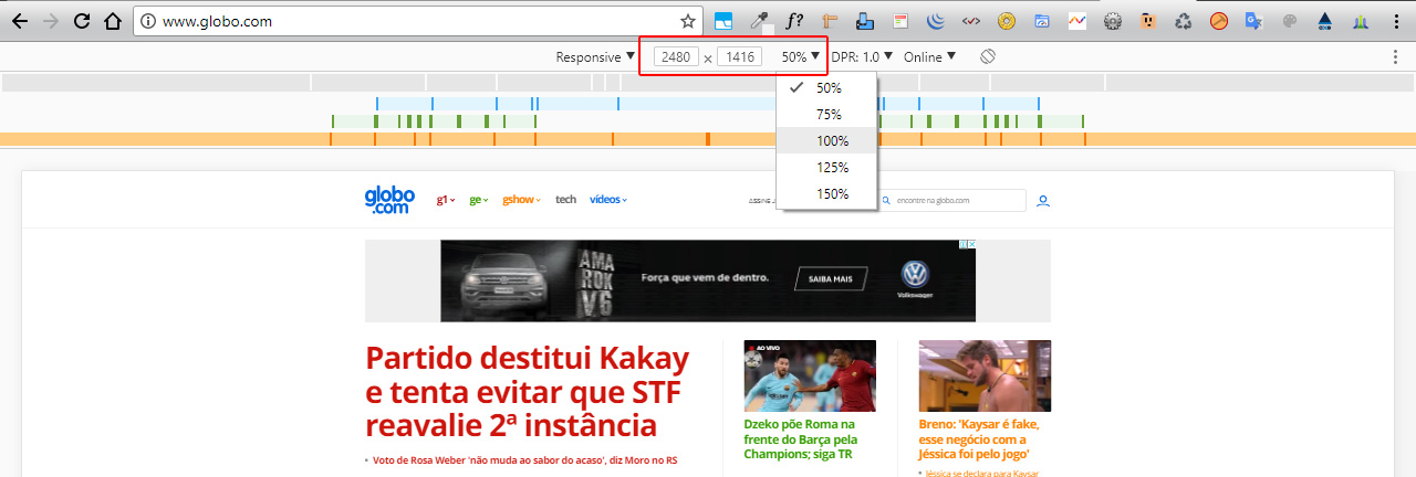
As some responses are half dated, as the browser is updated frequently, I will contribute an updated response on the latest versions of Chrome. You can easily simulate resolutions greater than 4K
First access the Chrome developer tools by pressing F12 or Ctrl+Shift+i. After that locate the button as below, or press Ctrl+Shift+m
Done this at the top, just watch the red squares, you can put the resolution you want, both simulating smaller screens, the larger.
Here is a test on the globe website with the resolution 50% higher than my screen.
(you can click on the BLUE, GREEN or ORANGE bars to simulate the breakpoints in min-width and max-width)
Now the 4K view
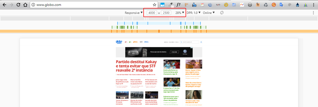
OBS1: In this same bar where you choose the recalculation vc can also test the screen with different values of Pixel Density (DPR: 1x, 2x and 3x). In addition to being able to "rotate" the screen between portrait and landscape at the last bar button.
OBS2: When you raise the zoom, you are actually decreasing the screen and the width of the screen, so if your screen has 1000px wide and vc increases the zoom for 150% actually your screen will be on 500px wide.
1
You can use Firefox’s Adaptive Design Mode (Ctrl+shift+M) feature in the Web Developer menu, then just set the dimensions of each element using media queries in CSS.
1
Try using the Screen Fly, this site allows you to test a site hosted in several resolutions, the cool thing is that it has the resolutions of the devices. This makes it easier, so you know which devices your site is running perfect on.
0
You can create a page with a iframe calling the page you want to test.
Put in this iframe to width and height that you need.
Maybe you have better ways, but then you can test. Maybe by working on the browser zoom you will get a good test used the iframe.
Browser other questions tagged html css responsive-layout
You are not signed in. Login or sign up in order to post.