HTML with bootstrap responsive layout

Asked

Viewed 1,199 times

3

I can not leave my layout as it should, the idea is to leave as follows:

  +-------------------------------------------------+
  |  logo      |          Menu Superior             |
  |            |------------------------------------+
  |------------|                                    |
  |            |                                    |
  |Menu        |         Conteudo                   |
  |            |                                    |
  |            |                                    |
  |            |                                    |
  |            |                                    |
  |            |                                    |
  |            |                                    |
  |------------|------------------------------------|
  | outra logo |          Rodapé                    |
  +-------------------------------------------------+

this and my main screen, I need to work the menus, because if you copy this and run with bootstrap, you will see that the footer is in the middle of the screen, the menu is bigger than the content part and etc. The ideal is to leave all responsive, both the left and the right part.

    <body class="sidebar-mini">
    <div class="wrapper ">
        <div class="col-sm-2 col-lg" style="background-color: #252525;">
            <div class="row navbar" style="text-align: center; vertical-align: middle; padding-top: 35px;">
                <img src="~/Images/tecbox/logo_tecbox.png" style="max-height: 80px;" />
            </div>
            <div class="row">
                @Html.Partial("_Menu")

            </div>
            <div class="row" style="margin-top: 60px; text-align:center; background-color: #363636">
                <img src="~/Images/logo-infoworld.png" style="max-width: 150px;" />
            </div>
        </div>
        <div class="col-lg-10 text-center" style="background-color: black;">
            <div class="row navbar navbar-static-top" style="background-color: steelblue;">
                <div class="navbar-custom-menu" style="width: 100%;">
                    <div class="col-md-4" style="text-align: left;">
                        <a href="#" class="sidebar-toggle" data-toggle="offcanvas" role="button" style="height: 60px;">
                            <span class="sr-only">Toggle navigation</span>
                        </a>
                        <a href="@Url.Action("Index")" style="color: white; font-size: 20px;">
                            <img src="~/Images/tecbox/icons/home-icon.png" style="max-height: 40px; padding-left: 5px;" />
                            <span class="hidden-xs">Home</span>
                        </a>
                    </div>

                    <div class="col-md-4" style="color: white;">
                        <span>nome da loja - bla bla - bla bla</span>
                    </div>
                    <div class="col-md-4" style="text-align: right;">
                        <a href="#" class="dropdown-toggle" data-toggle="dropdown">
                            <span class="hidden-xs" style="padding-right: 10px;">Negrini</span>
                            <img src="~/Images/tecbox/semFoto300x300.png" alt="Foto" class="image-semfoto" />
                        </a>
                        <ul class="dropdown-menu menu-superior">
                            <!-- User image -->
                            <li class="user-header">
                                <a>
                                    <span>
                                        <b>Alterar imagem da conta</b>
                                    </span>
                                </a>
                            </li>
                            <li>
                                <hr class="divider" />
                            </li>
                            <li class="user-header">
                                <a>
                                    <span>
                                        <b>Alterar senha</b>
                                    </span>
                                </a>
                            </li>
                            <li class="user-header">
                                <a>
                                    <span>
                                        <b>Histórico de acessos</b>
                                    </span>
                                </a>
                            </li>
                            <li>
                                <hr class="divider" />
                            </li>
                            <li class="user-header">
                                <a>
                                    <span>
                                        <b>Trocar loja</b>
                                    </span>
                                </a>
                            </li>
                            <li>
                                <hr class="divider" />
                            </li>
                            <li class="user-header">
                                <a>
                                    <span>
                                        <b>Bloquear</b>
                                    </span>
                                </a>
                            </li>
                            <li>
                                <hr class="divider" />
                            </li>
                            <li class="user-header">
                                <a>
                                    <span>
                                        <b>Sobre</b>
                                    </span>
                                </a>
                            </li>
                            <li>
                                <hr class="divider" />
                            </li>
                            <li class="user-header">
                                <a>
                                    <span>
                                        <b>Trocar usuário</b>
                                    </span>
                                </a>
                            </li>
                            <li class="user-header">
                                <a>
                                    <span>
                                        <b>Sair</b>
                                    </span>
                                </a>
                            </li>
                        </ul>
                        <a href="#" data-toggle="control-sidebar" style="height: 60px;"><i class="fa fa-gears"></i></a>
                    </div>
                    <!-- Control Sidebar Toggle Button -->

                </div>
            </div>
            <div class="row">
                <section class="content" ng-model="idForTransactions" ng-controller="MainController">
                    <!-- sidebar: style can be found in sidebar.less -->
                    <section class="sidebar">
                        <ul class="sidebar-menu">
                            <li class="menu-principal">
                                <a href="~/Home/Cadastros" style="background-color: #375DC0;">
                                    @*<i class="fa fa-envelope"></i>*@ <span>Cadastros</span>
                                    @*<small class="label pull-right bg-yellow">12</small>*@
                                </a>
                            </li>
                            <li class="menu-principal">
                                <a href="pages/mailbox/mailbox.html" style="background-color: #8e4e71;">
                                    @*<i class="fa fa-envelope"></i>*@ <span>Movimentações</span>
                                    @*<small class="label pull-right bg-yellow">12</small>*@
                                </a>
                            </li>
                            <li class="menu-principal">
                                <a href="pages/mailbox/mailbox.html" style="background-color: #CE603B; ">
                                    @*<i class="fa fa-envelope"></i>*@ <span>Financeiro</span>
                                    @*<small class="label pull-right bg-yellow">12</small>*@
                                </a>
                            </li>
                            <li class="menu-principal">
                                <a href="pages/mailbox/mailbox.html" style="background-color: #E38C23; ">
                                    @*<i class="fa fa-envelope"></i>*@ <span>Comercial</span>
                                    @*<small class="label pull-right bg-yellow">12</small>*@
                                </a>
                            </li>
                            <li class="menu-principal">
                                <a href="pages/mailbox/mailbox.html" style="background-color: #96A040; ">
                                    @*<i class="fa fa-envelope"></i>*@ <span>Configurações</span>
                                    @*<small class="label pull-right bg-yellow">12</small>*@
                                </a>
                            </li>
                            <li class="menu-principal">
                                <a href="pages/mailbox/mailbox.html" style="background-color: #DEB887; ">
                                    @*<i class="fa fa-envelope"></i>*@ <span>Relatórios</span>
                                    @*<small class="label pull-right bg-yellow">12</small>*@
                                </a>
                            </li>
                        </ul>
                    </section>
                </section>
            </div>
            <div class="row bg-fuchsia bottom" style="padding: 15px;">
                rodapé
            </div>
        </div>
    </div>
<-- scripts -->
</body>

Current situation:

inserir a descrição da imagem aqui

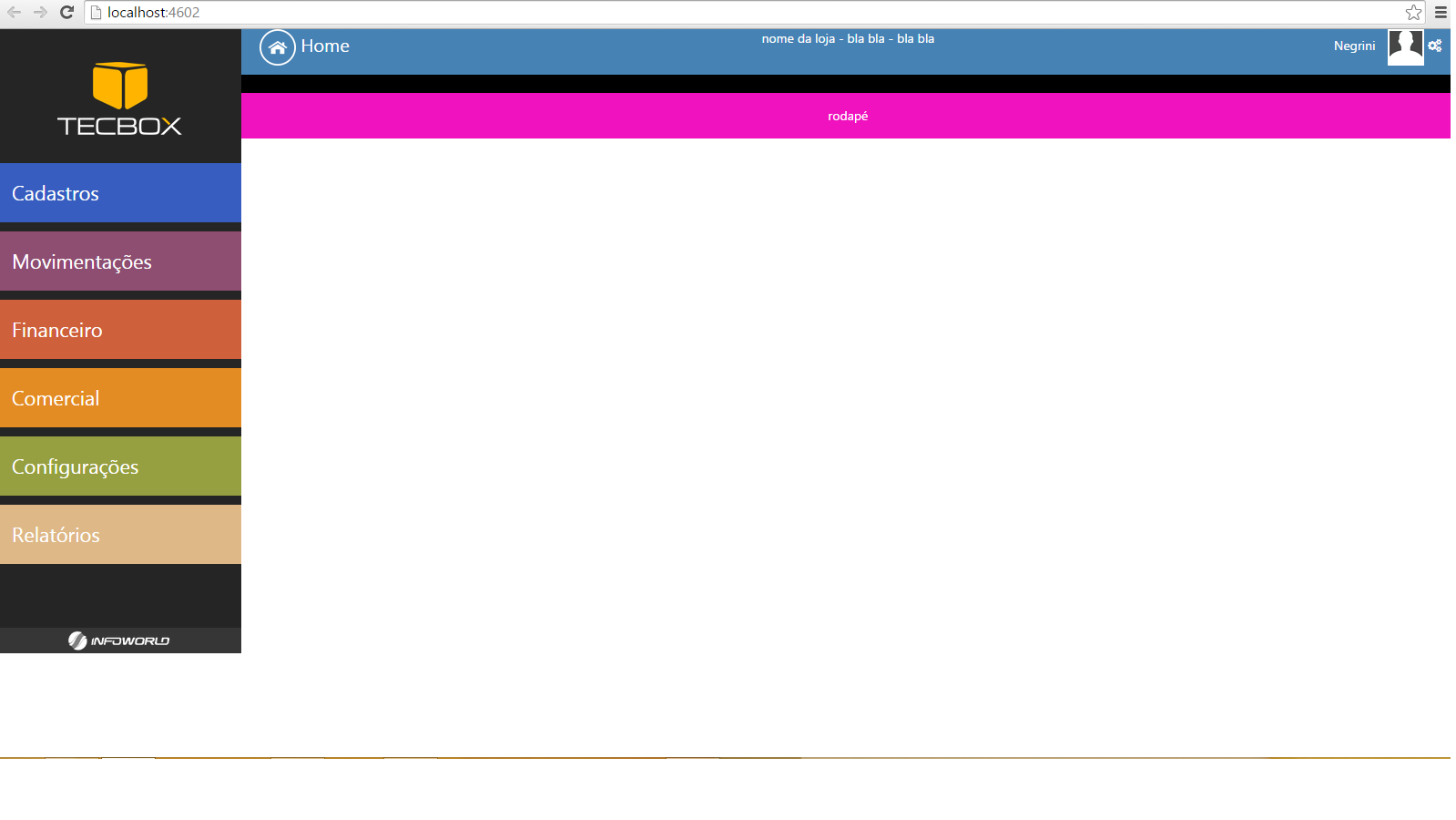
as noted, none of the parts reaches the end of the screen.

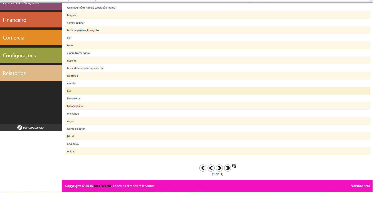
UPDATE: when the central content is inserted and is not a little information, the layout breaks again as in the image below.

inserir a descrição da imagem aqui

  • 1

    Do you want the content area to expand until the footer area touches the bottom of the screen? Is that the problem? If you need to use javascript, then I’ll give you a formula I use.

  • exactly, the area of the content will vary enough, ie, it should adapt, but always stay until the bottom of the screen, the same thing with the left side menu, the logo 'Infoworld' should always be aligned to the footer

  • @Kaduamaral see above please.

  • I think you could solve this with a certain ease using CSS measures in %. Basically leaving the logo marked with 20% of the height of the browser, the menus with 80%. And a tip: in-line css is one headache for maintenance purposes.

  • @Luiznegrini ready the answer, any doubt gives a touch.

2 answers

3


The formula for fixing container height is quite simple:

WindowHeight - MenuHeight - FooterHeight

That is, the height of the window, minus the height of the menu and footer, with the side menu is the same thing with the top and bottom logo. Assign the IDs in those blocks to manipulate their heights and do it.

// Guarda os elementos em variáveis.
var $logotop = $('#logo-top');
var $sidemenu = $('#side-menu');
var $logobot = $('#logo-bot');

var $menutop = $('#menu-top');
var $maincontent = $('#main-content');
var $footer = $('#footer');

$(window).resize(function(event){
  
  var windowheight = $(window).height(); // Guarda a altura da janela

  // Altura da logo do topo e do rodapé 
  var loff = $logotop.outerHeight(true) + $logobot.outerHeight(true);
  // Altura do menu do topo e do rodapé 
  var roff = $menutop.outerHeight(true) + $footer.outerHeight(true);
  
  // Altura da coluna esquerda
  var lh = $sidemenu.outerHeight(true) + loff;

  // Altura da coluna direita
  var rh = $maincontent.outerHeight(true) + roff;

  // Se ambas alturas ultrapassarem a da janela pega a maior
  if (lh > windowheight && rh > windowheight){
    var mh = (lh > rh ? lh : rh);
  } else if (lh > windowheight){ // Se apenas a coluna esquera for maior
    var mh = lh;
  } else if (rh > windowheight){ // Se apenas a coluna direita for maior
    var mh = rh;
  } else { // Se ambas forem menores, pega altura da janela
      var mh = windowheight - 10; // Esse -10 é algum bug que ainda não olhei
  }

  // Atribui altura mínima para menu lateral
  $sidemenu.css('min-height', mh - loff + 10); // Obs esse +10 é algum bug que ainda não olhei.
  // Atribui altura mínima para conteúdo
  $maincontent.css('min-height', mh - roff);
}).resize();
#logo-top {background-color:yellow;}
#footer{background-color:green;}
#side-menu, #logo-bot, #main-content{color:white;}
<link href="https://maxcdn.bootstrapcdn.com/bootstrap/3.3.5/css/bootstrap.min.css" rel="stylesheet"/>
<script src="https://ajax.googleapis.com/ajax/libs/jquery/1.11.1/jquery.min.js"></script>
<div class="col-lg-2 col-md-2 col-sm-2 col-xs-2" style="background-color: #252525;">
   <div class="row navbar" id="logo-top" style="text-align: center; vertical-align: middle; padding-top: 35px;">
       Logo
   </div>
   <div class="row" id="side-menu">
       <p>Menu</p>
   </div>
   <div class="row" style="margin-top: 60px; text-align:center; background-color: #363636" id="logo-bot">
       Logo Rodapé
   </div>
</div>

<div class="col-lg-10 col-md-10 col-sm-10 col-xs-10 text-center" style="background-color: black;">
   <div class="row navbar navbar-static-top" style="background-color: steelblue;" id="menu-top">
      Menu
   </div>
   <div class="row">
       <section class="content" ng-model="idForTransactions" ng-controller="MainController" id="main-content">
          <p>Conteúdo</p><p>Conteúdo</p><p>Conteúdo</p><p>Conteúdo</p><p>Conteúdo</p><p>Conteúdo</p><p>Conteúdo</p><p>Conteúdo</p><p>Conteúdo</p><p>Conteúdo</p><p>Conteúdo</p><p>Conteúdo</p><p>Conteúdo</p>
       </section>
   </div>
   <div class="row bg-fuchsia bottom" style="padding: 15px;" id="footer">
       Rodapé
   </div>
</div>

Note that as we are changing the property min-height, there will be no problem the content exceeds this time. And we are also making these changes in the event resize window, so if the user resizes the browser window the heights will follow the window up to the content height limit.

  • I made the modifications and he was as he was before. It seems that ignored the calculations....

  • 1

    Something you did wrong then @Luiznegrini. Did you assign the Ids to the elements? Are you using jQuery? You placed the code after rendering the layout (preferably on $(document).ready)?

  • 1

    I just tried another way and it worked! Thanks for the help @Kaduamaral was fine as wanted.

  • now moving to another page, when the content is large in the same part of content, the left menu does not accompany it, is like the link I put in the question update.

  • I believe the solution is to insert a max-height in my table that is in content according to the screen size....

  • The solution is to calculate which may value, the content or the menu and compare with the available size exceed and apply the highest height found @Luiznegrini

  • can update the reply?

  • Fetio @Luiznegrini...

  • Thanks, it still hasn’t turned out like I want, but I believe from here I can manage hehe.

Show 4 more comments

2

Luiz Negrini, regardless of using Bootstrap, you can use the strategy below, in case you will only need css to define the position of each element in the page.

Note that everything depends on the position of the Divs and their respective "anchors".

div {
    box-sizing: border-box;
}

#container {
    position: fixed;
    padding: 0px;
    margin: 0px;
    top: 0px;
    right: 0px;   
    left: 0px;
    bottom: 0px;
}

#logo1 {
    position: absolute;
    top: 0px;
    right: 0px;
    left: 0px;
    height: 96px;
}

#sideMenu {
    position: absolute;
    top: 96px;
    right: 0px;   
    left: 0px;
    bottom: 48px;
    overflow-y: auto;
}

#logo2 {
    position: absolute;    
    right: 0px;   
    bottom: 0px;
    left: 0px;
    height: 48px;
}

#topMenu {
    position: absolute;
    top: 0px;
    right: 0px;
    left: 0px;
    height: 48px;
}

#content {
    position: absolute;
    top: 48px;
    right: 0px;   
    left: 0px;
    bottom: 48px;
    overflow-y: auto;
}

#esquerda, #direita {
    position: relative;
    height: 100%;
}

#footer {
    position: absolute;    
    right: 0px;   
    bottom: 0px;
    left: 0px;
    height: 48px;
}

#logo1, #sideMenu, #logo2,
#topMenu, #content, #footer {
    border: 1px solid black;
}

.linha {
    width: 100%
    clear: both;
}

.celula {
    float: left;
}

.celula-2 {
    width: 16.66%;
}

.celula-10 {
    width: 83.33%;
}
<div id="container" class="linha">
  <div id="esquerda" class="celula celula-2">
    <div id="logo1">
      logo  
    </div>
    <div id="sideMenu">
      Menu  
    </div>
    <div id="logo2">
      outra logo
    </div>
  </div>
  <div id="direita" class="celula celula-10">
    <div id="topMenu">
      Menu Superior  
    </div>
    <div id="content">
      <p>
        Conteudo
      </p>
      <p>
        Lorem ipsum dolor sit amet, consectetur adipiscing elit. Nullam dignissim efficitur lorem, lobortis rhoncus erat elementum nec. Sed imperdiet in ante sit amet consectetur. Nullam ac nisl gravida, fermentum ex vitae, hendrerit orci. Proin ullamcorper sapien vitae odio pellentesque, ac volutpat urna accumsan. Suspendisse risus felis, iaculis eu sagittis in, posuere a purus. Morbi eget hendrerit mi. Nulla dapibus magna faucibus lobortis malesuada. Praesent vehicula dui tortor, scelerisque commodo nunc lacinia nec. Nulla condimentum erat eu est auctor aliquam. Fusce nec neque rutrum, cursus tortor in, luctus sapien. Class aptent taciti sociosqu ad litora torquent per conubia nostra, per inceptos himenaeos. Integer eleifend odio in nunc porta tristique. Nam luctus ultrices ex, sit amet maximus mauris iaculis finibus. Nulla fringilla erat in mattis fermentum. Suspendisse hendrerit lacinia nisi quis interdum. Duis pellentesque dignissim lacus, quis imperdiet tellus mattis nec.
      </p>
      <p>
        Quisque ac arcu turpis. Fusce suscipit fermentum arcu. Donec porta, elit eget finibus bibendum, neque lorem accumsan eros, in ultrices turpis neque ut nulla. Donec dolor mi, tristique sit amet fringilla non, malesuada ac ante. Cras porttitor sed nisl sit amet dignissim. Aenean convallis quis magna quis cursus. Nam fringilla tincidunt nibh vel porttitor.
      </p>
      <p>
        Nam vitae luctus justo. Donec ac volutpat odio. Vivamus in justo risus. Aenean pharetra orci tellus, quis accumsan sem convallis at. In non mauris rhoncus, faucibus tortor at, bibendum nibh. Pellentesque faucibus, nisi blandit viverra sodales, felis quam faucibus turpis, ornare condimentum ex risus nec elit. Nam ullamcorper aliquet bibendum. Curabitur eu diam auctor nulla auctor fringilla. Nunc eleifend sollicitudin sagittis. Aliquam erat volutpat. Suspendisse eget lobortis libero. In venenatis egestas dui, sed tincidunt lectus commodo ut. Nulla ultrices convallis purus, eu faucibus turpis luctus sed. Morbi nec tellus id odio ultrices posuere eu vel odio. Fusce tincidunt at eros a cursus. Vestibulum cursus rhoncus est, quis commodo sem scelerisque vel.
      </p>
      <p>
        Donec tellus nisl, semper quis blandit sit amet, iaculis vel nulla. Proin metus arcu, fringilla et varius et, pretium non nisl. Sed erat justo, efficitur quis ipsum ac, cursus congue ipsum. Suspendisse ut convallis libero, nec commodo nibh. Nam et pretium ante. Sed sit amet tincidunt lacus, ac egestas urna. Integer auctor enim nulla, vel molestie justo luctus eget.
      </p>
      <p>
        Duis a libero in nisl vestibulum dapibus. Sed vulputate odio quis eros pretium, eu vehicula mauris ornare. Curabitur ornare neque sed mattis pretium. Vestibulum ante ipsum primis in faucibus orci luctus et ultrices posuere cubilia Curae; Vivamus efficitur sollicitudin ipsum sed varius. Vivamus congue consectetur est, viverra luctus risus venenatis ac. Phasellus ultricies dignissim arcu, et venenatis est sagittis pulvinar. In et rhoncus mauris. Proin egestas eu mauris id gravida. Donec ac tincidunt neque.
      </p>
    </div>
    <div id="footer">
      Rodapé  
    </div>
  </div> 
</div>

I tried simulating the boostrap classes using the classes linha and celula-2 and celula-10.

If you need the Side Menu to have a fixed size, just use position: absolute and define a width for it to the left pane, while in the right pane you place the value of "anchor" left equal to width left-hand panel

  • The solution with CSS is good (+1 for this), but it depends on the case if the person wants the footer to always appear...

Browser other questions tagged

You are not signed in. Login or sign up in order to post.