3
In the new version of Chrome (version 44) the tables are not behaving in the same way as the other versions of it behaved.
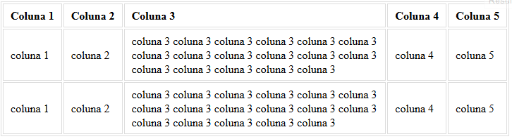
Expected:
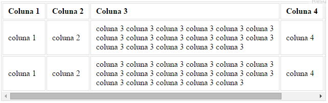
Upshot:
When resizing the screen, the browser calculates the width of each td adjusting its width to contain the content and at the same time not to burst the total width of the screen (or the element in which it is inserted) until the moment it is no longer possible to break the content in several lines and the table exceeds the width of the parent element.
However, in the new version, Chrome stops considering the width of the parent element earlier than expected. Analyzing the example of the result obtained, it can be noticed that it is still possible to break the contents of column 3 in rows, that is, to decrease the width of the same so that it is not necessary to use the scroll.
So far, the only way I’ve found to get around this problem is to set the width of tds to 1%. However, in this way, all tds are the same size, regardless of their content. Set the width of each td would also be unviable.
Someone has a solution to the problem?
Have you tested for Chrome in the updated version (v44)? Although your approach is interesting the class
table-responsiveis usually used in a very generic way and must respect the width of the parent element which is not always (in my case never) the size of the viewport...– Oeslei
Tested, did not present the error for me, worked?
– Leandro Amorim
You need to resize the screen until the problem happens. Chrome behaves correctly to some extent... =)
– Oeslei