3
I need to create a layout and make Divs diagonally and responsive (100%), as in the example below:
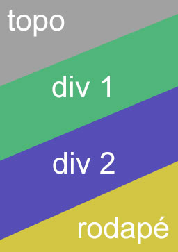
The contents inside have to stay horizontal
Any ideas? Suggestion?
3
I need to create a layout and make Divs diagonally and responsive (100%), as in the example below:
The contents inside have to stay horizontal
Any ideas? Suggestion?
4
You can also work with the method rotate of property transform and "undo" the transformation (remake it in the opposite direction) into a child element:
body{
    margin:0 0 -250px;
    padding:0 0 -250px;
    overflow-x:hidden;
}
.block{
   min-height: 200px;
   width: 140%;
   margin:-20% -14%;
   padding:28% 0;
}
.block:last-child{
    margin-bottom: -50%;
}
.diagonal{
    -ms-transform: rotate(-20deg); /* IE 9 */
    -webkit-transform: rotate(-20deg); /* Safari */
    transform: rotate(-20deg);
    overflow:hidden;
    position:relative;
}

.diagonal .inner{
    position:relative;
        -ms-transform: rotate(20deg); /* IE 9 */
    -webkit-transform: rotate(20deg); /* Safari */
    transform: rotate(20deg);
}

.texto{
    color:#FFF;
    text-align:center;
    font-size:3em;
}

#top{background: #A1A1A1;}
#content_1{background: #4EB67A;}
#content_2{background: #564EB6;}
#bottom{background: #D2C643;}
<div id="top" class="block diagonal">
<div class="inner texto">
Topo
</div>
</div>
<div id="content_1" class="block diagonal">
<div class="inner texto">
Conteudo 1
</div>
</div>
<div id="content_2" class="block diagonal">
<div class="inner texto">
Conteudo 2
</div>
</div>
<div id="bottom" class="block diagonal">
<div class="inner texto">
Rodapé
</div>
</div>2
You can work with the property css skew, would look something like this: transform:skewY(-10deg);
.block{
  width: 102%;
}

.formatado{
  text-align: center;
  color:#FFF;
  font-size:100px;
  padding: 80px;
}

#top{
  height: 400px;
  background: #A1A1A1;
}

#texto{
  transform:skewY(10deg);
}

#content_1{
  z-index: 1;
  margin-top: -10%;
  height: 400px;
  position: relative;
  background: #4EB67A;
  transform:skewY(-10deg);
}

#content_2{
  z-index: 1;
  height: 400px;
  position: relative;
  background: #564EB6;
  transform:skewY(-10deg);
}

#bottom{
  margin-top: -10%;
  text-align: bottom;
  height: 400px;
  background: #D2C643;
}
<div id="top" class="block formatado">
Topo
</div>
<div id="content_1" class="block">
<div id="texto" class="formatado">
Conteudo 1
</div>
</div>
<div id="content_2" class="block">
<div id="texto" class="formatado">
Conteudo 2
</div>
</div>
<div id="bottom" class="block formatado">
Rodapé
</div>Ai is a matter of adapting your need
Browser other questions tagged jquery html css css3
You are not signed in. Login or sign up in order to post.
Excellent +1 response, however as the author said there is how to leave the parallel written content (straight)?
– Ricardo
I edited it tomorrow when I get to the service
– MarceloBoni