How to make a DIV fill all available width

Asked

Viewed 5,526 times

7

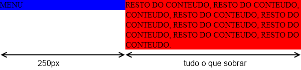
I have two Ivs, one with a fixed width, 250px; which is on the left, will be a fixed menu, always on the left. And another div to the right that I want to make it 100%, whenever the user handle the corners of the screen, she got 100%.

Something like that:

.menu{width: 250px; float: left; position;fixed}
.resto{width:100%; float:right;}

8 answers

7

Do so:

.menu{ width: 250px; float: left; background-color: blue; }
.resto{ background-color: red; overflow: hidden;}

To keep it that way:

Conteúdo com presença de menu

Note that if the content has multiple lines, it will not appear under the menu. This is done by using the style overflow: hidden. Also, the content doesn’t need the float style you used.

Example in jsfiddle

If it weren’t for the use of overflow: hidden would look like this:

Como ficaria sem o uso do estilo overflow hidden

  • Thank you very much Miguel, your tip was very helpful! :)

  • psss... where did you get the position:blocked ? (see: W3C - CSS Properties - Position) Whether you use position:blocked whether or not, since the value for that property is invalid, that statement is not interpreted by the browser. The result if you remove that from your code is strictly the same, keeping your solution as valid.

  • @Zuul: I based on the @Jeffersonalison response, but instead of using height: 100% in the CSS classes, I used overflow: hidden in class resto... I don’t know where the position:blocked. =D

  • I didn’t realize he had that one, too position:blocked, thanks for the feedback, I have already left comment in his reply on this subject.

3

I guess that’s right: EXAMPLE

CSS:

//Opcional para pegar 100% de altura
body, html, .menu, .resto{
    height: 100%;
    color: #fff;
}

.menu{
    width: 250px; 
    float: left; 
    background-color: #f09; 
    position:blocked;
}

HTML:

<div class="menu">
    Menu Fixed com 250px
</div>
<div class="resto">
    Resto do conteudo (liquido)
</div>
  • psss... where did you get the position:blocked ? (see: W3C - CSS Properties - Position) Whether you use position:blocked whether or not, since the value for that property is invalid, that statement is not interpreted by the browser. The result if you remove that from your code is strictly the same, keeping your solution as valid.

1

If you want the div's change the size depending on how you handle the screen, you have to put all the measurements in %. That is, this 250px you have to pass to %. Otherwise it will always assume this size and never the screen size.

EDIT: I think this is what you’re looking for. You need to use the position to blocked. Follow Jsfiddle I made, I think it’s your solution:

JSFIDDLE with div’s

  • In fact, I want only the rest div gets 100% in the case to the right. The div with the menu can not change size or width, it is a fixed div on the left. Will have to do this in javascript?

  • I edited my comment. Take a look

  • If the width is 100% no need float

  • No, I just copied the code from @Felipestoker float

  • I made the change. The div is increasing 100%, would be able to do this also with the elements within this div? including with images?

  • You want the images to change in size too?

  • That’s right, if that’s possible too. Maybe: . rest img {width:100%} ?

  • To be honest I’ve never tried :P But you must also use percentages

Show 3 more comments

0

Do you want to make a responsive layout? If yes take a look at bootstrap grid template, this way you will be able to easily responsive layouts.

  • Responsive, I think it wouldn’t be the right term. I want only one div to be handled, in case the div rest.

  • 1

    But you want it to change the feature when the user modifies the screen size of the browser?

0

0

Here is a possible solution to your problem.

PS: position:blocked, as quoted is not an allowed value for the position.

HTML

<div class="box">
  <div class="col1">...</div>
  <div class="col2">...</div>
</div>

CSS

.box {
  border:1px solid #ccc;
  width: 900px;
  overflow:hidden;
}

/* coluna da esquerda */
.col1 {
  background-color: red;
  float: left;
  width: 300px;
}

/* coluna da direita */
.col2 {
  background-color: blue;
  width: 100%;
}

See on Jsfiddle

0

Thank you all, I managed to solve.

In the Menu div. I used as usual:

.menu{position:fixed; width:192px; z-index:10;}
.resto{float:right; margin: 0 auto;}

Alas, it took a JS

function resizeHome(){
    var largura = $(window).width();
        if(largura>=*tamanho mínimo da tela (VALOR)*){
            $('.resto').css('width',($(window).width()-*largura da div menu*)+'px');
        }
}
  • post the solution for more people to see...

  • I edited my comment. = D

  • Dude, there’s no need to use javascript for this, take a look at my answer.

  • wouldn’t it be better to put the sizes all in % so you don’t have to use javascript?

  • What happens is that there are elements within these 100% Ivs, and these elements need to be aligned to the center, that is, these elements need a defined width and a margin: auto, so only with % will not work.

0

If you want to use the menu with position:fixed, a good way would be:

.menu{
    width:250px;
    position:fixed;
    top:0;left:0;
}
.resto{
    margin-left:250px;
}

Example: FIDDLE

Browser other questions tagged

You are not signed in. Login or sign up in order to post.