The transform is a modern CSS tool. It allows you to zoom, perspective or rotate elements.
The prefix -webkit- means that only browsers that have structure of the webkit is that they will use/read/apply this rule.
An example that is on the MDN page and that rotates an element 5 degrees div:
#rotate1
{
    height:100px;
    background-color: yellow;
    -moz-transform: rotate(5deg);
    -ms-transform: rotate(5deg); /* IE 9 */
    -webkit-transform: rotate(5deg); /* Chrome, Safari, Opera */
    transform: rotate(5deg);
}
<div id="rotate1">
<pre>
    height:100px;
    background-color: yellow;
    -moz-transform: rotate(5deg);
    -ms-transform: rotate(5deg);
    -webkit-transform: rotate(5deg);
    transform: rotate(5deg);
</pre>
</div>
And an example of zoom rotating:
div {
    background:#fcf8b3;
    border:1px solid #aaa;
    margin:100px;
    padding:10px;
    width:330px;

    -webkit-transition:-webkit-transform 0.2s ease-in-out;
       -moz-transition:-moz-transform 0.2s ease-in-out;
            transition:transform 0.2s ease-in-out;

}

div:hover {
    cursor:pointer;
    /* CSS3 */
    -webkit-transform:scale(3) rotate(-15deg) skew(-5deg, 30deg);
       -moz-transform:scale(3) rotate(-15deg) skew(-5deg, 30deg);
            transform:scale(3) rotate(-15deg) skew(-5deg, 30deg);
}
<div>
    Passa o mouse aqui se vês mal!
</div>
Note:
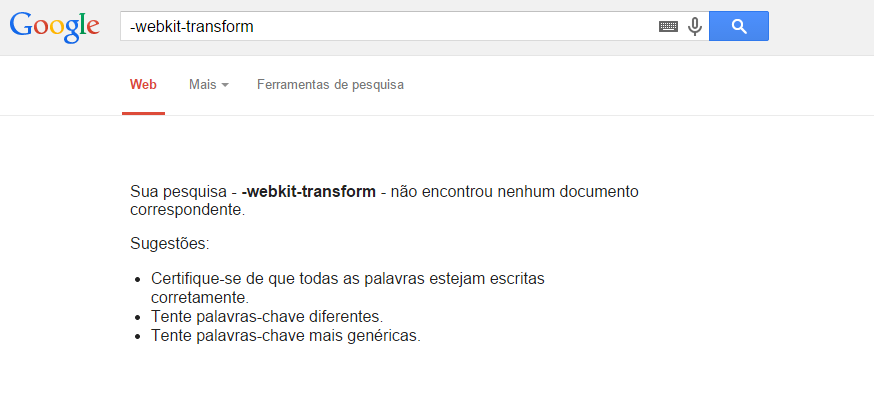
In relation to your Google search you have to take into account that - at the beginning of a search means: "I want results without the word -xxxxxx".
You should search with quotes, thus: "-webkit-transform"
+1 for the explanation about Google, was going to be my comment :)
– Guilherme Nascimento
Dude, so I wasn’t researching anything? serio? KKKKKKKKK
– Andrey Hartung
Great answer!
– Alicia Tairini