1
I need a div block that’s always proportional to itself, like width: 100px; e height: 60px; if width is 200px, height will be 120px, regardless of the size of the screen, and it should have width: 100%;
Preferably only with CSS, but if you need jQuery neh :\
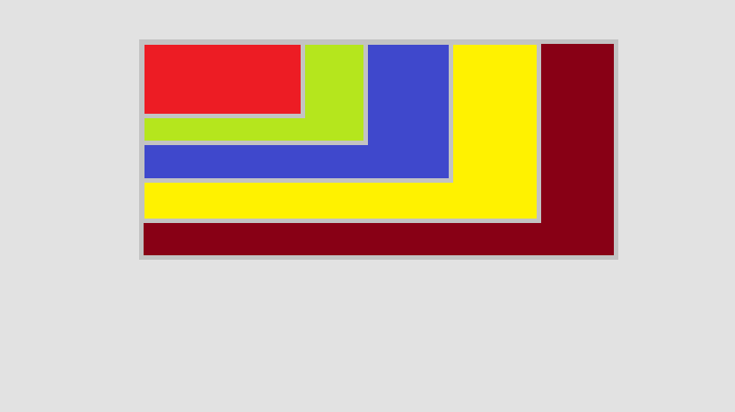
This image illustrates how the block should be in windows of different sizes and are not multiple blocks!
Please don’t delete your question and answer, and edit it to solve potential problems (if any). Even because I was writing a suggestion, when the question disappeared and I could not post...
– mgibsonbr
Who defines the
width? Is it fixed, or changes via JS, etc? There’s nothing I know in CSS to adjust one property to another, what you can do is have an external div with onewidthassigned (e.g. in pixels) and an internal div withwidth: 100%; height: 60%, this should keep the internal proportional even if you touch the width of the external (note: I have not tested to be sure).– mgibsonbr
If I answered by pasting here, this would be copy. I’m leaving the link of a topic very similar to this one of yours, here from Stack. Take a look at the answer from <b>Luiz Vieira</b> and see if it helps you. https://answall.com/questions/3485/howto augment ou-decrease proportionaldiv-a-720x540 The <b>Guilherme Bernal</b> response in the above topic may also help you, but cause more problems.
– Tiago Boeing
Complementing what @mgibsonbr said, there seems to be a consensus among those starting on the site that a closed question is definitive. One should regard a closed question as suspended until it is improved. It is a tool of the site that is used for this purpose, just stay quiet, listen to the suggestions and edit the question. ;)
– fernandosavio