See the result on Jsfiddle, using pure Javascript to manipulate the CSS properties of the slide element.
Note that the property padding-bottom: 75%; slide class was removed, since the dimensions of the slide are controlled by script.
Below, follow the script that performs the task:
var slide = document.querySelector('.slide');

var aspectRatio = 720/540;  // ou (4:3) proporção de aspecto do div .slide

function resize() {
    // dimensões da janela disponíveis
    var newHeight = document.documentElement.offsetHeight - 39; // 39 é o espaço ocupado pelo footer
    var newWidth = 0.8 * (document.documentElement.offsetWidth); // largura disponível: 80% do documento
    var newWidthToHeight = newWidth / newHeight;

    // ajusta o div mantendo as proporções de aspecto definidas por aspectRatio
    if (newWidthToHeight > aspectRatio) {
      newWidth = newHeight * aspectRatio;
    } else {
      newHeight = newWidth / aspectRatio;
    }
    slide.style.width = newWidth + 'px';
    slide.style.height = newHeight + 'px';
}

// efetua um redimensionamento inicial
resize();

// redimensiona o slide sempre que a janela for redimensionada
window.addEventListener('resize', resize, false);

// (!) utilize a função resize sempre que o div .slide sofrer alterações
Whenever an element needs to be resized according to an aspect ratio("Aspect ratio"- in English), a similar strategy may be used.
I do not know if it is possible to achieve the same results through CSS Media Queries or another strategy that uses purely CSS, but if possible always prefer the use of CSS.
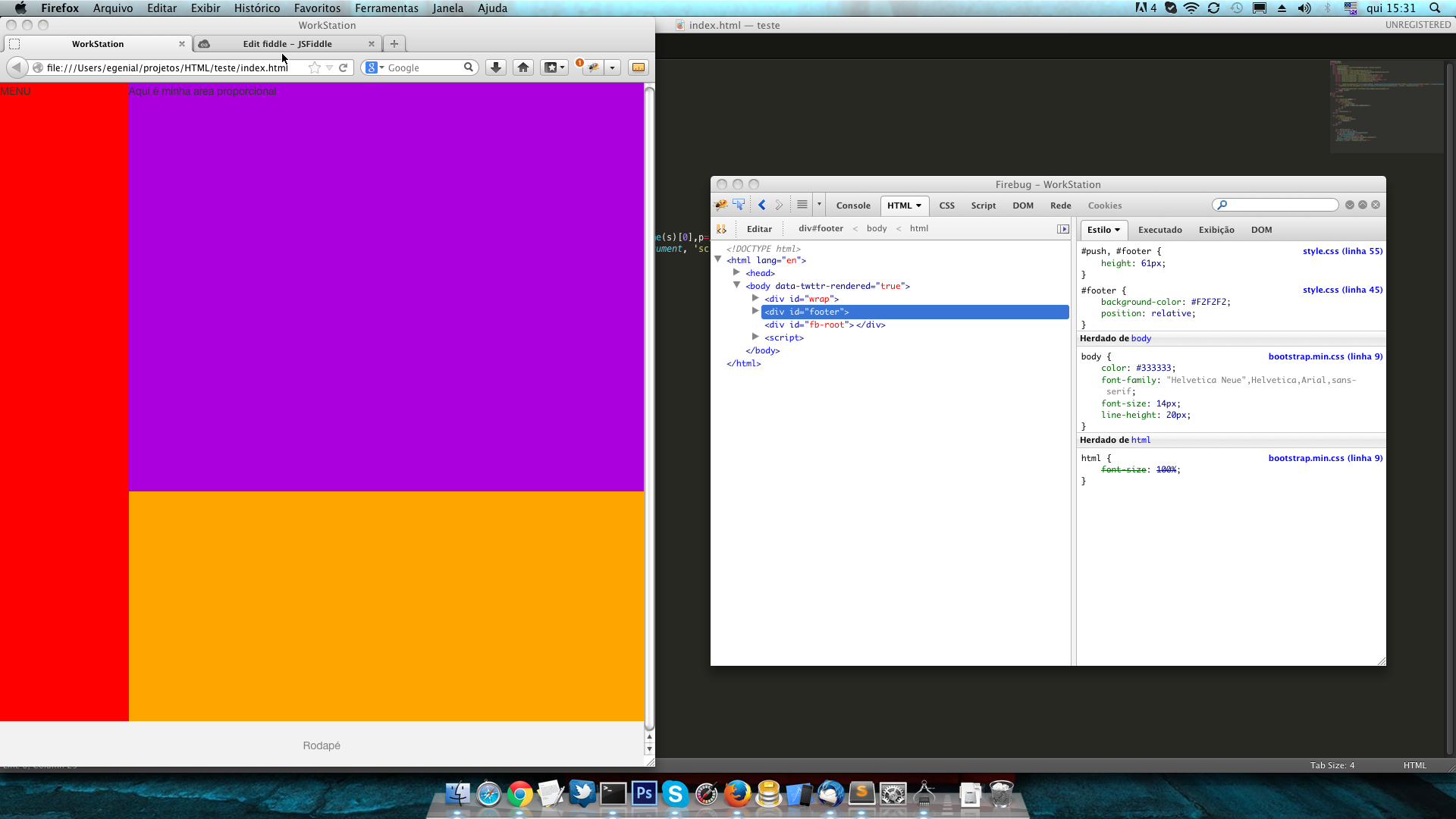 First phase this ok.
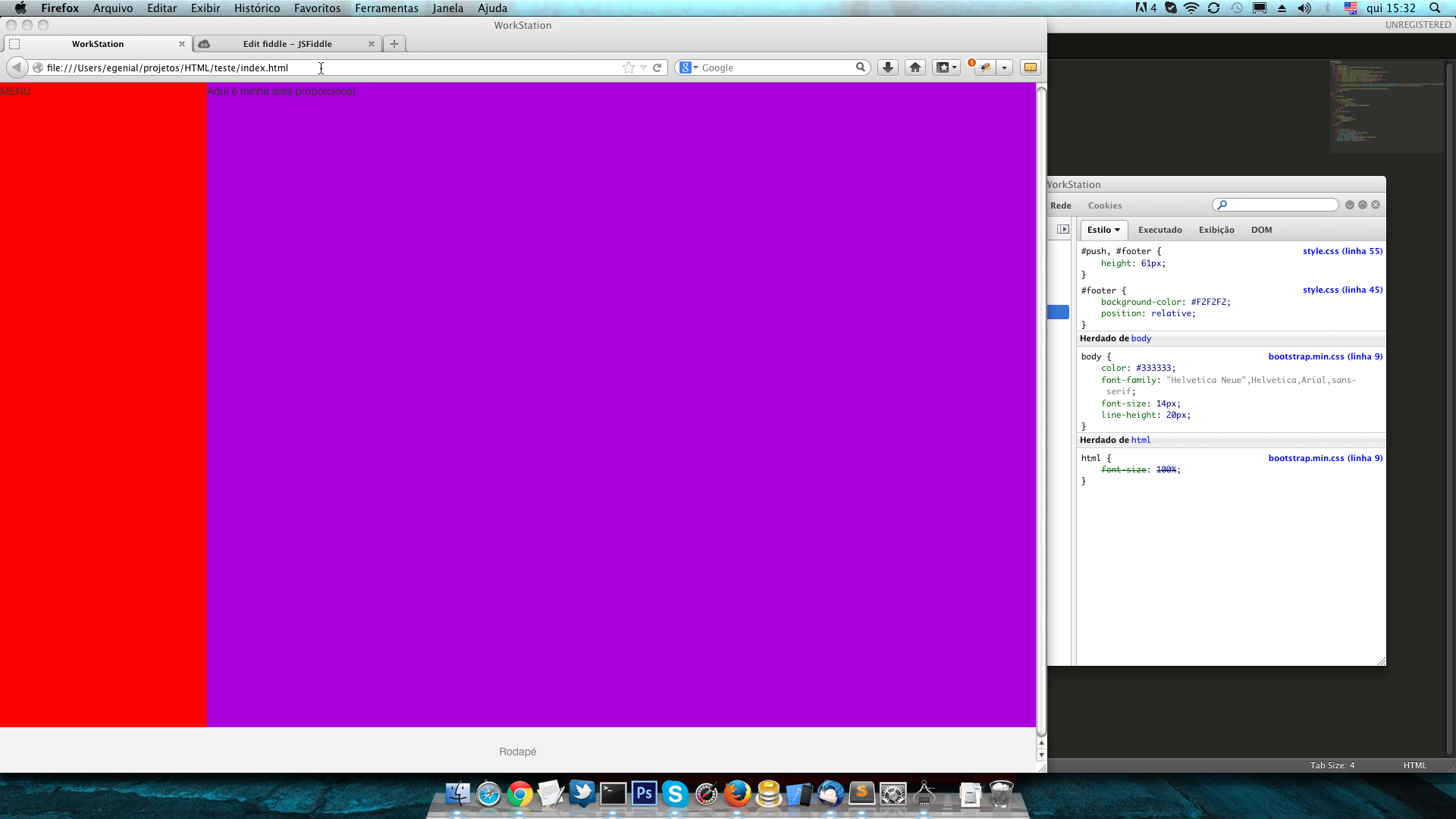 In this second image, notice that he touched the footer, IE, it is for him to lock with this size staying as the third image.
Note: The above script is not 100% cross-browser, since
querySelectoranddocument.documentElement.offsetWidthmay not be available in older browsers, but it is quite simple to adjust it as needed, for example using jQuery if you already use it in the document in question. =)– Gustavo Carvalho
perfect @Gustavocarvalho, just a little problem. The body is with a margin, how do I remove it? I put a margin:0 on it, only then the slide gets a space between the right side.
– Jefferson Alison
Another thing, I’ll have two slide classes and it only works on the first.
– Jefferson Alison
@Jeffersonalison, To remove body margin just add in body CSS
margin: 0 0 0 0;But then you have to adjust the script innewWidth(the discount of 16 was given on account of the margin, check the updated reply). For more than one slide just divide the available height by the number of slides. Check in this fiddle.– Gustavo Carvalho