How to make elements fit the text size?

Asked

Viewed 2,788 times

1

I am developing a site where all pages have one with a title that varies in size, and in this same title has two lines, one on each side of the text that has to adjust to the right size.

I know it sounds confusing, but to explain it better follow an image for you to understand:

imagem

My code:

.promo{
	display:block;
	float:left;
	width:100%;
	height:200px;
	background-image:url(http://s0.ejesa.ig.com.br/portal/images/2012-07/1.461037.jpg);
	background-size:cover;
	background-position:center center;
}
h1{
	width:100%;
	text-align:center;
}

h1.tit_header{
	width:70%;
	margin:80px 15% 10px 15%;
	color:#FFF;
}

.line_01, .line_02, .line_03{
	display:block;
	width: 100%;
	clear:both;
	font-size:1em;
}

.line_01{
	display:block;
	float:left;
	width:80%;
	margin:0 10%;
	text-align:center;
}

.text_tit{
	display:block;
	float:left;
	width:33%;
}

.linhaAzul_box{
	display:block;
	float:left;
	width:33%;
	height:40px;
}
.linha{
	display:block;
	float:left;
	width:100%;
	height:5px;
	background-color:#fff;
	margin-top:18px;
}
<div class="promo">
    <h1 class="tit_header">
        <span class="line_01">
            <span class="linhaAzul_box"><span class="linha"></span></span>
            <span class="text_tit">Titulo Grande de Mais</span>
            <span class="linhaAzul_box"><span class="linha"></span></span>
        </span>
    </h1>
</div>

  • It is not clear what you are looking for... can you explain better? is this what you want? -> http://jsfiddle.net/j9nv4v3w/3/

  • Almost that, only instead of the text adjusting is the white line that should be larger or less.

  • Marcelo gave an answer, that’s what I was looking for?

2 answers

4


The best solution is to use Flexbox, will save you a lot of trouble in calculating the internal positioning of the elements and make it yours HTML simpler. See browsers that support.

You can create two elements <span> (before and after) the tag where the title will be. Or adopt a more elegant solution using the pseudo-elements ::after and ::before of CSS3 to make the lines, since they have no relevance to page because it deals only with something visual.

*{box-sizing:border-box;margin:0;padding:0}

header {
    background:url(http://i.stack.imgur.com/DGejA.jpg) center center;
    background-size:cover;
    height: auto;
    padding: 10% 10px;
    width: 100%;
    
    /* flexbox */
    display: -webkit-flex;
            display: flex;
  
    /* comportamento: em linha com wrap */
    -webkit-flex-flow: row wrap;
            flex-flow: row wrap;
  
    /* conteúdo justificado no centro */
    -webkit-justify-content: center;
             justify-content:center;
}

span, h2 {
    -webkit-flex: 1 0 auto;
            flex: 1 0 auto;
}

.line {
    background: #fff;
    margin-top:12px;
    height: 4px;
    width: auto /* tcharam! */
}

h2 {
    color: #fff;
    text-align:center;
}
<header>
    <span class='line'></span>
    <h2 class='title'>Título pequeno?</h2>
    <span class='line'></span>
</header>

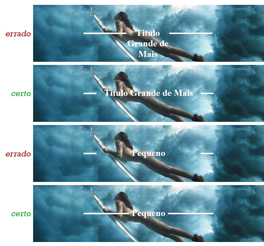
The secret is not to define the width of the internal elements, leaving the calculation in the hands of the property flexbox.

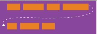
PS: You can set the sizes quietly, the behavior will depend on the rule flex-flow. In the example I left the width of all elements with auto, supposing I had defined mine <h2> with 200px and the size exceeded the width of the header the internal content will be broken as in the following image:

créditos: CSS-tricks

Of course, don’t just rely on this rule. I don’t know what your CSS looks like, but it will come to a small resolution that you’ll need to deal with breakpoints correctly with media queries.

To prove that the Flexbox works very well, why not test a larger title?

/* É o mesmo CSS, minificado */

*{box-sizing:border-box;margin:0;padding:0}header{background:url(http://i.stack.imgur.com/FFTx9.jpg) center center/cover;height:auto;padding:10% 10px;width:100%;display:-webkit-flex;display:flex;-webkit-flex-flow:row wrap;flex-flow:row wrap;-webkit-justify-content:center;justify-content:center}h2,span{-webkit-flex:1 0 auto;flex:1 0 auto}.line{background:#fff;margin-top:12px;height:4px;width:auto}h2{color:#fff;text-align:center}
<header>
    <span class='line'></span>
    <h2 class='title'>Olá, você me acha um título muito grande?</h2>
    <span class='line'></span>
</header>


Run the code block in full screen here on Sopt. If you are on , use the shortcut Ctrl + shift + m to start the adaptive design mode and see how the lines are positioned as the screen is resized. In there is a similar way explained in that reply.

  • 1

    The way you did with Flexbox seems to me more correct and semantic, really that’s what I needed, thanks for the help and sorry the delay of reply I’m coming back from holidays now! thank you even Renan

2

I think the solution is to use display: table; and display: table-cell; in the immediate offspring. That way you get the cells in this "table" to adapt to the size/width.

But that just doesn’t solve it because I understand that you want the central cell basically fixed, the size of the content. To make it work you can fool the browser and say that the sides must have 50% of the width and which the central cell shall have white-space: nowrap;. This will prevent line breaks and will force the side cells to give space to the title.

I suggest some changes to the CSS:

.line_01 {
    display: table;
    width:80%;
    margin:0 10%;
    text-align:center;
}
.line_01 > span {
    display: table-cell;
}
.text_tit {
    padding: 0 10px;
    white-space: nowrap;
}
.linhaAzul_box {
    width: 50%;
    height:40px;
}
.linha{
    display:block;
    width:100%;
    height:5px;
    background-color:#fff;
    margin-bottom: 5px;
}

jsFiddle: http://jsfiddle.net/38ucz1ev/

  • Sensational, really this is what I needed, thanks for the help and sorry the delay of reply I’m coming back from holidays now! thank you even Sergio

Browser other questions tagged

You are not signed in. Login or sign up in order to post.