1
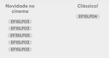
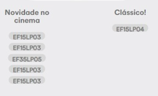
I’m trying to solve a layout misalignment problem, which in Windows 10, with the latest Chrome it changes the padding from the height of a button. This button looks right on Mac OS Mojave, using the same version of Chrome, note between the pictures, the difference:
Mac:
Windows:
.item-descritores {
    display: -webkit-flex;
    flex-wrap: wrap;
    -webkit-flex-wrap: wrap;
    justify-content: center;
    -webkit-justify-content: center;
    text-align: center;
    margin: auto -6% auto -6%;
    position: relative;
    z-index: 200;
}
.selo-descritores {
    padding: 7px 10px 3px;
    background: #d8d8d8;
    -webkit-border-radius: 15px;
    -moz-border-radius: 15px;
    border-radius: 15px;
    text-align: center;
    font-size: 15px;
    font-weight: bold;
    margin: 4px;
    color: #777;
    border: none;
}

button {
   -webkit-writing-mode: horizontal-tb !important;
   text-rendering: auto;
   color: buttontext;
   letter-spacing: normal;
   word-spacing: normal;
   text-transform: none;
   text-indent: 0px;
   text-shadow: none;
   display: inline-block;
   text-align: center;
   align-items: flex-start;
}
* {
  -webkit-box-sizing: border-box;
  -moz-box-sizing: border-box;
  box-sizing: border-box;
}
<div class="item-descritores" style="">
<button data-toggle="tooltip" title="" class="selo-descritores" style="">EF15LP03</button>
</div>
I believe it’s the rendering of the source.
– CypherPotato
I’ll put the font in the CSS and see if it improves.
– Ivan Ferrer
Does this occur in other browsers? or is it just in the OS?
– Renan
What would be Sos?
– victor
Here I have Win 10 and I’m in Chrome and it’s like http://prntscr.com/pza4y4 normal, it didn’t present the same problem you didn’t. Another thing, Mac Chrome does not use Chromium, it is Webkit equal to Safari as far as I know,
– hugocsl
Sos - System(s) Operacionai(s), that would be.
– Ivan Ferrer
I believe it is some problem with some models of Pcs... it does not happen in all the company Pcs here, it is only appearing in two models so far... I thought it could be some extension and loaded the window in anonymous mode, however the problem persists, I thought it might actually be the source that might be saved on the machine that’s different, I’m still having doubts. [+]
– Ivan Ferrer
[+] The problem is not only on this screen, there are several places of the site, which misaligned on these screens... I mean, I don’t think it’s a CSS problem, but PC adaptation with this configuration.
– Ivan Ferrer
So @Renan, I haven’t tested it on other browsers, but safari and Chrome on mac are the same. The Windows I have here is from the communication staff, so I can’t install safari to test...
– Ivan Ferrer
Probably the font-family used, or the font is "native" to the OS. Personally I find it a huge exaggeration the use of flex and grid for simple things, when something simple and more "controlled" would work very well, but it became fashionable to use flex and grid, so the fashion prevails over working well and "teach" that this is now the right way... If flex were better than doing the simple to achieve the same effect, float would have been "removed". Your problem is the flex or the source, but usually flex if you do not know how to use well and at the right time will cause unexpected effects due to lack of understanding (most).
– Guilherme Nascimento
If you explain a line-height, the output is more constant. Anyway, I would need [Dit] and provide a [mcve] problem, because the code has a lot of information that hinders the analysis.
– Bacco