12
After the window appeared auto-complete, I came across the following:
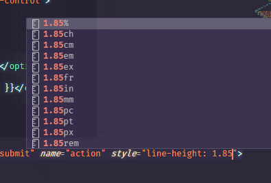
and then I wondered: why the CSS has so many different units of measures?
12
After the window appeared auto-complete, I came across the following:
and then I wondered: why the CSS has so many different units of measures?
17
It is because not only do we have a "display media", you may have to set up a web page for print output, as any typographic design for you to have more control of as a PX screen will appear on paper you can make a @media print {} and use units of measurement for printing. The advantage of this is to ensure that both on screen and in print vc will deliver a good reading experience for the user.
Various "printing" software like Corel, for example, works with measurements in Dots or Centimentros/Milímitros, etc. This is just one example for printing. There are still ways you can configure the print page using @page, and in that at rule vc can set the page size if it is A4 or A5 for example, and still define the margins in CM or MM for example
@page {
  size: A4;
}
@page :left {
  margin-right: 200pt;
}

@page :right {
  margin-left: 2cm;
}
The above example was basically for printing, but imagine that you will have in some trade something like a tablet that the user can only interact with the screen, and that screen does not have scroll, or even navigation bar. For such a system you can use the measures of viewport for example (vw, vh, vmin, vmax). So vc ensures that the screen will occupy 100% of the visible area of the device.

For these types of more "flexible" devices, which can vary the orientation and change screen size at any time it is interesting to use relative measurements. If there are many or few CSS measurement options I don’t know... the important thing is to know which ones to use for each type of problem. In an interface in which the user will use a lot the zoom of browser you can take measures in px, already to screens where the user can not give zoom would be legal measures concerning.
"Different units for different demands"
3
Basically we can define the units of measures in two categories:
1. Absolute measures : Even with different screens they will appear exactly this size.
cm
mm
in
px
pt
pc
2. Measures relating to Its size is relative and may vary according to screen size or equipment ( widely used for responsive layouts )
in
ex
ch
rem
vw
vh
vmin
Vmax
The different units help us to define different types of parameters, for example:
If you are resizing an image in CSS we have its size and px, depending on the application of this image in the layout it will be more convenient to set its size in px, but if you want to define its size in relation to an element the best is to define in in.
Another example would be a text, it is easier to define most of the time in pt, especially if it is some text for printing purposes.
So each unit of measure has its purpose of facilitating depending on the type of application it wants to define.
Okay, you set the units of measures. But why do you have so many?
The different units help us to define different types of parameters, for example, if you are resizing an image in CSS that we have its size and px depending on the application of this image in the layout it will be more convenient to set its size in "px"but if you want to define its size in relation to an element the best is to define it in "in". Another example would be a text, it is easier to define most of the time in pt. So each unit of measure has its purpose of facilitating depending on the type of application you want to define.
It would be interesting to supplement your answer.
Edited the answer, I hope to have helped!
Browser other questions tagged css css3
You are not signed in. Login or sign up in order to post.
Can you put code instead of image?
– Jorge B.
@Jorgeb. the image has no code, it’s just a reference to where my doubt arose.
– CypherPotato
Anyway, I think I’d be better off with code/text.
– Jorge B.