1
I have a Page with this style:
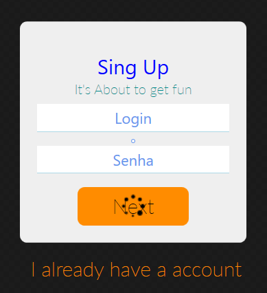
<Border Padding="{Binding InnerContentPadding}" >
    <Border>
        <ScrollViewer HorizontalScrollBarVisibility="Auto" VerticalScrollBarVisibility="Auto">
            <StackPanel VerticalAlignment="Center" HorizontalAlignment="Center" TextBlock.TextAlignment="Center">
                <Border Background="{StaticResource BackgroundLightBrush}" Margin="50 50 50 0" Padding="15 50 15 15" CornerRadius="10" Width="330">
                    <StackPanel>
                        <TextBlock Text="Sing Up" FontFamily="{StaticResource LatoRegular}" FontSize="30" Foreground="Blue"/>
                        <TextBlock Text="It's About to get fun" FontSize="20" Foreground="DarkCyan"/>

                        <TextBox Text="{Binding Email}" Style="{StaticResource textboxlogin}" Tag="Loguin"/>
                        <PasswordBox Name="PasswordText" PasswordChanged="PasswordBox_PasswordChanged"  Style="{StaticResource  textboxSenhalogin}" Tag="Senha"/>

                        <Button Command="{Binding LoginCommand}" HorizontalAlignment="Center" Content="Next"  />

                    </StackPanel>
                </Border>
                <Button Style="{StaticResource TextButton}" Content=" I already have a account" HorizontalAlignment="Center"/>
            </StackPanel>
        </ScrollViewer>
    </Border>
</Border>
I use the styles from a Resourcedictionary, and the orange button style is this.
 <Style TargetType="{x:Type Button}" BasedOn="{StaticResource BaseStyle}">
    <Setter Property="Background" Value="DarkOrange" />
    <Setter Property="BorderThickness" Value="0" />
    <Setter Property="FontSize" Value="30" />
    <Setter Property="Padding" Value="50 10" />
    <Setter Property="Margin" Value="0 10" />

    <Setter Property="Template" >
        <Setter.Value>
            <ControlTemplate  TargetType="{x:Type ButtonBase}">
                <Border x:Name="border" CornerRadius="10" BorderBrush="{TemplateBinding BorderBrush}" BorderThickness="{TemplateBinding BorderThickness}" Background="{TemplateBinding Background}" SnapsToDevicePixels="True">
                    <Grid>
                        <TextBlock Name="tbLoguin"
                                   Text="{TemplateBinding Content}"
                                   Focusable="False"
                                   HorizontalAlignment="{TemplateBinding HorizontalContentAlignment}"
                                   Margin="{TemplateBinding Padding}"
                                   SnapsToDevicePixels="{TemplateBinding SnapsToDevicePixels}"
                                   VerticalAlignment="{TemplateBinding VerticalContentAlignment}"/>

                        <Image Source="https://img.icons8.com/metro/26/000000/spinner-frame-4.png" Width="40"   Height="40" VerticalAlignment="Center" >

                            <Image.Style >
                                <Style TargetType="Image" >
                                    <Setter Property="RenderTransformOrigin" Value="0.5, 0.5" />
                                    <Setter Property="RenderTransform">
                                        <Setter.Value>
                                            <RotateTransform></RotateTransform>
                                        </Setter.Value>
                                    </Setter>

                                    <Style.Resources>
                                        <Storyboard x:Key="Spin">
                                            <DoubleAnimation
                                                        Storyboard.TargetProperty="(UIElement.RenderTransform).(RotateTransform.Angle)"
                                                        From="0"
                                                        To="360"
                                                        Duration="0:0:2"
                                                        RepeatBehavior="Forever" />
                                        </Storyboard>
                                    </Style.Resources>

                                    <Style.Triggers>
                                        <Trigger Property="IsMouseOver" Value="True">
                                            <Trigger.EnterActions>
                                                <BeginStoryboard Name="SpinStoryboard" Storyboard="{StaticResource Spin}" />
                                            </Trigger.EnterActions>
                                            <Trigger.ExitActions>
                                                <RemoveStoryboard BeginStoryboardName="SpinStoryboard" />
                                            </Trigger.ExitActions>
                                        </Trigger>
                                    </Style.Triggers>
                                </Style>
                            </Image.Style>
                        </Image>
                    </Grid>

                </Border>

                <ControlTemplate.Triggers>
                    <EventTrigger RoutedEvent="MouseEnter" >
                        <BeginStoryboard>
                            <Storyboard >
                                <ColorAnimation Duration="0:0:0.3" To="LightBlue" Storyboard.TargetName="border" Storyboard.TargetProperty="Background.Color"/>
                            </Storyboard>
                        </BeginStoryboard>
                    </EventTrigger>

                    <EventTrigger RoutedEvent="MouseLeave" >
                        <BeginStoryboard>
                            <Storyboard >
                                <ColorAnimation Duration="0:0:0.3" To="DarkOrange" Storyboard.TargetName="border" Storyboard.TargetProperty="Background.Color"/>
                            </Storyboard>
                        </BeginStoryboard>
                    </EventTrigger>


                    <Trigger Property="IsEnabled" Value="False">
                        <Setter Property="Background" TargetName="border" Value="pink"/>
                    </Trigger>

                    <DataTrigger Binding="{Binding LogisisRunning}" Value="True">
                        <Setter Property="Visibility" TargetName="tbLoguin" Value="Hidden"/>
                    </DataTrigger>
                </ControlTemplate.Triggers>
            </ControlTemplate>
        </Setter.Value>
    </Setter>
</Style>
The problem is that when I click the button it can take X seconds to perform the task (which in case I put 2 seconds delay to test) and I need the text to disappear and the spinner to appear while the task is not completed. That is, while it is not clicked appears the text and when it is clicked appears the spinner until it finishes the action.
The button uses Command in Viewmodel to perform the action. I am using a Control Property public bool LoginIsRunning { get; set; } while the action is taking place the value of it is True.
What I’m not getting is to use this Property to change the design in XAML, how can I do this?