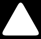
The idea is really simple: you first apply a series of transformations to your element .triangle (with the attribute overflow: hidden that you can remove it to see what is happening) to get a rhombus.
Then you apply the same transformations to the pseudo-elements :before and :after, make them a little more romantic.
And at the end, you have three lozenges that intersect, the orange shape being the intersection of them. Pass the triangle mouse to see the shapes that intersect.
The figure is scalable, simply changing the width and height of the element .triangle.
For Firefox, Chrome, and Safari, only the orange triangle with rounded corners is sensitive when hovering (thanks to pointer-events: none; in the element .triangle and pointer-events: auto; in the pseudo-elements). Otherwise it can be achieved by involving .triangle in an element of the same width and height (and the same radius of edge) with overflow: hidden;.
.triangle, .triangle:before, .triangle:after { width: 4em; height: 4em; }
.triangle {
	overflow: hidden;
	position: relative;
	margin: 7em auto 0;
	border-radius: 20%;
	transform: translateY(50%) rotate(30deg) skewY(30deg) scaleX(.866);
	cursor: pointer;
	pointer-events: none;
}
.triangle:before, .triangle:after {
	position: absolute;
	background: orange;
	pointer-events: auto;
	content: '';
}
.triangle:before {
	border-radius: 20% 20% 20% 53%;
	transform: scaleX(1.155) skewY(-30deg) rotate(-30deg) translateY(-42.3%)
			skewX(30deg) scaleY(.866) translateX(-24%);
}
.triangle:after {
	border-radius: 20% 20% 53% 20%;
	transform: scaleX(1.155) skewY(-30deg) rotate(-30deg) translateY(-42.3%)
			skewX(-30deg) scaleY(.866) translateX(24%);
}

/** extra styles to show how it works **/

.triangle:hover { overflow: visible; }
.triangle:hover:before, .triangle:hover:after { background: none; }
.triangle:hover, .triangle:hover:before, .triangle:hover:after {
	border: dashed 1px;
}
<div class='triangle'></div>
Translated from Stack Overflow EN
I think with border-Radius you can make those curved edges.
– Maycon F. Castro
With border-Radius you can do the vertices of the base but it does not affect the top vertex. You will need a second
div.– Augusto Vasques
@Augustovasques possibly with more Divs and border-Radius to do, maybe it is a way
– hugocsl
An example of how to achieve the goal: https://stackoverflow.com/questions/14446677/how-to-make-3-corner-rounded-triangle-in-css, if someone wants to translate to enrich the content of sopt feel free :)
– MarceloBoni
I did the translation because I found the answer very creative.
– Augusto Vasques
@Marceloboni was worth the tip
– hugocsl