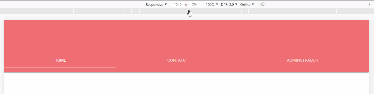
Dude you have to use the class .tabs-fixed-width in the component, this is described in the documentation http://archives.materializecss.com/0.100.2/tabs.html
Follow the code with the component set as above:
<!DOCTYPE html>
<html lang="en">
<head>
<meta charset="utf-8" />
<meta http-equiv="X-UA-Compatible" content="IE=edge">
<title>Page Title</title>
<link rel="stylesheet" href="https://fonts.googleapis.com/icon?family=Material+Icons" />
<link rel="stylesheet" href="https://cdnjs.cloudflare.com/ajax/libs/materialize/0.100.2/css/materialize.min.css" />
<meta name="viewport" content="width=device-width, initial-scale=1">
<style>
</style>
</head>
<body>
<!-- Título -->
<nav class="nav-extended">
<div class="nav-wrapper center">
<img style="width: 200px; height: 200px; margin-top: 25px;" src="imagem/livro.jpg" alt="" class="circle">
<a href="#" class="brand-logo center" style="margin-top: 225px">Empório Belém</a>
</div>
<!-- Abas -->
<div class="nav-wrapper" style="margin-top: 50px">
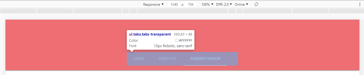
<ul class="tabs tabs-transparent tabs-fixed-width">
<li class="tab"><a href="#home" class="active">Home</a></li>
<li class="tab"><a href="#contato">Contato</a></li>
<li class="tab"><a href="#adm">Adminstrador</a></li>
</ul>
</div>
</nav>
<script src="https://code.jquery.com/jquery-3.2.1.min.js"></script>
<script src="https://cdnjs.cloudflare.com/ajax/libs/materialize/0.100.2/js/materialize.min.js"></script>
</body>
</html>
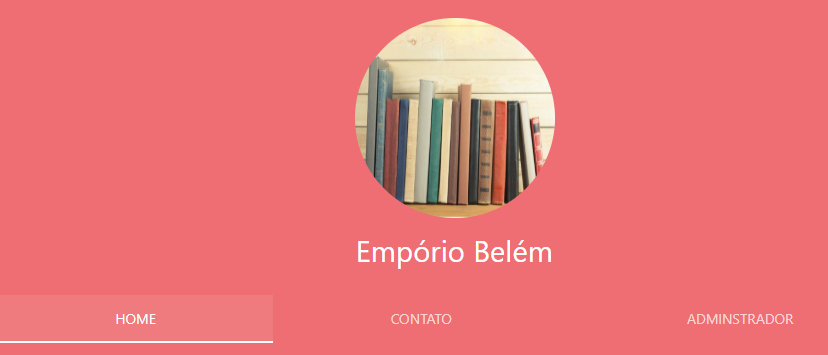
Option 2
If you want to center the component as a whole, but you don’t want to "expand" the tabs, you can use the Materialize Grid, you have to create a Row with a col and offset and put the Tabs in, it will look like this. See the Grid documentation http://archives.materializecss.com/0.100.2/grid.html
Code of the image above:
<!DOCTYPE html>
<html lang="en">

<head>
<meta charset="utf-8" />
<meta http-equiv="X-UA-Compatible" content="IE=edge">
<title>Page Title</title>
<link rel="stylesheet" href="https://fonts.googleapis.com/icon?family=Material+Icons" />
<link rel="stylesheet" href="https://cdnjs.cloudflare.com/ajax/libs/materialize/0.100.2/css/materialize.min.css" />
<meta name="viewport" content="width=device-width, initial-scale=1">
<style>


</style>
</head>

<body>

    <!-- Título -->
    <nav class="nav-extended">
        <div class="nav-wrapper center">
            <img style="width: 200px; height: 200px; margin-top: 25px;" src="imagem/livro.jpg" alt="" class="circle">
            <a href="#" class="brand-logo center" style="margin-top: 225px">Empório Belém</a>
        </div>

        <!-- Abas -->


        <div class="row">
            <div class="col s4 offset-s4">
                <div class="nav-wrapper" style="margin-top: 50px">
                    <ul class="tabs tabs-transparent ">
                        <li class="tab"><a href="#home" class="active">Home</a></li>
                        <li class="tab"><a href="#contato">Contato</a></li>
                        <li class="tab"><a href="#adm">Adminstrador</a></li>
                    </ul>
                </div>
            </div>
        </div>
    </nav>


    <script src="https://code.jquery.com/jquery-3.2.1.min.js"></script>
    <script src="https://cdnjs.cloudflare.com/ajax/libs/materialize/0.100.2/js/materialize.min.js"></script>
</body>

</html>

Take a look at this class here:
.brand-logowho is in the<a>that involves the logo. Maybe he has apaddingor amarginthat is interfering. But looking at the image, the two are to the right.– Diego Souza
In the div of
nav-wrapper, try forwidth: 100%to stretch all items, or bytext-align:centerto place the content in the center.– CypherPotato