Problem with div’s that don’t "fit"

Asked

Viewed 46 times

-1

inserir a descrição da imagem aqui
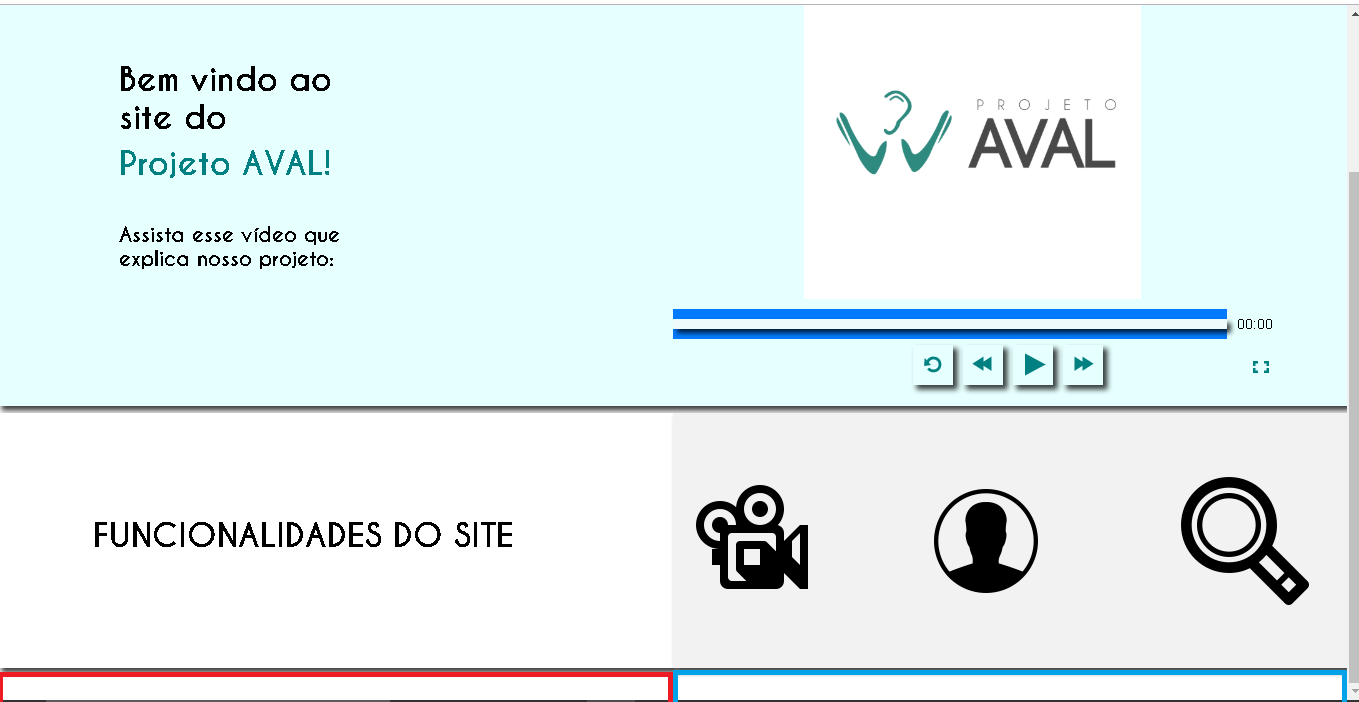
Sorry for the buggy page, I’m going to put some images below of how she really is:

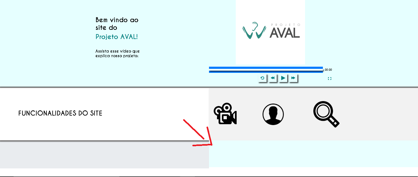
This image shows where I put the two Ivs, one next to the other, have tried several things, use col-Sm, until change with margin-left and margin-top, also tried the z-index thinking it could fix the problem, but what happens is that it sits on top of the shadow... I know it’s a basic problem, so forgive me...

  (function() {
            //Show Modal
            $('#exampleModalLong').on('show.bs.modal', function(e) {
                $('.firstBlur').addClass('modalBlur');
            })
            //Remove modal
            $('#exampleModalLong').on('hide.bs.modal', function(e) {
                $('.firstBlur').removeClass('modalBlur');
            })
        })();


        $('.nav-link').on('click', function() {
            $('.active-link').removeClass('active-link');
            $(this).addClass('active-link');
        });
const body = document.querySelector('body');
const searchBtn = document.querySelector('#search');
const searchInput = document.querySelector('#search-input');
let active = false;

body.addEventListener('click', (e) => {
  if(e.target.id === 'search' || e.target.id === 'search-input' || e.target.id === 'search-icon') {
    if(!active) {
      searchBtn.classList.add('active');
      searchInput.classList.add('active');
      active = true;
    }
  } else {
      searchBtn.classList.remove('active');
      searchInput.classList.remove('active');
      searchInput.value = '';
      active = false;
  }
});

       new InitPxVideo({
  videoId: "myvid",
  captionsOnDefault: true,
  seekInterval: 20,
  videoTitle: "PayPal Austin promo",
  debug: true
});
 .animate {
        -webkit-animation: animatezoom 0.6s;
        animation: animatezoom 0.6s
    }


    a {
        outline: none;
    }

    .navbar-container {
        text-align: left;
        background-color: #008080;
        box-shadow: 0px 2px 5px 0px #333333;
        
        font-size: 0;
        
        position: relative;


    }

    .navbar-container ul {
        margin: 0;
        padding: 0;
        text-align: right;
        display: inline-block;
        vertical-align: top;
        
    }

    .navbar-container ul li {
        display: inline-block;
        font-size: 16px;
        
    }

    .navbar-container ul li a {
        color: #ffffff;
        text-decoration: none;
        display: inline-block;
        padding: 10px;
        transition: color 0.5s;
        
    }

    .navbar-container ul li .underline {
        height: 3px;
        background-color: transparent;
        width: 0%;
        transition: width 0.2s, background-color 0.5s;
        margin: 0 auto;
        
    }

    .navbar-container ul li.active-link .underline {
        width: 100%;
        background-color: white;
        
    }

    .navbar-container ul li:hover .underline {
        background-color: white;
        width: 100%;
        
    }

    .navbar-container ul li:hover a {}

    .navbar-container ul li:active a {
        transition: none;
        color: rgba(255, 255, 255, 0.76);
    }

    .navbar-container ul li:active .underline {
        transition: none;
        background-color: rgba(255, 255, 255, 0.76);
    }

    @-webkit-keyframes animatezoom {
        from {
            -webkit-transform: scale(0)
        }

        to {
            -webkit-transform: scale(1)
        }
    }

    @keyframes animatezoom {
        from {
            transform: scale(0)
        }

        to {
            transform: scale(1)
        }
    }

    /* Change styles for span and cancel button on extra small screens */
    @media screen and (max-width: 300px) {
        span.psw {
            display: block;
            float: none;

        }

        .cancelbtn {
            width: 100%;
        }

    }

    @-webkit-keyframes fadeIn {
0% { opacity: 0; }
100% { opacity: 1.5; } 
}
@-moz-keyframes fadeIn {
0% { opacity: 0;}
100% { opacity: 1.5; }
}
@-o-keyframes fadeIn {
0% { opacity: 0; }
100% { opacity: 1.5; }
}
@keyframes fadeIn {
0% { opacity: 0; }
100% { opacity: 1.5; }
}

.fadeIn {
-webkit-animation: fadeIn 1s ease-in-out;
-moz-animation: fadeIn 1s ease-in-out;
-o-animation: fadeIn 1s ease-in-out;
animation: fadeIn 1s ease-in-out;
}


body {
  
  font-family: Caviar Dreams;
margin: 0 auto;
  color: #FFF;
  
}

#search {
  height: 60px;
  width: 60px;
  border: solid 5px;
  border-radius: 50px;
  display: flex;
  justify-content: center;
  align-items: center;
  font-size: 35px;
  transition: 0.3s;
  margin-left: 530px;
  margin-top: -65px;

}

#search-input {
  height: 100%;
  width: 0px;
  font-size: 28px;
  font-weight: 600;
  background: none;
  color: #FFF;
  border: none;
  outline: 0;
  visibility: hidden;
  transition: 0.3s;
   margin-left: -35px;
}

#search.active {
  width: 350px;
}

#search-input.active {
  width: 260px;
  margin-left: 16px;
  visibility: visible;
}


 #hero {
       background-color: #e6ffff;
        background-size: cover;
        height: 525px;
         box-shadow: 4px 4px 5px 0px rgba(0,0,0,0.75);


    }

    #hero2{
        margin-top: -25px;
        background-size: cover;
        background-color: #FFFFFF;
box-shadow: 4px 4px 5px 0px rgba(0,0,0,0.75);
        height: 255px;
       width: 50%;
       float: left;

    }

    #hero3{
        margin-top: -25px;
        background-size: cover;
        background-color: #f2f2f2;
        height: 255px;
       width: 50%;
       float: right;
       box-shadow: 4px 4px 5px 0px rgba(0,0,0,0.75);
    }


    .row{
        width: 300px;
        margin-top: -500px;
       
    }


    .logo2{
        height: 600px;
        width: 600px;
    }

      #wrapper {
      font-family: "Helvetica Neue", Helvetica, Arial, sans-serif;
    }

     
   #wrapper {
      font-family: "Helvetica Neue", Helvetica, Arial, sans-serif;
    }

    #brand a,
    p a {
      border: 1px #fff dotted;
    }

    #brand a:focus,
    p a:focus {
      border: 1px #999 dotted;
      outline: none;
    }

    p {
      padding-top: 1em;
    }

    .t2{
        margin-top: 40px;
        margin-left: 80px;
        text-transform: uppercase;
    }

.iconc{
    margin-left: 100px;
}

.iconi{
    margin-left: 125px;
}


#jum1 { 
 
  background-color: #c2FFFF;
  margin-top:265px;
  width: 50%;
  margin: 0;
}
#jum2 { 
 
  background-color: #c244FF;
  margin-top:0px;
  width: 50%;
  margin: 0;
  
}

#hero4{
width: 50%;
margin-top: 269px;
}

#hero5{
width: 50%;
margin-top: -168px;
float: right;
background-color: #e9FFFF;
}


@media only screen and (min-width: 620px) {
  .custom-controls .transcript-link {
    margin-top: -44px;
  }
}
.transcript-single {
  border-bottom: 2px solid black-thirty;
}
.transcript-single.hidden {
  display: none;
}
.session--watch {
  margin-bottom: HalfLineHeight;
}
.session--watch .button {
  background: black-sixty;
  margin-top: QuarterLineHeight;
}
.session--watch .button:hover,
.session--watch .button:active,
.session--watch .button:focus {
  background: black-seventy;
}
.sr-only {
  position: absolute !important;
  clip: rect(1px, 1px, 1px, 1px);
  padding: 0 !important;
  border: 0 !important;
  height: 1px !important;
  width: 1px !important;
  overflow: hidden;

}
.hide {
  display: none;
}
.show-inline {
 
}
.px-video-container {
  overflow: hidden;
  min-width: 300px;
  width: 600px;
  height: 600px;
  margin-left: 554px;
  margin-top: 0px;


}
.px-video {
  position: absolute;
  top: 0;
  left: 0;
  margin-top: 0;
  width: 100%;
  height: 100%;
}


.px-video-wrapper {
  position: relative;
  padding-bottom: 56.25%;
  height: 0;
  z-index: 1;

}
.px-video {
  position: absolute;
  top: 0;
  left: 0;
  width: 100%;
  height: 100%;


}
.progress-bar {
  width: 85%;
 
}
@media only screen and (min-width: 480px) {
  .progress-bar {
    width: 89%;
  }
}
@media only screen and (min-width: 970px) {
  .progress-bar {
    width: 95%;
  }
}
@media only screen and (min-width: 1795px) {
  .progress-bar {
    width: 97.5%;
  }
}
.px-video-controls {
  margin-bottom: 10px;
  margin-top: 10px;
}
.px-video-controls:after {
  
  font-size: 0;
  content: " ";
  clear: both;
  height: 0;
  visibility: hidden;
}
.px-video-progress {
  display: block;
  width: 100%;
  margin-bottom: 10px;
  height: 10px;
}
.px-video-progress[value] {
  -webkit-appearance: none;
  border: none;
}
.px-video-progress[value]::-webkit-progress-bar {
  background-color: #EFFBFB;
  box-shadow: 4px 4px 5px 0px rgba(0,0,0,0.75);
}
.px-video-progress[value]::-webkit-progress-value {
  background-color: #008080;
 
}
.px-video-time {
  font-family: "Helvetica Neue", Helvetica, Arial, sans-serif;
  float: right;
  line-height: 30px;
  margin-top: -30px;
  font-size: 14px;
  
}

.px-video-playback-buttons {
  float: left;
  line-height: 20px;
  min-width: 145px;
}
@media only screen and (min-width: 620px) {
  .px-video-playback-buttons {
    float: none;
    left: 50%;
    margin-left: -120px;
    min-width: 200px;
    position: absolute;
    width: 200px;

  }
}
.px-video-controls button {
  border: 1px transparent solid;
  background: transparent;
  padding: 0;
  margin: 0 5px;
  width: 25px;
  height: 25px;
  overflow: hidden;
  background: no-repeat url("../images/px-video-sprite.svg");

}
@media only screen and (min-width: 620px) {
  .px-video-controls button {
    background-size: 150%;
    width: 40px;
    height: 40px;
    box-shadow: 4px 4px 5px 0px rgba(0,0,0,0.75);
  }
}

.px-video-controls button:focus {
  border: 1px #999 dotted;
  outline: none;
}
.px-video-controls button {
  cursor: pointer;
}
.px-video-controls button.px-video-restart {
  background-position: -9px -331px;
}
.px-video-controls button.px-video-restart:hover,
.px-video-controls button.px-video-restart:focus {
  background-position: -9px -295px;
}
@media only screen and (min-width: 620px) {
  .px-video-controls button.px-video-restart {
    background-position: -9px -523px;
  }
}
@media only screen and (min-width: 620px) {
  .px-video-controls button.px-video-restart:hover,
  .px-video-controls button.px-video-restart:focus {
    background-position: -9px -466px;
  }
}
.px-video-controls button.px-video-rewind {
  background-position: -9px -187px;
}
.px-video-controls button.px-video-rewind:hover,
.px-video-controls button.px-video-rewind:focus {
  background-position: -9px -151px;
}
@media only screen and (min-width: 620px) {
  .px-video-controls button.px-video-rewind {
    background-position: -9px -295px;
  }
  .px-video-controls button.px-video-rewind:hover,
  .px-video-controls button.px-video-rewind:focus {
    background-position: -9px -238px;
  }
}
.px-video-controls button.px-video-play {
  background-position: -8px -43px;
}
.px-video-controls button.px-video-play:hover,
.px-video-controls button.px-video-play:focus {
  background-position: -8px -7px;
}
@media only screen and (min-width: 620px) {
  .px-video-controls button.px-video-play {
    background-position: -8px -67px;
  }
  .px-video-controls button.px-video-play:hover,
  .px-video-controls button.px-video-play:focus {
    background-position: -8px -10px;
  }
}
.px-video-controls button.px-video-pause {
  background-position: -9px -115px;
}
.px-video-controls button.px-video-pause:hover,
.px-video-controls button.px-video-pause:focus {
  background-position: -9px -79px;
}
@media only screen and (min-width: 620px) {
  .px-video-controls button.px-video-pause {
    background-position: -9px -182px;
  }
}
@media only screen and (min-width: 620px) {
  .px-video-controls button.px-video-pause:hover,
  .px-video-controls button.px-video-pause:focus {
    background-position: -9px -124px;
  }
}
.px-video-controls button.px-video-forward {
  background-position: -10px -259px;
}
.px-video-controls button.px-video-forward:hover,
.px-video-controls button.px-video-forward:focus {
  background-position: -10px -223px;
}
@media only screen and (min-width: 620px) {
  .px-video-controls button.px-video-forward {
    background-position: -10px -409px;
  }
  .px-video-controls button.px-video-forward:hover,
  .px-video-controls button.px-video-forward:focus {
    background-position: -10px -352px;
  }
}
.px-video-fullscreen-btn-container {
  float: left;
  width: 25px;
  margin-top: 12px;

}
.px-video-fullscreen-btn-container label {
 
  width: 25px;
  height: 20px;
  margin-top: 3px;
  margin-left: 1px;
  background: no-repeat url("../images/px-video-sprite.svg");
  background-position: -6px -943px;
}
@media only screen and (min-width: 540px) {
  .px-video-fullscreen-btn-container label {
    margin-top: 5px;
  }
}

.px-video-fullscreen-btn-container input[type="checkbox"]:focus+label {
  outline: 1px #999 dotted;
  background-position: -6px -907px;
}
.px-video-fullscreen-btn-container input[type="checkbox"]:hover+label {
  background-position: -6px -907px;
  cursor: pointer;
}
.px-video-fullscreen-btn-container input[type="checkbox"]:focus+label {
  outline: 1px #999 dotted;
  background-position: -6px -907px;
}
.px-video-fullscreen-btn-container input[type="checkbox"]:checked+label {
  background-position: -6px -979px;
}
.px-video-fullscreen-btn-container input[type="checkbox"]:checked:hover+label {
  background-position: -6px -1015px;
}
.px-video-captions-btn-container {
  float: left;
}


.px-video-controls input[type='range'] {
  -webkit-appearance: none;
  height: 6px;
  width: 70px;
  margin-top: 9px;
  margin-right: 0;
  margin-left: 5px;
  background-color: #e6e6e6;
  outline: none;
}
@media only screen and (min-width: 540px) {
  .px-video-controls input[type='range'] {
    margin-top: 12px;
    width: 85px;
  }
}
.px-video-controls input[type='range']:focus::-webkit-slider-thumb {
  outline: 1px #999 dotted;
}
.px-video-controls input[type='range']::-moz-range-track {
  -moz-appearance: none;
  height: 6px;
  background-color: #e6e6e6;
  border: none;
}
.px-video-controls input[type='range']::-webkit-slider-thumb {
  -webkit-appearance: none !important;
  height: 10px;
  width: 6px;
  background-color: #666;
}
.px-video-controls input[type='range']::-moz-range-thumb {
  background-color: #666;
  border: none;
  height: 12px;
  width: 8px;
}
@media screen and (-ms-high-contrast: active), (-ms-high-contrast: none) {
  .px-video-controls input[type='range'] {
    position: relative;
    padding: 0;
    height: 8px;
    top: -3px;
  }
  .px-video-controls .px-video-time {
    margin-top: 4px;
  }

}
.px-video-controls {
  display: flex;
  flex-direction: row;
  flex-wrap: wrap;
  justify-content: space-between;
  align-items: center;
  align-content: center;
}
.progress-bar {
  flex-grow: 1;
  width: 75%;
}
@media only screen and (min-width: 480px) {
  .progress-bar {
    width: 75%;
  }
}
@media only screen and (min-width: 590px) {
  .progress-bar {
    width: 85%;
  }
}
@media only screen and (min-width: 970px) {
  .progress-bar {
    width: 85%;
  }
}
@media only screen and (min-width: 1795px) {
  .progress-bar {
    width: 85%;
  }
}
.px-video-progress {
  margin-top: 10px;
  width: 100%;
}
.px-video-time {
  flex-grow: 0;
  flex-shrink: 0;
  padding-left: 10px;
  margin-top: 0;
}
.px-video-playback-buttons {
  flex-grow: 1;
  min-width: auto;
}
@media only screen and (min-width: 620px) {
  .px-video-playback-buttons {
    left: auto;
    margin-left: auto;
    min-width: auto;
    position: relative;
    width: auto;
    display: flex;
    flex-direction: row;
    flex-wrap: no-wrap;
    justify-content: center;
    align-items: center;
    align-content: center;
    padding-left: 96px;

  }
}

}
.px-video-controls button {
  margin: 0 5px;
}
<body class="fadeIn">

    <!-- TODA PROGRAMAÇÃO DEVE SER FEITA DENTRO DA DIV firstBlur!!!-->

    <div class="firstBlur">

        <div class="navbar-container">

            <ul>
                <li class="nav-link active-link">
                    <a href="#">Página inicial
                    </a>
                    <div class="underline"></div>
                </li>
                <li class="nav-link">
                    <a href="#">Vídeos</a>
                    <div class="underline"></div>
                </li>
                <li class="nav-link">
                    <a href="#">Quem somos?</a>
                    <div class="underline"></div>
                </li>
                <li class="nav-link">
                    <a class="btn btn-primary" data-toggle="modal" data-target="#exampleModalLong" href="#">Entrar</a>
                    <div class="underline">
                        
                    </div>

                </li>

           
            </ul>

                <div id="search">
  <i class="fas fa-search" id="search-icon"></i>
  <form>
    <input type="text" id="search-input" name="search" autocomplete="off">
  </form>
</div>
    </div>


<div class="jumbotron jumbotron-fluid" id="hero">
<!-- you can also add something like style="min-height: 70vh;" to the div above -->
    <div class="container">
   
      
 <div class="px-video-container" id="myvid">
      <div class="px-video-img-captions-container">
       
        <div class="px-video-wrapper">
          <video poster="images/Logotipo.jpg" class="px-video" controls>
                <!-- video files -->
                <source src="videoteste.mp4" type="video/mp4" />
                

                <!-- text track file -->
                

                <!-- fallback for browsers that don't support the video element -->
                <div>
                    
                        <img src="images/Logotipo.jpg" class="logo2" alt="download video" />
                    
                </div>
            </video>
        </div>
      </div>
      <!-- end container for captions and video -->
      <div class="px-video-controls"></div>

    </div>
        <div class="row">
            <div class="col">
                <h2 class ="ti">Bem vindo ao site do <h2 class=
                "t1" style="color:#008080">Projeto AVAL!</h2></h2>
                <p>
                    <h5 class="t1">Assista esse vídeo que explica nosso projeto:</h5>
                </p> 
            </div>
        </div>
    </div>
</div>


<div class="jumbotron jumbotron-fluid" id="hero2">
     <div class="row2">
            <div class="col">
              <strong><h2 class="t2" style="color:black">Funcionalidades do site</h2></strong>>

            
            </div>
        </div>
</div>


<div class="jumbotron jumbotron-fluid" id="hero3">
     <div class="row2">
            <div class="col">
                <img src="images/iconv.png" class="iconv"/>
                <img src="images/iconc.png" class="iconc"/>
                <img src="images/iconi.png" class="iconi"/>
            
            </div>
        </div>
    </div>


    <div class="jumbotron jumbotron-fluid" id="hero4">
    <div class="col-sm-8"></div>
       <div class="row3">      
         <div class="col">             
         </div>           
      </div>
     </div>


<div class="jumbotron jumbotron-fluid" id="hero5">
     <div class="col-sm-4"></div>
       <div class="row3">      
         <div class="col">             
         </div>           
       </div>
     </div>


</div>


        <div class="modal fade" id="exampleModalLong" tabindex="-1" role="dialog" aria-labelledby="exampleModalLongTitle" aria-hidden="true" data-backdrop="true" data-keyboard="true">

            <div class="modal-dialog" role="document">

                <div class="modal-content">
                    <div class="modal-header">

                        <h5 class="modal-title" id="exampleModalLongTitle" style="color:black">Faça o login!</h5>


                    </div>


                    <div class="modal-body">


                        <!-- Início do formulário -->

                        <form class="log">
                            <div class="imgcontainer">

                                <div class="logo">
                                    <img src="logotipo.png" alt="Avatar" class="logo">
                                </div>
                            </div>


                            <div class="container">
                                <label for="uname"><b>Nome</b></label>
                                <input type="text" placeholder="Digite seu nome" name="uname" required>

                                <label for="psw"><b>Senha</b></label>
                                <input type="password" placeholder="Digite sua senha" name="psw" required>

                                <button type="submit" class="shadow-pop-tr" style="background-color:#008080">Entrar</button>
                                <label>
                                    <input type="checkbox" checked="checked" name="remember"> Lembrar de mim
                                </label>
                            </div>

                            <div class="container1" style="background-color:#008080; height: 60px;">

                                <span class="psw" style="margin-top:0px">Esqueceu a<a href="#"> senha?</a></span>
                                </div>
                        </form>
                    </div>
                </div>
            </div>
        </div>


    <!-- Fim do formulário -->


    <script src="https://code.jquery.com/jquery-3.2.1.min.js"></script>
    <script src="https://cdnjs.cloudflare.com/ajax/libs/popper.js/1.12.9/umd/popper.min.js"></script>
    <script src="https://maxcdn.bootstrapcdn.com/bootstrap/4.0.0/js/bootstrap.min.js"></script>
    <script src="https://maxcdn.bootstrapcdn.com/bootstrap/4.0.0-beta.3/js/bootstrap.bundle.min.js"></script>
<script src="js/strings.js"></script>
  <script src="js/px-video.js"></script>

  • I could not understand it. What is on top of the shadow? From the image shown, the two Divs are next to each other, no? Because in the title of the question you say one thing and in the text something else. See: in the title you say that the problem is that the Divs do not fit, they are not next to each other. Already in the text you say that the problem is with the shadow, and the image shows the two Ivs next to each other. Mt confused to understand.

  • Pardon me, those two are right... the problem is in the two Ivs below that when they are "placed" there do not stay with the shadow (The shadow of the two Ivs from above).

  • I made a correction, I added a photo of how it looks, for you understand the problem, I hope it helps, I really tried to fix several ways for hours, but as I am inexperienced it is kind of complicated for me =)

1 answer

1


The problem is that you used the class jumbotron jumbotron-fluid as if it were a container, and it doesn’t work that way.

Trade all you want

<div class="jumbotron jumbotron-fluid">

for

<div class="container-fluid"> and will normalize.

inserir a descrição da imagem aqui

<!DOCTYPE html>
<html lang="en">
<head>
  <meta charset="utf-8" />
  <title>Page Title</title>
  <meta name="viewport" content="width=device-width, initial-scale=1">
  <link rel="stylesheet" type="text/css" media="screen" href="https://stackpath.bootstrapcdn.com/bootstrap/4.2.1/css/bootstrap.min.css" />
  <link rel="stylesheet" type="text/css" media="screen" href="https://cdnjs.cloudflare.com/ajax/libs/font-awesome/5.8.2/css/all.min.css" />
<style>
  .animate {
-webkit-animation: animatezoom 0.6s;
animation: animatezoom 0.6s
}


a {
outline: none;
}

.navbar-container {
text-align: left;
background-color: #008080;
box-shadow: 0px 2px 5px 0px #333333;

font-size: 0;

position: relative;


}

.navbar-container ul {
margin: 0;
padding: 0;
text-align: right;
display: inline-block;
vertical-align: top;

}

.navbar-container ul li {
display: inline-block;
font-size: 16px;

}

.navbar-container ul li a {
color: #ffffff;
text-decoration: none;
display: inline-block;
padding: 10px;
transition: color 0.5s;

}

.navbar-container ul li .underline {
height: 3px;
background-color: transparent;
width: 0%;
transition: width 0.2s, background-color 0.5s;
margin: 0 auto;

}

.navbar-container ul li.active-link .underline {
width: 100%;
background-color: white;

}

.navbar-container ul li:hover .underline {
background-color: white;
width: 100%;

}

.navbar-container ul li:hover a {}

.navbar-container ul li:active a {
transition: none;
color: rgba(255, 255, 255, 0.76);
}

.navbar-container ul li:active .underline {
transition: none;
background-color: rgba(255, 255, 255, 0.76);
}

@-webkit-keyframes animatezoom {
from {
    -webkit-transform: scale(0)
}

to {
    -webkit-transform: scale(1)
}
}

@keyframes animatezoom {
from {
    transform: scale(0)
}

to {
    transform: scale(1)
}
}

/* Change styles for span and cancel button on extra small screens */
@media screen and (max-width: 300px) {
span.psw {
    display: block;
    float: none;

}

.cancelbtn {
    width: 100%;
}

}

@-webkit-keyframes fadeIn {
0% { opacity: 0; }
100% { opacity: 1.5; } 
}
@-moz-keyframes fadeIn {
0% { opacity: 0;}
100% { opacity: 1.5; }
}
@-o-keyframes fadeIn {
0% { opacity: 0; }
100% { opacity: 1.5; }
}
@keyframes fadeIn {
0% { opacity: 0; }
100% { opacity: 1.5; }
}

.fadeIn {
-webkit-animation: fadeIn 1s ease-in-out;
-moz-animation: fadeIn 1s ease-in-out;
-o-animation: fadeIn 1s ease-in-out;
animation: fadeIn 1s ease-in-out;
}


body {

font-family: Caviar Dreams;
margin: 0 auto;
color: #FFF;

}

#search {
height: 60px;
width: 60px;
border: solid 5px;
border-radius: 50px;
display: flex;
justify-content: center;
align-items: center;
font-size: 35px;
transition: 0.3s;
margin-left: 530px;
margin-top: -65px;

}

#search-input {
height: 100%;
width: 0px;
font-size: 28px;
font-weight: 600;
background: none;
color: #FFF;
border: none;
outline: 0;
visibility: hidden;
transition: 0.3s;
margin-left: -35px;
}

#search.active {
width: 350px;
}

#search-input.active {
width: 260px;
margin-left: 16px;
visibility: visible;
}


#hero {
background-color: #e6ffff;
background-size: cover;
height: 525px;
 box-shadow: 4px 4px 5px 0px rgba(0,0,0,0.75);


}

#hero2{
margin-top: -25px;
background-size: cover;
background-color: #FFFFFF;
box-shadow: 4px 4px 5px 0px rgba(0,0,0,0.75);
height: 255px;
width: 50%;
float: left;

}

#hero3{
margin-top: -25px;
background-size: cover;
background-color: #f2f2f2;
height: 255px;
width: 50%;
float: right;
box-shadow: 4px 4px 5px 0px rgba(0,0,0,0.75);
}


.row{
width: 300px;
margin-top: -500px;

}


.logo2{
height: 600px;
width: 600px;
}

#wrapper {
font-family: "Helvetica Neue", Helvetica, Arial, sans-serif;
}


#wrapper {
font-family: "Helvetica Neue", Helvetica, Arial, sans-serif;
}

#brand a,
p a {
border: 1px #fff dotted;
}

#brand a:focus,
p a:focus {
border: 1px #999 dotted;
outline: none;
}

p {
padding-top: 1em;
}

.t2{
margin-top: 40px;
margin-left: 80px;
text-transform: uppercase;
}

.iconc{
margin-left: 100px;
}

.iconi{
margin-left: 125px;
}


#jum1 { 

background-color: #c2FFFF;
margin-top:265px;
width: 50%;
margin: 0;
}
#jum2 { 

background-color: #c244FF;
margin-top:0px;
width: 50%;
margin: 0;

}

#hero4{
width: 50%;
margin-top: 269px;
}

#hero5{
width: 50%;
margin-top: -168px;
float: right;
background-color: #e9FFFF;
}


@media only screen and (min-width: 620px) {
.custom-controls .transcript-link {
margin-top: -44px;
}
}
.transcript-single {
border-bottom: 2px solid black-thirty;
}
.transcript-single.hidden {
display: none;
}
.session--watch {
margin-bottom: HalfLineHeight;
}
.session--watch .button {
background: black-sixty;
margin-top: QuarterLineHeight;
}
.session--watch .button:hover,
.session--watch .button:active,
.session--watch .button:focus {
background: black-seventy;
}
.sr-only {
position: absolute !important;
clip: rect(1px, 1px, 1px, 1px);
padding: 0 !important;
border: 0 !important;
height: 1px !important;
width: 1px !important;
overflow: hidden;

}
.hide {
display: none;
}
.show-inline {

}
.px-video-container {
overflow: hidden;
min-width: 300px;
width: 600px;
height: 600px;
margin-left: 554px;
margin-top: 0px;


}
.px-video {
position: absolute;
top: 0;
left: 0;
margin-top: 0;
width: 100%;
height: 100%;
}


.px-video-wrapper {
position: relative;
padding-bottom: 56.25%;
height: 0;
z-index: 1;

}
.px-video {
position: absolute;
top: 0;
left: 0;
width: 100%;
height: 100%;


}
.progress-bar {
width: 85%;

}
@media only screen and (min-width: 480px) {
.progress-bar {
width: 89%;
}
}
@media only screen and (min-width: 970px) {
.progress-bar {
width: 95%;
}
}
@media only screen and (min-width: 1795px) {
.progress-bar {
width: 97.5%;
}
}
.px-video-controls {
margin-bottom: 10px;
margin-top: 10px;
}
.px-video-controls:after {

font-size: 0;
content: " ";
clear: both;
height: 0;
visibility: hidden;
}
.px-video-progress {
display: block;
width: 100%;
margin-bottom: 10px;
height: 10px;
}
.px-video-progress[value] {
-webkit-appearance: none;
border: none;
}
.px-video-progress[value]::-webkit-progress-bar {
background-color: #EFFBFB;
box-shadow: 4px 4px 5px 0px rgba(0,0,0,0.75);
}
.px-video-progress[value]::-webkit-progress-value {
background-color: #008080;

}
.px-video-time {
font-family: "Helvetica Neue", Helvetica, Arial, sans-serif;
float: right;
line-height: 30px;
margin-top: -30px;
font-size: 14px;

}

.px-video-playback-buttons {
float: left;
line-height: 20px;
min-width: 145px;
}
@media only screen and (min-width: 620px) {
.px-video-playback-buttons {
float: none;
left: 50%;
margin-left: -120px;
min-width: 200px;
position: absolute;
width: 200px;

}
}
.px-video-controls button {
border: 1px transparent solid;
background: transparent;
padding: 0;
margin: 0 5px;
width: 25px;
height: 25px;
overflow: hidden;
background: no-repeat url("../images/px-video-sprite.svg");

}
@media only screen and (min-width: 620px) {
.px-video-controls button {
background-size: 150%;
width: 40px;
height: 40px;
box-shadow: 4px 4px 5px 0px rgba(0,0,0,0.75);
}
}

.px-video-controls button:focus {
border: 1px #999 dotted;
outline: none;
}
.px-video-controls button {
cursor: pointer;
}
.px-video-controls button.px-video-restart {
background-position: -9px -331px;
}
.px-video-controls button.px-video-restart:hover,
.px-video-controls button.px-video-restart:focus {
background-position: -9px -295px;
}
@media only screen and (min-width: 620px) {
.px-video-controls button.px-video-restart {
background-position: -9px -523px;
}
}
@media only screen and (min-width: 620px) {
.px-video-controls button.px-video-restart:hover,
.px-video-controls button.px-video-restart:focus {
background-position: -9px -466px;
}
}
.px-video-controls button.px-video-rewind {
background-position: -9px -187px;
}
.px-video-controls button.px-video-rewind:hover,
.px-video-controls button.px-video-rewind:focus {
background-position: -9px -151px;
}
@media only screen and (min-width: 620px) {
.px-video-controls button.px-video-rewind {
background-position: -9px -295px;
}
.px-video-controls button.px-video-rewind:hover,
.px-video-controls button.px-video-rewind:focus {
background-position: -9px -238px;
}
}
.px-video-controls button.px-video-play {
background-position: -8px -43px;
}
.px-video-controls button.px-video-play:hover,
.px-video-controls button.px-video-play:focus {
background-position: -8px -7px;
}
@media only screen and (min-width: 620px) {
.px-video-controls button.px-video-play {
background-position: -8px -67px;
}
.px-video-controls button.px-video-play:hover,
.px-video-controls button.px-video-play:focus {
background-position: -8px -10px;
}
}
.px-video-controls button.px-video-pause {
background-position: -9px -115px;
}
.px-video-controls button.px-video-pause:hover,
.px-video-controls button.px-video-pause:focus {
background-position: -9px -79px;
}
@media only screen and (min-width: 620px) {
.px-video-controls button.px-video-pause {
background-position: -9px -182px;
}
}
@media only screen and (min-width: 620px) {
.px-video-controls button.px-video-pause:hover,
.px-video-controls button.px-video-pause:focus {
background-position: -9px -124px;
}
}
.px-video-controls button.px-video-forward {
background-position: -10px -259px;
}
.px-video-controls button.px-video-forward:hover,
.px-video-controls button.px-video-forward:focus {
background-position: -10px -223px;
}
@media only screen and (min-width: 620px) {
.px-video-controls button.px-video-forward {
background-position: -10px -409px;
}
.px-video-controls button.px-video-forward:hover,
.px-video-controls button.px-video-forward:focus {
background-position: -10px -352px;
}
}
.px-video-fullscreen-btn-container {
float: left;
width: 25px;
margin-top: 12px;

}
.px-video-fullscreen-btn-container label {

width: 25px;
height: 20px;
margin-top: 3px;
margin-left: 1px;
background: no-repeat url("../images/px-video-sprite.svg");
background-position: -6px -943px;
}
@media only screen and (min-width: 540px) {
.px-video-fullscreen-btn-container label {
margin-top: 5px;
}
}

.px-video-fullscreen-btn-container input[type="checkbox"]:focus+label {
outline: 1px #999 dotted;
background-position: -6px -907px;
}
.px-video-fullscreen-btn-container input[type="checkbox"]:hover+label {
background-position: -6px -907px;
cursor: pointer;
}
.px-video-fullscreen-btn-container input[type="checkbox"]:focus+label {
outline: 1px #999 dotted;
background-position: -6px -907px;
}
.px-video-fullscreen-btn-container input[type="checkbox"]:checked+label {
background-position: -6px -979px;
}
.px-video-fullscreen-btn-container input[type="checkbox"]:checked:hover+label {
background-position: -6px -1015px;
}
.px-video-captions-btn-container {
float: left;
}


.px-video-controls input[type='range'] {
-webkit-appearance: none;
height: 6px;
width: 70px;
margin-top: 9px;
margin-right: 0;
margin-left: 5px;
background-color: #e6e6e6;
outline: none;
}
@media only screen and (min-width: 540px) {
.px-video-controls input[type='range'] {
margin-top: 12px;
width: 85px;
}
}
.px-video-controls input[type='range']:focus::-webkit-slider-thumb {
outline: 1px #999 dotted;
}
.px-video-controls input[type='range']::-moz-range-track {
-moz-appearance: none;
height: 6px;
background-color: #e6e6e6;
border: none;
}
.px-video-controls input[type='range']::-webkit-slider-thumb {
-webkit-appearance: none !important;
height: 10px;
width: 6px;
background-color: #666;
}
.px-video-controls input[type='range']::-moz-range-thumb {
background-color: #666;
border: none;
height: 12px;
width: 8px;
}
@media screen and (-ms-high-contrast: active), (-ms-high-contrast: none) {
.px-video-controls input[type='range'] {
position: relative;
padding: 0;
height: 8px;
top: -3px;
}
.px-video-controls .px-video-time {
margin-top: 4px;
}

}
.px-video-controls {
display: flex;
flex-direction: row;
flex-wrap: wrap;
justify-content: space-between;
align-items: center;
align-content: center;
}
.progress-bar {
flex-grow: 1;
width: 75%;
}
@media only screen and (min-width: 480px) {
.progress-bar {
width: 75%;
}
}
@media only screen and (min-width: 590px) {
.progress-bar {
width: 85%;
}
}
@media only screen and (min-width: 970px) {
.progress-bar {
width: 85%;
}
}
@media only screen and (min-width: 1795px) {
.progress-bar {
width: 85%;
}
}
.px-video-progress {
margin-top: 10px;
width: 100%;
}
.px-video-time {
flex-grow: 0;
flex-shrink: 0;
padding-left: 10px;
margin-top: 0;
}
.px-video-playback-buttons {
flex-grow: 1;
min-width: auto;
}
@media only screen and (min-width: 620px) {
.px-video-playback-buttons {
left: auto;
margin-left: auto;
min-width: auto;
position: relative;
width: auto;
display: flex;
flex-direction: row;
flex-wrap: no-wrap;
justify-content: center;
align-items: center;
align-content: center;
padding-left: 96px;

}
}

}
.px-video-controls button {
margin: 0 5px;
}
</style>
</head>


<body class="fadeIn">

<!-- TODA PROGRAMAÇÃO DEVE SER FEITA DENTRO DA DIV firstBlur!!!-->

<div class="firstBlur">

<div class="navbar-container">

    <ul>
        <li class="nav-link active-link">
            <a href="#">Página inicial
            </a>
            <div class="underline"></div>
        </li>
        <li class="nav-link">
            <a href="#">Vídeos</a>
            <div class="underline"></div>
        </li>
        <li class="nav-link">
            <a href="#">Quem somos?</a>
            <div class="underline"></div>
        </li>
        <li class="nav-link">
            <a class="btn btn-primary" data-toggle="modal" data-target="#exampleModalLong" href="#">Entrar</a>
            <div class="underline">
                
            </div>

        </li>

   
    </ul>

        <div id="search">
<i class="fas fa-search" id="search-icon"></i>
<form>
<input type="text" id="search-input" name="search" autocomplete="off">
</form>
</div>
</div>


<div class="container-fluid" id="hero">
<!-- you can also add something like style="min-height: 70vh;" to the div above -->
<div class="container">


<div class="px-video-container" id="myvid">
<div class="px-video-img-captions-container">

<div class="px-video-wrapper">
  <video poster="images/Logotipo.jpg" class="px-video" controls>
        <!-- video files -->
        <source src="videoteste.mp4" type="video/mp4" />
        

        <!-- text track file -->
        

        <!-- fallback for browsers that don't support the video element -->
        <div>
            
                <img src="images/Logotipo.jpg" class="logo2" alt="download video" />
            
        </div>
    </video>
</div>
</div>
<!-- end container for captions and video -->
<div class="px-video-controls"></div>

</div>
<div class="row">
    <div class="col">
        <h2 class ="ti">Bem vindo ao site do <h2 class=
        "t1" style="color:#008080">Projeto AVAL!</h2></h2>
        <p>
            <h5 class="t1">Assista esse vídeo que explica nosso projeto:</h5>
        </p> 
    </div>
</div>
</div>
</div>


<div class="container-fluid" id="hero2">
<div class="row2">
    <div class="col">
      <strong><h2 class="t2" style="color:black">Funcionalidades do site</h2></strong>>

    
    </div>
</div>
</div>


<div class="container-fluid" id="hero3">
<div class="row2">
    <div class="col">
        <img src="images/iconv.png" class="iconv"/>
        <img src="images/iconc.png" class="iconc"/>
        <img src="images/iconi.png" class="iconi"/>
    
    </div>
</div>
</div>


<div class="container-fluid" id="hero4">
<div class="col-sm-8"></div>
<div class="row3">      
 <div class="col">             
 </div>           
</div>
</div>


<div class="container-fluid" id="hero5">
<div class="col-sm-4"></div>
<div class="row3">      
 <div class="col">             
 </div>           
</div>
</div>


</div>


<div class="modal fade" id="exampleModalLong" tabindex="-1" role="dialog" aria-labelledby="exampleModalLongTitle" aria-hidden="true" data-backdrop="true" data-keyboard="true">

    <div class="modal-dialog" role="document">

        <div class="modal-content">
            <div class="modal-header">

                <h5 class="modal-title" id="exampleModalLongTitle" style="color:black">Faça o login!</h5>


            </div>


            <div class="modal-body">


                <!-- Início do formulário -->

                <form class="log">
                    <div class="imgcontainer">

                        <div class="logo">
                            <img src="logotipo.png" alt="Avatar" class="logo">
                        </div>
                    </div>


                    <div class="container">
                        <label for="uname"><b>Nome</b></label>
                        <input type="text" placeholder="Digite seu nome" name="uname" required>

                        <label for="psw"><b>Senha</b></label>
                        <input type="password" placeholder="Digite sua senha" name="psw" required>

                        <button type="submit" class="shadow-pop-tr" style="background-color:#008080">Entrar</button>
                        <label>
                            <input type="checkbox" checked="checked" name="remember"> Lembrar de mim
                        </label>
                    </div>

                    <div class="container1" style="background-color:#008080; height: 60px;">

                        <span class="psw" style="margin-top:0px">Esqueceu a<a href="#"> senha?</a></span>
                        </div>
                </form>
            </div>
        </div>
    </div>
</div>


<!-- Fim do formulário -->


<script src="https://code.jquery.com/jquery-3.2.1.min.js"></script>
<script src="https://cdnjs.cloudflare.com/ajax/libs/popper.js/1.12.9/umd/popper.min.js"></script>
<script src="https://maxcdn.bootstrapcdn.com/bootstrap/4.0.0/js/bootstrap.min.js"></script>
<script src="js/strings.js"></script>
<script src="js/px-video.js"></script>

<script src="https://code.jquery.com/jquery-3.2.1.min.js"></script>
<script src="https://cdnjs.cloudflare.com/ajax/libs/popper.js/1.12.9/umd/popper.min.js"></script>
<script src="https://stackpath.bootstrapcdn.com/bootstrap/4.2.1/js/bootstrap.min.js"></script>
<script src="https://maxcdn.bootstrapcdn.com/bootstrap/4.0.0-beta.3/js/bootstrap.bundle.min.js"></script>

<script>
  (function() {
    //Show Modal
    $('#exampleModalLong').on('show.bs.modal', function(e) {
        $('.firstBlur').addClass('modalBlur');
    })
    //Remove modal
    $('#exampleModalLong').on('hide.bs.modal', function(e) {
        $('.firstBlur').removeClass('modalBlur');
    })
})();


$('.nav-link').on('click', function() {
    $('.active-link').removeClass('active-link');
    $(this).addClass('active-link');
});
const body = document.querySelector('body');
const searchBtn = document.querySelector('#search');
const searchInput = document.querySelector('#search-input');
let active = false;

body.addEventListener('click', (e) => {
if(e.target.id === 'search' || e.target.id === 'search-input' || e.target.id === 'search-icon') {
if(!active) {
searchBtn.classList.add('active');
searchInput.classList.add('active');
active = true;
}
} else {
searchBtn.classList.remove('active');
searchInput.classList.remove('active');
searchInput.value = '';
active = false;
}
});

new InitPxVideo({
videoId: "myvid",
captionsOnDefault: true,
seekInterval: 20,
videoTitle: "PayPal Austin promo",
debug: true
});
</script>
</body>
</html>

Browser other questions tagged

You are not signed in. Login or sign up in order to post.