How to make an element cross the screen continuously and always visible?

Asked

Viewed 349 times

7

I have a CSS animation of an element that crosses the entire screen, from right to left, continuously infinitely:

#slider{
   position: absolute;
   top: 50px;
   right: 0;
   background: red;
   width: 150px;
   height: 50px;
   animation: anima 3s linear infinite;
}

@keyframes anima{
   from {right: 0}
   to {right: 100%}
}
<div id="slider"></div>

Note that the element, disappearing from the screen on the left (right: 100%), he returns to position right: 0, that is, to the initial right-hand side and so on.

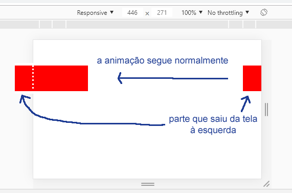
That’s not the effect I’d like. He wanted the element to be crossing the screen continuously, not returning to the initial position, and that when part of it left the screen, this part would already appear on the right side; and also not that it would start to appear again on the right side when it disappears all on the left, as does the nostalgic marquee. That is, the element will always be visible, be it all or part of it.

It would be something like this, as illustrated in the image below as an example:

inserir a descrição da imagem aqui

Is it possible to do this only with CSS? A solution with Javascript would also be valid, but I couldn’t think of a way to get to that result. You may have to clone the element, or use a pseudo-element ::before or ::after... Any idea?

  • 3

    A reference that will help you: https://stackoverflow.com/questions/40698758/css-infinite-horizontal-scroll-with-keyframe

  • 4

    Now that I understood what you needed, I even found this other answer, but it’s pretty much the same as what I had given https://answall.com/questions/2960/barra-informa%C3%A7%C3%B5es-style-tv-similar-to-a-tag-Marquee/ I think only with CSS the only way would be with same pseudo element with two equal elements, because it can not be in two places at the same time.... Although for this example your in particular would give to do with SVG (I mean just a cube across the screen, if it is to be identical to the question, with SVG tb would give), but going before/after

  • 2

    Face look that interesting, I know that SVG should not be the best option, but I know you like these stops, look how the animation in SVG looks softer! She’s not a clingy nanhuma, she’ll flow without "tremidinha"...

4 answers

14


One way to do it is to put as after an equal element on the right by the entire screen size with left: 100vw. So when the element starts to disappear on the left the distance to the right appears in the same proportion as the first one has already disappeared.

Example (I just added #slider::after):

#slider{
   position: fixed;
   top: 50px;
   right: 0;
   background: red;
   width: 150px;
   height: 50px;
   animation: anima 3s linear infinite;
}

#slider::after{
   content:"";
   position:absolute;
   left:100vw;
   background: red;
   width: 150px;
   height: 50px;
}

@keyframes anima{
   from {right: 0}
   to {right: 100%}
}
<div id="slider"></div>

  • 4

    Very creative answer, it turned out well pasta!

  • 3

    That’s right! Mt obg! :))))

  • @Sam That’s it! We’re here for each other! D

7

Tb is possible using a linear-gradiente and changing the background-position

#slider{
  position: absolute;
  top: 50px;
  right: 0;
  background: red;
  width: 100%;
  height: 50px;
  animation: anima 3s linear infinite;
  background-image: linear-gradient(to right,red 75px, #fff 75px, #fff calc(100% - 75px), red calc(100% - 75px));
}
@keyframes anima{
  from {background-position-x: 100vw;}
  to {background-position-x: 0vw;}
}
<div id="slider"></div>


Option 2

Animating the dashoffset of a line svg

Note that the animation is very fluid, has no locking or "tremidinhas" in the element when it moves around the screen.

svg {
	stroke-dashoffset: 75px;
	animation: nome 3s infinite linear;
}
line {
	stroke:red; 
	stroke-width: 150px;
}
@keyframes nome {
	0% {
		stroke-dashoffset: 0px;
	}
	100% {
		stroke-dashoffset: 100vw;
	}
}
<svg width="100%" height="50px" version="1.1" xmlns="http://www.w3.org/2000/svg">
		<line stroke-dasharray="150, calc(100vw - 150px)" x1="0" y1="0" x2="100%" y2="0"></line>
</svg>

  • Nice, but not quite that. Note that the element only appears on the right when it goes all the way to the left. That’s exactly what I didn’t want rs :D

  • @sam I’ll reread the rss question

  • It was cool, but note that before the element touches the left side, another appears to the right.

  • @Sam solved, I who faltered with the rss accounts

  • 1

    The problem is that vc is only working on the red background. The div will have content. The red is just to see the element in the example.

  • @Sam no problem, I was just testing the possibilities

Show 1 more comment

2

3°option

Perks: More performatic

Motive: Makes use of Feature transform CSS, does not make reflows for each iteration of the animation.

Note: The browser rendering algorithm (Render Tree, CSSOM) do not need to recalculate the positioning of the element at each animation iteration.

html,
body {
  overflow-x: hidden
}
.carousel {
  display: grid;
  grid-template-columns: repeat(2, .25fr);
  justify-content: space-between;
  transform: translate3d(75%,0,0);
  animation: anima 3s linear infinite
}
.carousel:before,
.carousel:after {
  content: ".";
  display: inherit;
  background: rgba(255,0,0,1)
}
.carousel:after {
  transform: translate3d(100%,0,0)
}
@keyframes anima{
  from{transform: translate3d(75%,0,0)}
  to {transform: translate3d(-25%,0,0)}
}
<aside class="carousel"></aside>

-1

I was looking for a way to make an image move, Thanks to your code I got it, but I changed some things. Follow the code:

CSS

#slider{
    position: absolute;
    scroll-padding-bottom: 50px;
    right: 0;
    background: transparent;
    width: 150px;
    height: 50px;
    animation: anima 20s linear infinite;
 }
 
 @keyframes anima{
    from {right: 0}
    to {right: 100%}
 }

HTML

<img src="img/well.jpg" id="slider" alt="Instalador de painel Solar">
  • Your code does not answer the question, in the loop your image starts right, already inside the page, the attention here is that the element starts right off the screen, and ends on the left, off the screen every loop

Browser other questions tagged

You are not signed in. Login or sign up in order to post.