With making CSS a Carbon Fiber type background? Is it possible to make carbon fiber style background with CSS?

Asked

Viewed 506 times

7

I’d like to create a patter to my background in order to simulate the texture of carbon fiber. Like this image, or something close to it.

inserir a descrição da imagem aqui

What I have so far is this... It doesn’t have to be exactly like the image, mate has to look like it’s the texture of the carbon fiber, it has to have a minimum of similarity.

html, body {
    width: 100%;
    height: 100%;
    margin: 0;
    padding: 0;
}

body {
    background: linear-gradient(rgba(255, 255, 255, 0.25) 0px, transparent 10px);
    background-color: #131313;
    background-size: 20px 20px;
}

2 answers

2

Long live!

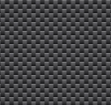
I think this is what you’re looking for:

html, body {
    width: 100%;
    height: 100%;
    margin: 0;
    padding: 0;
}

body {
background: 
linear-gradient(27deg, #151515 5px, transparent 5px) 0 5px,
linear-gradient(207deg, #151515 5px, transparent 5px) 10px 0px,
linear-gradient(27deg, #222 5px, transparent 5px) 0px 10px,
linear-gradient(207deg, #222 5px, transparent 5px) 10px 5px,
linear-gradient(90deg, #1b1b1b 10px, transparent 10px),
linear-gradient(#1d1d1d 25%, #1a1a1a 25%, #1a1a1a 50%, transparent 50%, transparent 75%, #242424 75%, #242424);
background-color: #131313;
background-size: 20px 20px;
}

Small explanation for each linear-gradient

/* Um degradê inclinado de 27 graus, com uma metade inferior esquerda #151515 e uma metade superior direita transparente */ 
linear-gradient(27deg, #151515 5px, transparent 5px) 0 5px,
/* Um degradê inclinado de 207 graus, com uma metade inferior esquerda transparente e uma metade superior direita #151515 */
linear-gradient(207deg, #151515 5px, transparent 5px) 10px 0px,
/* Um degradê inclinado de 27 graus, com uma metade inferior esquerda #222 e uma metade superior direita transparente */
linear-gradient(27deg, #222 5px, transparent 5px) 0px 10px,
/* Um degradê inclinado de 207 graus, com uma metade inferior esquerda transparente e uma metade superior direita #222 */
linear-gradient(207deg, #222 5px, transparent 5px) 10px 5px,

Source of Information: https://leaverou.github.io/css3patterns/#

  • 2

    Can you explain in the answer why linear-gradiente is responsible? And why in that order? And what is each of these dimensions that put in px? I can reproduce this pattern for larger "squares"?

  • 2

    Good complex that there, I didn’t really understand anything rss. If the texture seems straight, why are the gradients with 207deg or 90deg ? It would be nice to complement you with some more information to help you adapt to other formats, colors etc.

1

I think that might be what you want, note that all gradients are facing 45º... the RGBA is setting the opacity to make the gradient effect on it. You can check a few more details on where I got this information

follows the Link

body {
  background-color: rgb(32, 32, 32);
  background-image: linear-gradient(to right, rgba(0,0,0,1), rgba(0,0,0,0) 20%, rgba(0,0,0,0) 80%, rgba(0,0,0,1)), linear-gradient(45deg, black 25%, transparent 25%, transparent 75%, black 75%, black), linear-gradient(45deg, black 25%, transparent 25%, transparent 75%, black 75%, black), linear-gradient(to bottom, rgb(8, 8, 8), rgb(32, 32, 32));
  background-size: 100% 100%, 10px 10px, 10px 10px, 10px 5px;
  background-position: 0px 0px, 0px 0px, 5px 5px, 0px 0px;
}
  html, body {
    width: 100%;
    height: 100%;
    margin: 0;
    padding: 0;
    }

Browser other questions tagged

You are not signed in. Login or sign up in order to post.