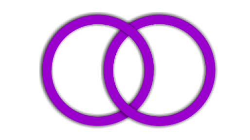
With ::before and ::after only in the first div can you:
.container{
position: relative;
}
.box, .box.x::before, .box.x::after {
width: 200px;
height: 200px;
box-sizing: border-box;
position: absolute;
border-radius: 50%;
border: 20px solid tomato;
}
.box.x::before, .box.x::after{
content: '';
top: -20px;
}
.box.x::before{
left: -20px;
border-bottom-color: transparent;
z-index: inherit;
}
.box.x, .box.x::after{
box-shadow: 0 0 15px 0 rgba(0, 0, 0, .75);
}
.box.x::after{
left: 80px;
border-top-color: transparent;
}
.box.x {
z-index: 20;
}
.box.y {
left: 100px;
}
<div class="container">
<div class="box x"></div>
<div class="box y"></div>
</div>
The idea is that the div.x has a z-index higher than the div.y and the ::before be on top with the transparent bottom edge so that the edge of the ::after over. The same thing with the ::after, only with the transparent top edge.
The shadow (box-shadow) applied only to div.x and in your ::after, because, like the ::after is over the div.y, this div doesn’t need the shadow.
Shadow issue
I had to create a pseudo ::before in div.y and change the shadow to inset in the pseudo ::before of div.x and use two shadows, one inset and another outset (standard) in the pseudo ::after of div.x:
.container{
position: relative;
}
.box, .box.x::before, .box.x::after, .box.y::before{
width: 200px;
height: 200px;
box-sizing: border-box;
position: absolute;
border-radius: 50%;
border: 20px solid tomato;
background-color: transparent;
}
.box.x::before, .box.x::after, .box.y::before{
content: '';
top: -20px;
}
.box.x::before{
left: -20px;
border-bottom-color: transparent;
z-index: inherit;
box-shadow: inset 0 0 15px 0 rgba(0, 0, 0, .75);
}
.box.x, .box.x::after{
box-shadow: 0 0 15px 0 rgba(0, 0, 0, .75);
}
.box.x::after{
left: 80px;
border-top-color: transparent;
box-shadow: inset 0 0 15px 0 rgba(0, 0, 0, .75), 0 0 15px 0 rgba(0, 0, 0, .75);
}
.box.y::before{
left: -20px;
z-index: 20;
border-top-color: transparent;
}
.box.x {
z-index: 20;
}
.box.y {
left: 100px;
}
<div class="container">
   <div class="box x"></div>
   <div class="box y"></div>
</div>
But you also never make it easy, right?! I’m just waiting for the question to be edited by adding the phrase "No SVG please"
– fernandosavio
@fernandosavio wants to go soft? Sit in the pudding! D
– hugocsl