8
I’m trying to solve this question because I have a slide on. ppt with dimensions of 720w and 540h and my page is net, so the reason for increasing or decreasing proportionally.
Example:
8
I’m trying to solve this question because I have a slide on. ppt with dimensions of 720w and 540h and my page is net, so the reason for increasing or decreasing proportionally.
Example:
8
The simplest way to create this effect is to add the style padding-bottom with the equivalent percentage of the height divided by the desired width.
div#slide {
  padding-bottom: 75%; /* 540/720 */
}
Thus, even after resizing the window, the size of the div will always be proportional to 720:540.
Example: Jsfiddle.
2
With a little Javascript you can ensure that the element has a 4:3 ratio by fixing one of the dimensions (i.e., either the width or the height).
I made an example (which can be tested in that Jsfiddle - Simply drag the panel edge Result to adjust the dimensions of the display) in which the width of the div is adjusted to the display area of the browser window and the height is calculated based on that new width and the desired ratio (3/4 = 0,75).
The div (representing the element in which you display your PPT):
<div id="teste">
    Olá mundo!
</div>
It has the style defined like this (it includes the "page" style of example):
body {
    margin: 5px;
    background-color: black;
    overflow: hidden;
}

#teste {
    background-color: red;
    display:inline-block;
    width: 720px;
    height: 540px;
    color: white;
    text-align: center;
    line-height: 540px;
}
And the code Javascript that adjusts the ratio is this:
var adjustSize = function() {
    var oDiv = document.getElementById("teste");

    var iWidth = window.innerWidth - 10; // Desconta duas vezes o tamanho da borda
    var iHeight = iWidth * 0.75; // Mantém o aspecto 4:3 para a largura (width) fixa

    oDiv.style.width = iWidth.toString() + "px";
    oDiv.style.height = iHeight.toString() + "px";
    oDiv.style.lineHeight = oDiv.style.height;
}

window.onresize = adjustSize;
adjustSize();
1
You can determine the dimensions in percentage, so it is adaptable to browser resizing:
div { width: 80%; height: 80%; border: 1px solid black; }
Okay, Igor, I tried that. Only that I need to diminiur or increase proportionally to 720x540 in ratio of 4:3, which he does so either if the person decreases or increases in width or height
0
You can use a CSS framework for this purpose, such as Twitter Bootstrap, whose examples you can find in this link:
http://getbootstrap.com/css/#grid-example-Fluid
For example:
(...)
<--! inclui o css do twitter-bootstrap, você também pode baixar ele e instalar direto no seu site -->
<link rel="stylesheet" href="//netdna.bootstrapcdn.com/bootstrap/3.1.0/css/bootstrap.min.css">
(...)
<div class="container-fluid">
  <div class="row">
      <div class="col-md-12">
          <!-- conteúdo aqui -->
      </div>
  </div>
</div>
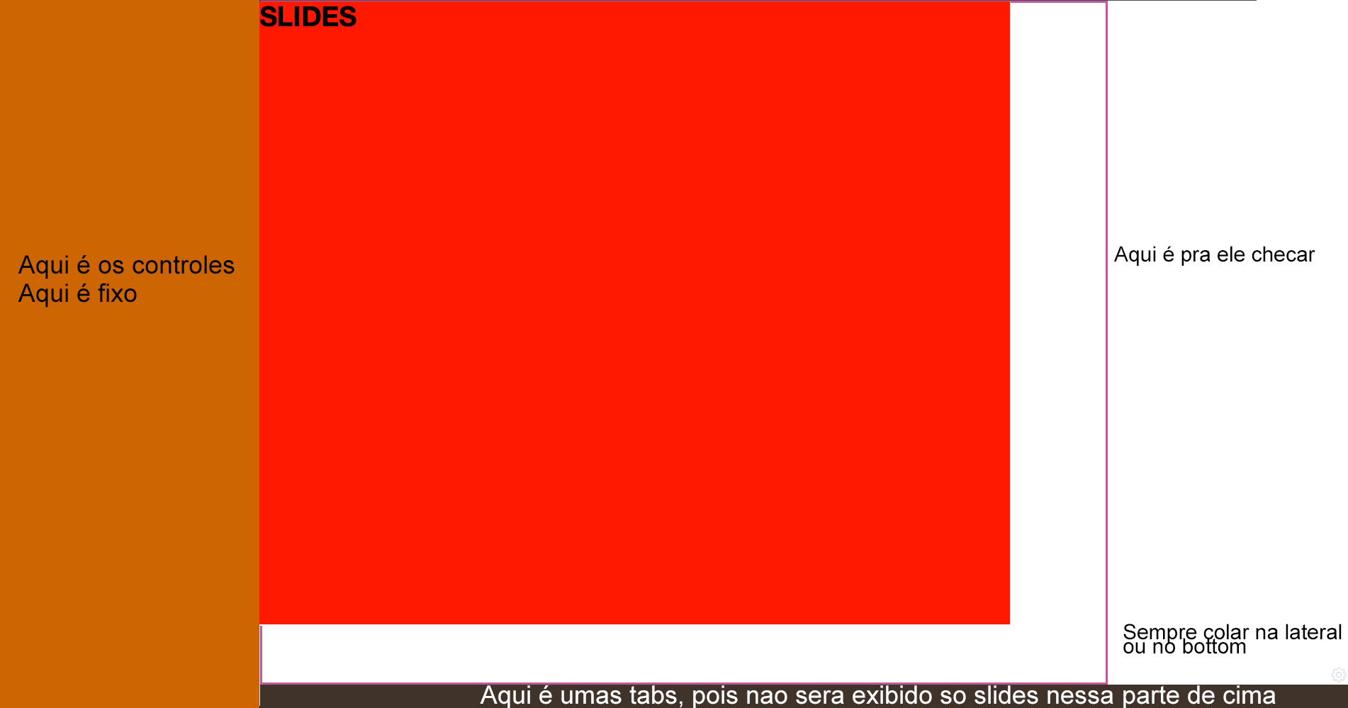
I’m using the bootstrap, only that idea is not this, I have two div one on the left side that is my menus and the other on the right side.. the one on the left is fixed. I have another div inside the right side and this div should grow or decrease proportionally to the size of 720x540 as the right side div increases.
How are you posting the ppt on the site? Copy part of the code that represents your problem and paste here for us to see.
0
If your slide is an image you can put the img with width: 100% and height: auto, would look like this:
img { width: 100%; height: auto; }
But if it’s not an image, if it’s, say, a div which contains a call to a flash, you will have to do in js.
In jQuery would look like this:
First the css.
div { width: 100%; }
Then the js, according to the ratio indicated, the height will always be 75% of the width.
$(function(){

    var largura = $('div').width();
    var altura  = ( 75 * largura ) / 100;

    $('div').css('height', Math.round(altura) + 'px');

});
In case you want when the window changes in size, the div follow, add the code below to js
$( window ).resize(function() {

    var largura = $('div').width();
    var altura  = ( 75 * largura ) / 100;

    $('div').css('height', Math.round(altura) + 'px');

});
Example in jsfiddle, if you resize the window, you will see that the div red behind the black.
Browser other questions tagged html div
You are not signed in. Login or sign up in order to post.
+1 Really cool and simple this solution. Living and learning. :)
– Luiz Vieira
+1 For the beautiful trick, I did not know.
– Kazzkiq
How do I give a min-height in this case?
– Jefferson Alison