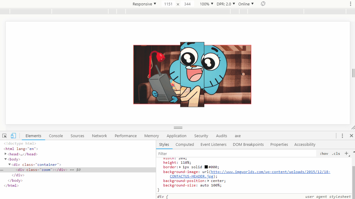
Yes it is possible, you can use background-size or transform:scale() to increase the background or the div along with your background.
With the background-size the size of div always remains the same, 20% of the father’s width, and 110% of the father’s height, you only change the size of the BG inside the child. If you want you can simplify using a pseudo-element ::after with the BG etc, I only did so to make it easier to understand ;)
OBS: I preferred not to use your example model, because it is with the style inline and with the syntax other than the normal CSS standard not enabling the execution of snippet here
Code of the above model:
.container {
    width: 400px;
    height: 200px;
    display: flex;
    justify-content: center;
    align-items: center;
    border: 1px solid red;
    margin: auto;
    background-image: url(http://www.imgworlds.com/wp-content/uploads/2015/12/18-CONTACTUS-HEADER.jpg);
    background-size: cover;
    margin-top: 50px;
}
.zoom {
    width: 20%;
    height: 110%;
    border: 1px solid #000;
    background-image: url(http://www.imgworlds.com/wp-content/uploads/2015/12/18-CONTACTUS-HEADER.jpg);
    background-position: center;
    background-size: auto 150%;

}
<div class="container">
    <div class="zoom"></div>
</div>
Option with transform:scale()
Notice that actually the middle element will be 22% of the father’s width, because scale(1.2) will increase the element by 20%, as well as the height will be 120%, 10% up 10% down. But the result was cool, I think it can meet you.
.container {
width: 400px;
height: 200px;
display: flex;
justify-content: center;
align-items: center;
border: 1px solid red;
margin: auto;
background-image: url(http://www.imgworlds.com/wp-content/uploads/2015/12/18-CONTACTUS-HEADER.jpg);
background-size: cover;
margin-top: 50px;
}
.zoom {
width: 20%;
height: 100%;
border: 1px solid #000;
background-image: url(http://www.imgworlds.com/wp-content/uploads/2015/12/18-CONTACTUS-HEADER.jpg);
background-position: center;
background-size: cover;
transform: scale(1.2);
}
<div class="container">
    <div class="zoom"></div>
</div>
Include the HTML structure in the question as well as the CSS.
– Sam