3
.lista-cartoneira h1 {
    font-size: 1.2rem;
    margin: 12px 0 12px 0;
    font-weight: 500;
}

.lista-cartoneira h2 {
    font-size: 1rem;
    margin: 12px 0 12px 0;
}

.lista-cartoneira img {
    width: 80px;
    height: 80px;
    max-width: 80px;
    margin: 12px;
}

.card-panel {
    padding: 0 !important;
}

.col.s9.lista-cartoneira {
    width: 75%;
    margin-left: 12px;
}

.botoes-cartoneira.row {
    height: 56px;
    margin: 24px 0 24px 0;
}

.botoes-cartoneira.col {
    height: 56px;
    text-align: center;
}

.atalhos-cartoneira.col i {
    margin-top: 43px;
}

.atalhos-cartoneira.col {
    height: 110px; text-align: center; color: white;
}

.item-total {
    width: 200%;
}

@media only screen and (min-width: 340px) {
    .col.s9.lista-cartoneira {
        width: 75%;
        margin-left: 0;
    }
}

@media only screen and (min-width: 600px) {
    .col.s9.lista-cartoneira {
        width: 220%;
        margin-left: 0;
    }
    .lista-cartoneira h1 {
        font-size: 1.8rem;
    }
    .lista-cartoneira h2 {
        font-size: 1.6rem;
    }
}
<link rel="stylesheet" href="https://cdnjs.cloudflare.com/ajax/libs/materialize/1.0.0/css/materialize.min.css">
<link href="https://fonts.googleapis.com/icon?family=Material+Icons" rel="stylesheet">
<script src="https://ajax.googleapis.com/ajax/libs/jquery/3.3.1/jquery.min.js"></script>
<div style="width: 100%; overflow-x: hidden;">
<div class="item-total">
<div class="col s12 m8 offset-m2 l6 offset-l3" style="width: 50%;">
<div class="card-panel grey lighten-5 z-depth-1">
<div class="row valign-wrapper">
<div class="col s3 lista-cartoneira" style="padding-left: 0px;">
<img src="https://encrypted-tbn0.gstatic.com/images?q=tbn:ANd9GcQrSKKu7oCCmPKDSTU6aSsZMfnUxrVImzv42-DDnAgVBmG54Szz" alt="" class="circle responsive-img">
</div>
<div class="col s9 lista-cartoneira">
<h1>ABC</h1>
<h2>DEF</h2>
</div>
</div>
</div>
</div>
</div>
<div class="col s12 m8 offset-m2 l6 offset-l3" style="width: 50%; float: right; margin-top: -136px;">
<div class="card-panel grey lighten-5 z-depth-1">
<div class="row valign-wrapper botoes">
<div class="atalhos-cartoneira col s3" style="background-color: #00b0ff;">
<i class="material-icons">phone</i>
</div>
<div class="atalhos-cartoneira col s3" style="background-color: #ffb74d;">
<i class="material-icons">email</i>
</div>
<div class="atalhos-cartoneira col s3" style="background-color: #757575;">
<i class="material-icons">place</i>
</div>
<div class="atalhos-cartoneira col s3" style="background-color: #00BFA5;">
<i class="material-icons">open_in_new</i>
</div>
</div>
</div>
</div>
</div>
<script type="text/javascript">
$('.botoes').hide();
// DESLIZA
var inicialX;
addEventListener('touchstart', function(e) {
var toqueobj = e.changedTouches[0];
inicialX = toqueobj.pageX;
}, false);
//
addEventListener('touchmove', function(e){
e.preventDefault();
}, false)
//
addEventListener('touchend', function(e){
var toqueobj = e.changedTouches[0];
var distancia = toqueobj.pageX - inicialX;
if(distancia < 0){
$('.botoes').show(100);
$('.botoes').css('position', 'relative');
}
if(distancia > 0){
$('.botoes').hide(100);
}
}, false)
</script>
</div>
</div>I have this html:

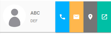
Follow the image code above:
<div style="width: 100%; overflow-x: hidden;">
                <div class="item-total">

                    <div class="col s12 m8 offset-m2 l6 offset-l3" style="width: 50%;">
                        <div class="card-panel grey lighten-5 z-depth-1">
                            <div class="row valign-wrapper">
                                <div class="col s3 lista-cartoneira" style="padding-left: 0px;">
                                    <img src="img/user-profile.jpg" alt="" class="circle responsive-img">
                                </div>
                                <div class="col s9 lista-cartoneira">
                                    <h1>ABC</h1>
                                    <h2>DEF</h2>
                                </div>
                            </div>
                        </div>
                    </div>
When the user slides left, the buttons appear:
Follow the image code above:
<div class="col s12 m8 offset-m2 l6 offset-l3" style="width: 50%; float: right; margin-top: -136px;">
                        <div class="card-panel grey lighten-5 z-depth-1">
                            <div class="row valign-wrapper botoes">
                                <div class="atalhos-cartoneira col s3" style="background-color: #00b0ff;">
                                    <i class="material-icons">phone</i>
                                </div>
                                <div class="atalhos-cartoneira col s3" style="background-color: #ffb74d;">
                                    <i class="material-icons">email</i>
                                </div>
                                <div class="atalhos-cartoneira col s3" style="background-color: #757575;">
                                    <i class="material-icons">place</i>
                                </div>
                                <div class="atalhos-cartoneira col s3" style="background-color: #00BFA5;">
                                    <i class="material-icons">open_in_new</i>
                               </div>
                          </div>
                        </div>
                   </div>
                </div>
So far so good, but I would like when these buttons appear to cover the entire first image and only the buttons, for example:
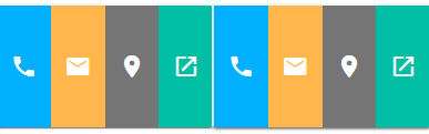
OBS: Not duplicated, just to give an example. Fill the entire first div with the 4 buttons. Then, when it slides again, it hides the buttons and the div appears again. How could you do this?
OBS: To test the buttons just sliding with your fingers on the pc or mobile phone, mine is touch so it works.
Friend first edit your question and put the full code, including the Script part so we can simulate the behavior of this component. Then, if you drag the top element all "out" it will disappear and there will be no way you drag it again because you will not be able to click it anymore to drag...
– hugocsl
@hugocsl edited the question.
– user131623