How to Overwrite an Image with DIV

Asked

Viewed 366 times

0

Gentlemen, I’m pulling some images from the database, and when the user hovers over them an opaque red color will be above them, and a title and text will be shown. I did this by putting the image in a div, and inside this div I put another div with these 2 contents. I’m trying to make her invisible and put the Hover mouse effect on her, but I could only do with position:absolute and the z-index, but that way, as soon as 4 images appear and a fifth is loaded - that should go to the next line - it sits on top of the first.

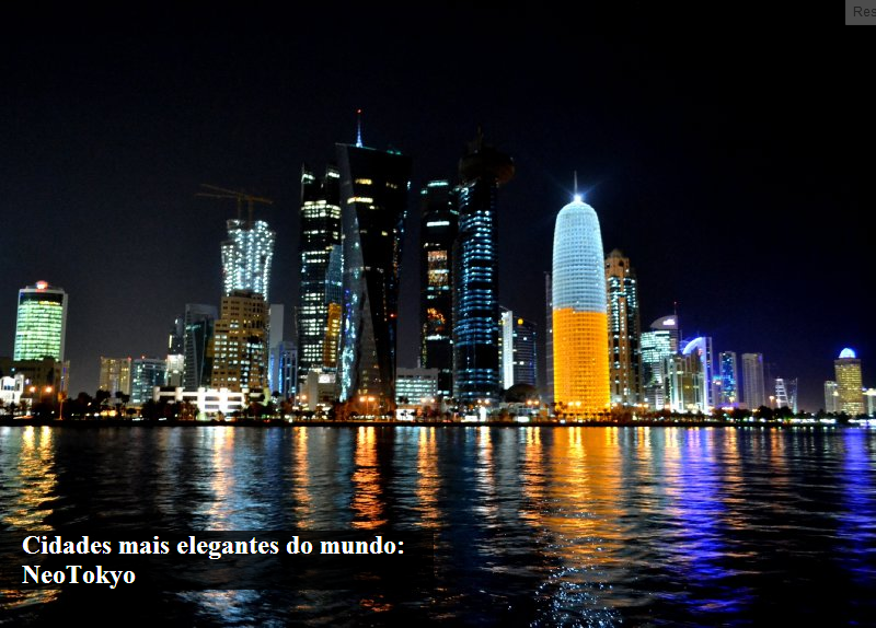
I want to leave her like this - see example How are you getting - view image

HTML

<div class="pure-g">
    @foreach($eventos as $eventos)
        <div class="pure-u-6-24">
            <a href="">
                <div class="conteudoEventoEscondido hideEvento">
                    <p class="tituloEventoEscondido">{{$eventos->nome}}</p>
                    <p class="localEventoEscondido">{{$eventos->local}}</p>
                </div>
                <img src="assets/images/eventos/thumbs/{{$eventos->miniatura}}" alt="{{$eventos->nome}}">
            </a>
        </div>
    @endforeach
</div>

CSS

.pure-u-6-24 {
    .marginReduzida(6px,0px);
        a{
            text-decoration: none;
            &:hover {
                .conteudoEventoEscondido {
                    display: block !important;
                }
            }
            .conteudoEventoEscondido {
                width: 17.25%;
                height: 36.5%;
                display: block;
                background-color: rgba(210, 183, 134, 0.8);
                background: rgba(210, 183, 134, 0.8);
                color: rgba(210, 183, 134, 0.8);
                .padding(30px,0,0,30px);
                .tituloEventoEscondido {
                    font-size: 16px;
                    font-weight: bold;
                    .colorFonte(#4B392C);
                    .margin(0,0,8px,0);
                }
                .localEventoEscondido {
                    font-size: 12px;
                    font-style: italic;
                    .colorFonte(#4B392C);
                }
                z-index: 2;
                position: absolute;
            }
            img {
                @media screen and (min-width: 320px) and (max-width: 768px){
                    width: 100%;
                }
                z-index: 1;
                position: absolute;
            }
        }
    }

2 answers

1


Following @Onosendai’s code - thank you very much - I was able to achieve the expected effect.

HTML

@section('conteudo')
    <main>
        <div id="eventos">
            <div class="pure-g">
                @foreach($eventos as $eventos)
                    <div class="pure-u-6-24">
                        <a href="">
                            <div class="caixaOculta caixaOcula-efeitos">
                                <img src="assets/images/eventos/thumbs/{{$eventos->miniatura}}" />
                                <div class="mask">
                                    <h2>{{$eventos->nome}}</h2>
                                    <p>{{$eventos->local}}</p>
                                </div>
                            </div>
                        </a>
                    </div>
                @endforeach
            </div>
        </div>
    </main>
@stop

CSS

.pure-g {
    .pure-u-6-24 {
        width: 23.5%;
        .margin(5px,10px,5px,0);

        .caixaOculta {
            width: 100%;
            position: relative;
        }
        .caixaOculta .mask {
            width: 100%;
            height: 100%;
            position: absolute;
            overflow: hidden;
            top: 0;
            left: 0;
        }
        .caixaOculta img {
            width: 100%;
            display: block;
            position: relative;
        }
        .caixaOculta h2 {
            font-family: Georgia;
            font-size: 16px;
            .colorFonte(#271714);
            position: relative;
            .margin(26px,0,0,26px);
        }
        .caixaOculta p {
            .colorFonte(#271714);
            font-family: Georgia;
            font-style: italic;
            font-size: 12px;
            padding: 10px 20px 20px;
            position: relative;
            .margin(0,0,0,6px);
        }

        /*Efeito*/
        .caixaOculta-efeitos .mask {
            -ms-filter: "progid: DXImageTransform.Microsoft.Alpha(Opacity=0)";
            filter: alpha(opacity=0);
            opacity: 0;
            background-color: rgba(209,181,134, 0.9);
            -webkit-transition: all 0.4s ease-in-out;
            -moz-transition: all 0.4s ease-in-out;
            -o-transition: all 0.4s ease-in-out;
            -ms-transition: all 0.4s ease-in-out;
            transition: all 0.4s ease-in-out;
        }
        .caixaOculta-efeitos h2 {
            -webkit-transform: translateY(-100px);
            -moz-transform: translateY(-100px);
            -o-transform: translateY(-100px);
            -ms-transform: translateY(-100px);
            transform: translateY(-100px);
            -ms-filter: "progid: DXImageTransform.Microsoft.Alpha(Opacity=0)";
            filter: alpha(opacity=0);
            opacity: 0;
            -webkit-transition: all 0.2s ease-in-out;
            -moz-transition: all 0.2s ease-in-out;
            -o-transition: all 0.2s ease-in-out;
            -ms-transition: all 0.2s ease-in-out;
            transition: all 0.2s ease-in-out;
        }
        .caixaOculta-efeitos p {
            -webkit-transform: translateY(100px);
            -moz-transform: translateY(100px);
            -o-transform: translateY(100px);
            -ms-transform: translateY(100px);
            transform: translateY(100px);
            -ms-filter: "progid: DXImageTransform.Microsoft.Alpha(Opacity=0)";
            filter: alpha(opacity=0);
            opacity: 0;
            -webkit-transition: all 0.2s linear;
            -moz-transition: all 0.2s linear;
            -o-transition: all 0.2s linear;
            -ms-transition: all 0.2s linear;
            transition: all 0.2s linear;
        }
        .caixaOculta-efeitos:hover .mask {
            -ms-filter: "progid: DXImageTransform.Microsoft.Alpha(Opacity=100)";
            filter: alpha(opacity=100);
            opacity: 1;
        }
        .caixaOculta-efeitos:hover h2, .caixaOculta-efeitos:hover p {
            -ms-filter: "progid: DXImageTransform.Microsoft.Alpha(Opacity=100)";
            filter: alpha(opacity=100);
            opacity: 1;
            -webkit-transform: translateY(0px);
            -moz-transform: translateY(0px);
            -o-transform: translateY(0px);
            -ms-transform: translateY(0px);
            transform: translateY(0px);
        }
        .caixaOculta-efeitos:hover p {
            -webkit-transition-delay: 0.1s;
            -moz-transition-delay: 0.1s;
            -o-transition-delay: 0.1s;
            -ms-transition-delay: 0.1s;
            transition-delay: 0.1s;
        }
    }

Wearing the blessed one position:relative and position:absolute i got the div to override the image, and when passing the mouse the div appears with a beige color, tranparente and a title and text appear with an effect (one from above and one from below).

1

Via CSS, you can use positioning structures:

HTML

<div class="image">
      <img src="http://photos.travellerspoint.com/537624/large_DSC_0081__6_.jpg" alt="" />
      <h2>Cidades mais elegantes do mundo: <br />NeoTokyo</h2>
</div>

CSS

.image { 
   position: relative; 
}

h2 { 
   position: absolute; 
   bottom: 20px; 
   left: 0px; 
    padding: 0 20px 0 20px;
    color:White;
    background-color: rgba(0,0,0,.8);
}

Upshot:

inserir a descrição da imagem aqui

See here the Fiddle of this solution.

  • But in this case I am working with responsive layout, Absolute would screw with everything x.x.

  • @Allan Not necessarily - I myself use this type of solution in responsive layouts. absolute always works together with the definition relative of a parent object in its hierarchy. In this case, the DIV is the wrapper.

  • 1

    I may be mistaken, but H2 would be absolutely positioned in a relatively positioned element (IMG). And in this case, as long as you deal with the responsiveness of the image, the caption wouldn’t get in the way of anything.

  • @Onosendai Placing the position:relative in the wrapper the mouse Hover does not even work x.x.

  • @Conflict with some previous definition, perhaps?

Browser other questions tagged

You are not signed in. Login or sign up in order to post.