3
I want to use this code only when it’s desktop. What size for media query?
overflow-y: hidden; // hide vertical
overflow-x: hidden; // hide horizontal
3
I want to use this code only when it’s desktop. What size for media query?
overflow-y: hidden; // hide vertical
overflow-x: hidden; // hide horizontal
3
I like to follow the pattern of Bootstrap, because I think he’s well-defined. For desktop you must use the Large and Extra Large
Extra small <576px
Small 576px
Medium 768px
Large 992px
Extra large 1200px
To define this in the CSS, you must use the Mediaqueries of CSS
@media screen and (max-width: 600px) and (min-width: 400px)  {
    // Code Here
}
Worth the most detailed reading about Media Queries w3school
It also follows the documentation of Bootstrap Grid
1
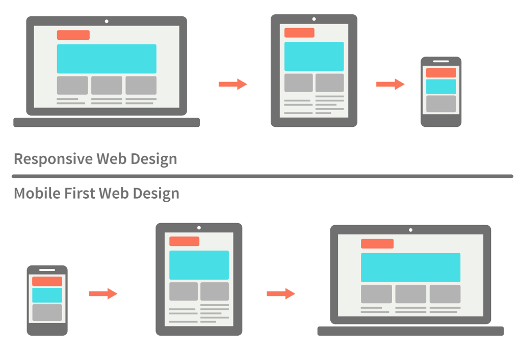
A good practice. When you build the site think about Mobile Frist. This means you should start your Media Queries by min-width
One of the thoughts of this technique is that when someone accesses a site by mobile device probably the connection is worse than when accessing by desktop. Soon the first Media Queries to be loaded should be the smallest, and then the CSS of the larger screens. So always start with the small screens. Then the biggest.
In case your question I would make a Media Queries like this:
<link rel="stylesheet" media="(min-width: 1024px)" href="desktop.css" />
So only when the screen is larger than 1024px will it call the desktop CSS
There on that one desktop.css you put your class
.classe {
    overflow-y: hidden; // hide vertical
    overflow-x: hidden; // hide horizontal
}
This link has several considerations: https://developer.mozilla.org/en-US/docs/Web/Guide/CSS/CSS_Media_queries
Browser other questions tagged css
You are not signed in. Login or sign up in order to post.