Change font size according to iOS device

Asked

Viewed 389 times

0

I have a Phrase App and each sentence has a different size (according to the amount of words) and on tablets as the resolution is the same as the iPhone 4s the phrases extrapolate the size reserved to them and are behind a button I have on the screen (centered at the bottom of the app), not displaying its entire content. Is it possible to change the font size according to the type of device? Or what would be the best solution to solve such problem? It is worth noting that in iPhones this text is very far from the button which makes it impossible to decrease the text always or throw it up.

inserir a descrição da imagem aqui

I’ve tried to create a variation, but it doesn’t seem to have solved:

inserir a descrição da imagem aqui

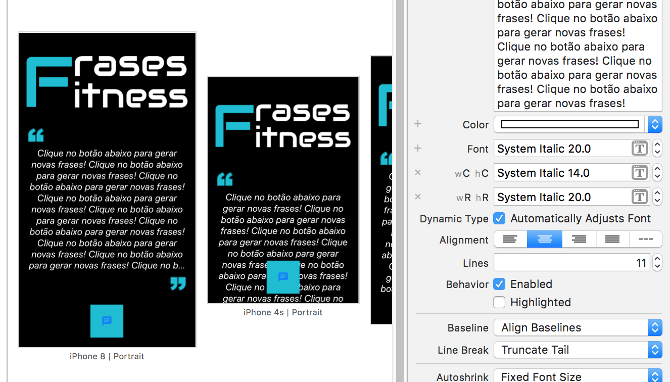
  • Tiago, it would be interesting for you to add some visual examples of what happens and excerpts of code to better understand the problem. About your question, I believe that the sizeToFit function can solve your problem

  • I’ll take a look at this function.. follows the rendering image in ipads. Thank you!

3 answers

1

There is a solution, if it calls "Auto Layout" you must select the text and in the Xcode inspector you trigger a rule for this by clicking the button + of the source.

inserir a descrição da imagem aqui

see that appears the fields so that you choose the width and height for the new variation. the sizes you can check below: inserir a descrição da imagem aqui

so just select the option you want and see how it looks in your app.

  • Hello Ramires, thank you so much for the tip, but I think there is still something missing, from a look at my question, I added the image (figure 2) with the variations and still occurs the same problem.

  • you should change the option wR and hr to 14 and not to 20

  • So, I did this, but the text already started in size 14 even on large screens, so I thought I’d do a wR and hr (Regular) with the normal size (20) and another with wc and hc (of Compact) with size 14, but it hasn’t changed at all. In addition to clicking on the + and choosing the items, you have to mark something else?

  • what the Component you are using for that phrase? is a label?

  • Another thing, are you starting your project with what screen size? it is recommended to start with the smaller screen size you want to achieve, and only then move on to larger screens.

  • Yes I am using a Label. How do I start with the smallest screen size?

  • at the bottom clicke on the bar that has "View as: iPhone 6" and choose the screen size, of course in place of "iPhone 6" will this the. size you are using. A second option is to use a text view instead of a labile, as it creates a scroll bar.

  • You got?

  • With Label, I’ve tried all this and it won’t. The solution I found for now was to limit the number of lines in the Lines property, but if the text is larger it will be cut.

  • Good evening Tiago, if you want we can schedule a video call to try to solve together, would be happy to help.

  • Thank you so much for all the help friend. We can try the video call yes, but I’ve had enough of this problem, I will remodel the whole look of the App.

Show 6 more comments

0

I believe it is possible to adjust with Auto Layout, as suggested in another reply.

For this, it would be good to ensure that the bottomAnchor of Label is anchored to the topAnchor from the button, preventing it from going behind it.

So to show all the lines of Label and ensure that they fit into the space she possesses:

label.numberOfLines = 0;

// Faz com que a fonte reduza para caber no container
label.adjustsFontSizeToFitWidth = true;

If you want to prevent the font from reducing too much, you can define how much of the original size it can reduce:

// Permite reduzir até metade do tamanho original da fonte da label    
label.minimumScaleFactor = 0.5

P.S.: Thinking of cases of very long sentences, there are some alternatives to circumvent, such as using a UITextView non-enterable/selectable.

I hope I’ve helped!

0

Dear friend, the idea is that autoLayout really helps you, but as your question was to know what type of device, follows the answer:

You can determine the device as follows:

To facilitate I will create 2 structs.

This first dynamically picks up the width and height of the device, determining max and min:

    public struct ScreenSize{
      static let SCREEN_WIDTH = UIScreen.main.bounds.size.width
      static let SCREEN_HEIGHT = UIScreen.main.bounds.size.height
      static let SCREEN_MAX_LENGTH = max(ScreenSize.SCREEN_WIDTH, ScreenSize.SCREEN_HEIGHT)
      static let SCREEN_MIN_LENGTH = min(ScreenSize.SCREEN_WIDTH, ScreenSize.SCREEN_HEIGHT)
    }

This second already has the rules to determine the type of device used:

    public struct DeviceType
    {
      static let IS_IPHONE_4_OR_LESS =  UIDevice.current.userInterfaceIdiom == .phone && ScreenSize.SCREEN_MAX_LENGTH < 568.0
      static let IS_IPHONE_5 = UIDevice.current.userInterfaceIdiom == .phone && ScreenSize.SCREEN_MAX_LENGTH == 568.0
      static let IS_IPHONE_6 = UIDevice.current.userInterfaceIdiom == .phone && ScreenSize.SCREEN_MAX_LENGTH == 667.0
      static let IS_IPHONE_6P = UIDevice.current.userInterfaceIdiom == .phone && ScreenSize.SCREEN_MAX_LENGTH == 736.0
      static let IS_IPHONE_X = UIDevice.current.userInterfaceIdiom == .phone && ScreenSize.SCREEN_MAX_LENGTH == 812.0
    }

An example of its use would be:

    if DeviceType.IS_IPHONE_4_OR_LESS {          
                // 4S ou anterior          
    } 

Static constants were created to facilitate their use in their classes.

Browser other questions tagged

You are not signed in. Login or sign up in order to post.