4
I’m developing a simple system in React and I’m having difficulties in the visual part, for example for mobile:
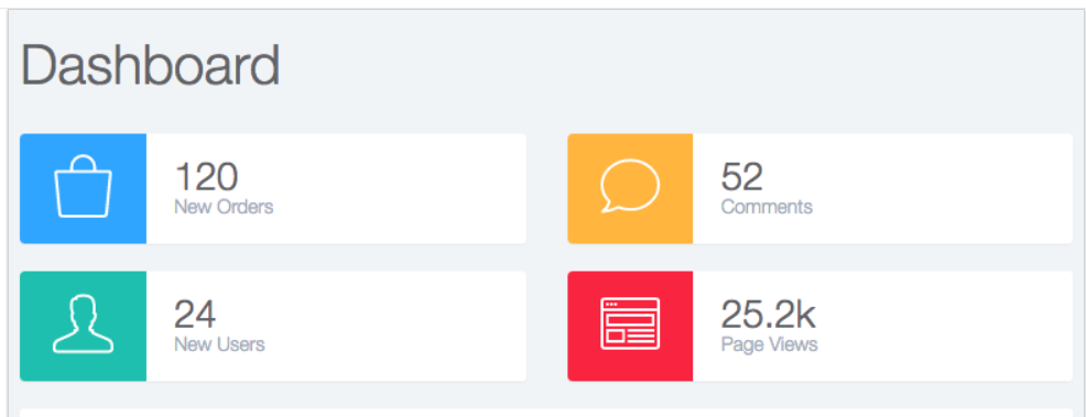
I need to leave my system this way:
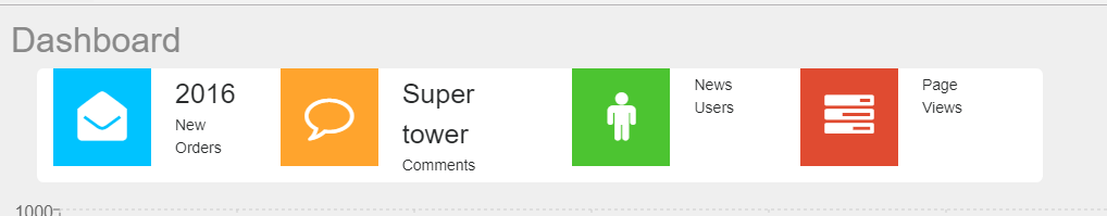
Is that way:
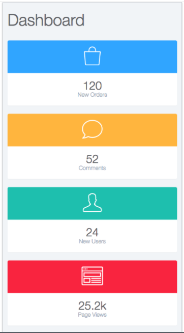
The web system needs to be like this:
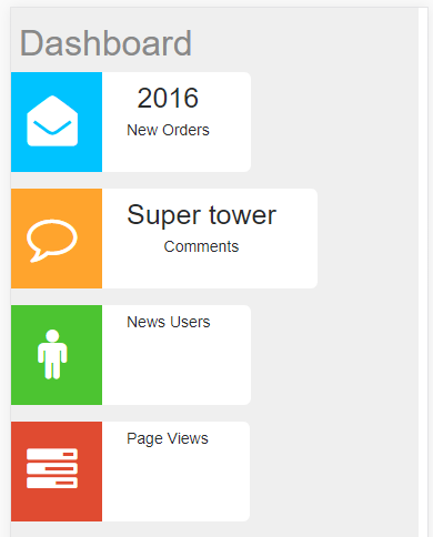
Mine, on the web, goes like this:
How can I put the content just below the icon and occupy the space remaining next to the icon on mobile and change the shape of the design on the web? If the solution is only in the design I need mobile, already great.
An example JS of any widget:
import React from 'react';

const WidgetOrder = (props) =>(
  <div className="row">
    <div className="info-box">
      <div className="col-md-3 col-sm-6 col-xs-12">
        <span className="info-box-icon logo-Order">
          <i className="fa fa-envelope-open"></i>
        </span>
        <div className="info-box-content">
          <span className="info-box-number">{props.title}</span>
          <span className="info-box-text">New Orders</span>
        </div>
      </div>
    </div>
  </div>
);
export default WidgetOrder;
The render function of the Home.JS:
  render(){
    return(
      <div className="container text-center">
          <div className="row">
          <WidgetOrder title={this.state.data.newOrders} //apos DATA. vai as tags do JSON pra pegar
           />
           <WidgetCom title={this.state.data.comments}
            />
            <WidgetUser title={this.state.data.newUsers}
             />
           <WidgetView title={this.state.data.pageViews}
            />

          </div>
      </div>
    );
  }
Html of the page in question taken from Chrome F12:
.logo-Order {
  background-color: #00c3ff;
  color: #fff;
}

.row {
  text-align: center;
}

.info-box-content {
  padding: 5px 22px;
  margin-left: 90px;
}

.info-box {
  display: block;
  min-height: 90px;
  background-color: #FFFFFF;
  width: 100%;
  border-radius: 6px;
  margin-bottom: 15px;
}

.info-box-text {
  display: block;
  font-size: 14px;
}

.info-box-number {
  display: block;
  font-size: 25px;
}

.info-box-icon {
  display: block;
  float: left;
  height: 90px;
  width: 90px;
  font-size: 45px;
  line-height: 90px;
}
<div class="container text-center">
<div class="row">
<div class="row">
<div class="info-box">
<div class="col-md-3 col-sm-6 col-xs-12">
<span class="info-box-icon logo-Order">
<i class="fa fa-envelope-open"></i>
</span>
<div class="info-box-content">
<span class="info-box-number">132</span>
<span class="info-box-text">NewOrders</span>
</div>
</div>
</div>
</div>
<div class="row">
<div class="info-box">
<div class="col-md-3 col-sm-6 col-xs12">
<span class="info-box-icon logoCom">
<i class="fa fa-comment-o"></i>
</span>
<div class="info-box-content">
<span class="info-boxnumber">58</span>
<span class="info-box-text">Comments</span>
</div>
</div>
</div>
</div>
<div class="row">
<div class="info-box">
<div class="col-md-3 col-sm-6 col-xs-12">
<span class="info-box-icon logo-User">
<i class="fa fa-male"></i>
</span>
<div class="info-box-content">
<span class="info-box-number">26</span>
<span class="info-box-text">News Users</span>
</div>
</div>
</div>
</div>
<div class="row">
<div class="info-box">
<div class="col-md-3 col-sm-6 col-xs-12">
<span class="info-box-icon logo-View">
<i class="fa fa-tasks"></i>
</span>
<div class="info-box-content">
<span class="info-box-number">18962</span>
<span class="info-box-text">Page Views</span>
</div>
</div>
</div>
</div>
</div>
</div>I started studying React recently and got the models ready.
Henrique, great! I wrote an Edit to the question. I set an example that you can run. If you can add more HTML/CSS to play what you have in the images it is much easier for us to give an answer because we have all the relevant data (which is still missing). Meanwhile I’m cleaning old comments for the question to be cleaner.
– Sergio
What parts do you need of HTML/CSS? All this I got from the browser, where it is in the project?
– Henrique Hermes
The HTML you have placed is only 1 widget. In the images you have 4. Their positioning depends on HTML and CSS. If you join the HTML of 4 with the common "parent" HTML element you can answer.
– Sergio
Added, again thank you for your help ;)
– Henrique Hermes
Good. Here in Sweden where I live it’s late and I go to sleep. Tomorrow I take a look here and help more if no one has helped yet. I owe you an apology because I forgot that this site tool already accepts React... so we could have set up the demo with your React code. I do this in the answer later if no one has responded. But in the meantime, add the missing CSS. Click on "Run" in the question snippet and you will see what is missing. See you soon!
– Sergio
You can use Media Query in your CSS this way you can have custom CSS for every device type and screen size.
– Roberto Compassi
Send the code so I can analyze!
– Victor