0
I have a page in php that searches for mysql data and shows in a table:
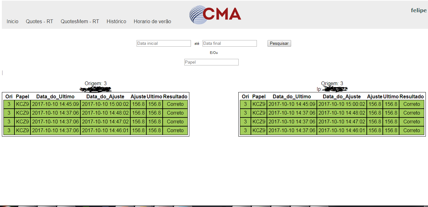
However, when I shorten the window, the tables and the header are "disorganized", thus:
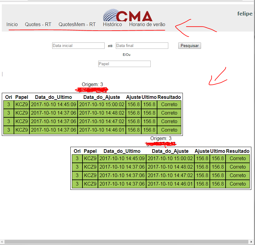
How do I "lock" the tables and they do not change position according to window size?
Follow the CSS used in the table:
<style>
table.sss1 {
    font-family: arial;
    padding: 4px;
    text-align: center;
    float:left;
    border: 1px solid;
    border-spacing: inherit;
}

table.sss2 {
    font-family: arial;
    padding: 4px;
    text-align: center;
    float:right;
    border: 1px solid;
    border-spacing: inherit;
}

td {
    padding: 4px;
    font-family: arial;
    font-size:100%;
    /*width: 21.93%;*/
    height: 2px;
    border: 1px solid;
    border-color: black;
}

tr {
    background: white;
}
</style>
Follow the header code:
#menu ul {
padding:5px;
margin:0px;
background: url(logo-cma.png) center no-repeat ;
background-color: #EDEDED;
list-style: none;
width:99.85%;
height: 80px ;
}
  #menu ul li { display: inline; }

#menu ul li a {
font-family: arial;
padding: 2px 10px;
display: inline-block;
background-color: #EDEDED;
color: #333;
text-decoration: none;
border-bottom:3px solid #EDEDED;
transition: background-color 1s , color 1s , border-bottom 1s;
transition-timing-function: ease-out;
 }
  #menu ul li a:hover {
background-color:#D6D6D6;
color: #6D6D6D;
border-bottom:5px solid #991919;
 }

<link rel="stylesheet" type="text/css" href="cabecalho.css">

<style>

 yp {
 font-family: verdana;
 font-weight: bold;
 color: darkslategrey;
  text-align: right;
  }

  </style>

  <nav id="menu">
   <ul>
    <yp><?php echo '<p>'.$logado.'</p>'; ?></yp>
     <li><a href="http://10.24.0.42/felipe_projetos/">Inicio</a></li>
    <li><a href="index.php">Quotes - RT</a></li>
    <li><a href="QuotesMem.php">QuotesMem - RT</a></li>
    <li><a href="historico.php">Histórico</a></li>
    <li><a href="check_hour.php">Horario de verão</a></li>
    <!--<li><a href="#">Em breve</a></li>
    <li><a href="#">Em breve</a></li>-->
    </ul>
   </nav>
You want me to stay centered all the time? Because being always on each other’s side becomes complicated, because when you shorten the window, it also decreases the space for them to stay!
– Gabriel Garcia
No, I want you both to stand side by side, regardless of the screen size.
– Geraldão de Rívia
And when there is no space for them to stay there?? Do you want to scroll bar?
– Gabriel Garcia
Exactly! That’s what I want.
– Geraldão de Rívia
Has how to post HTML and CSS code to view??
– Gabriel Garcia
Put this in the CSS of your tables: overflow-x:auto; Come back here and tell me if it works.
– Bsalvo
@Bsalvo, is it to put this inside table.exe { overflow-x:auto } ? Or inside td.outroexe {overflow-x:auto} ?
– Geraldão de Rívia
I don’t know your code, put it like this in your css: table { overflow-x:auto; }
– Bsalvo
They are centering
– Geraldão de Rívia
I added the CSS used in the table there in the question
– Geraldão de Rívia
Made menu with tag table?
– Jonathan de Toni
@Jonathandetoni, I entered the header code
– Geraldão de Rívia
Standing side-by-side is always impossible, because there will come a time when the table will not be able to get smaller and then will be one below the other. That’s because the width of the column only goes as far as there’s text inside it.
– Sam
@Dvdsamm, what if the site compacts? would work?
– Geraldão de Rívia
What do you mean? I don’t understand
– Sam