3
I’m making a website for the company where I work and I made a Multilevel menu. My problem is that when I open one of the levels, the last item does not appear and when I scroll what moves is the page that is behind. I wonder what I’m doing wrong, will be the position: Fixed I put in the class?
/*== RESET ==*/
* {
	margin: 0;
	padding: 0;
	font-size: 100%;
	border: none;
	outline: none;
	font-weight: 300;
	box-sizing: border-box;
	font-family: 'Lato', sans-serif;
}

body{
	 background-color: #fff;
}

a {text-decoration: none;}

ul {
	list-style: none;
}

img {
	max-width: 100%;
}


/*== CABEÇAHO ==*/
.cabecalho {
	width: 100%;
	float: left;
	padding: 3% 5%;
}

.logo {
	width: 70px;
	height: 91px;
	float: left;
	background: url(../_img/Estores_JF-mobile.jpg) center center/70px no-repeat;
	font-size: 0;
}

.btn-menu {
	width: 70px;
	height: 70px;
	float: right;
	text-align: center;
	border-radius: 70px;
	cursor: pointer;
	background: linear-gradient(to right, #025aa4, #2599fb);
	color: #fff;
	box-shadow: 2px 3px 20px #888888;
}


/* == MENU == */
.menu {
	display: none;
	width: 100%;
	height: 100%;
	position: fixed;
	background-color: rgba(2, 90, 164, 0.9);
	top: 0;
	left: 0;
}

.btn-close {
	float: right;
	font-size: 30pt;
	color: #fff;
	cursor: pointer;
	margin-right: 5%;
	margin-top: 5%;
}

.menu ul {
	width: 100%;
	float: left;
	text-align: left;
}

.menu li{
	padding: 4%;
}

.menu li a {
	font-size: 25pt;
	color: #fff;
	padding: 2%;
}

.menu li a:hover {
	border: 2px solid #fff;
	border-radius: 5px;
}

.submenu_prod {
	display: none;
	text-align: left;
	margin-left: 20%;
}

.submenu_prod li a{
	color: #fff;
	font-size: 15pt;
}

.submenu_empr {
	display: none;
	text-align: left;
	margin-left: 20%;
}

.submenu_empr li a{
	color: #fff;
	font-size: 15pt;
}


/* == BANNER == */
.banner {
	width: 100%;
	float: left;
	text-align: center;
	padding: 3% 4%;
	background: url(../_img/wallpaper-azul_web.jpg);
}

.title {
	width: 100%;
}

.title h1 {
	font-size: 35pt;
	color: #fff;
	font-weight: 700;
}

.title h2 {
	margin-top: 10px;
	font-size: 18pt;
	color: #fff;
}

.buttons {
	width: 100%;
	margin-top: 5%;
}

.btn-sobre i {
	float: right;
}

.btn-sobre {
	width: 100%;
	font-size: 1.5em;
	text-align: left;
	cursor: pointer;
	padding: 5%;
	border-radius: 10px;
	background-color: #fff;
	color:#130400;
}


/* == SERVIÇOS == */
.servicos {
	margin-top: 50px;
 	width: 100%;
	float: left;
	padding: 3% 4%;
}

.servico {
	width: 100%;
	background-color: #fff;
	text-align: left;
	border-radius: 7px;
	margin-bottom: 3%;
	text-align: center;
	box-shadow: 2px 3px 20px #888888;
}

.servico img {
	margin-top: 3%;
	border-radius: 7px 7px 0 0;
}

.inner {
	padding: 5%;
}

.inner a {
	font-size: 25pt;
	color: #130400;
	font-weight: 700;
	line-height: 1em;
}

.inner h4 {
	font-size: 18pt;
	margin-top: 2%;
	color: #130400;
}

.inner p {
	margin-top: 10%;
	color: #130400;
}
<!DOCTYPE html>
<html lang="pt-pt">
<head>
<meta name="viewport" content="width=device-width, initial-scale=1.0">
<title>Estores JF</title>
<meta charset="utf-8">
<meta name="description" content="Empresa especializada em fabrico de estores e redes mosquiteiras.">
<meta name="keywords" content="Estore, Estores, Rede mosquiteira, Redes mosquiteiras, persianas">
<meta name="robots" content="index, follow">
<meta name="author" content="Diogo Sousa">
<link rel="stylesheet" type="text/css" href="_css/style.css">
<link rel="stylesheet" href="https://maxcdn.bootstrapcdn.com/font-awesome/4.6.1/css/font-awesome.min.css">
<link href="https://fonts.googleapis.com/css?family=Lato:300,400,700" rel="stylesheet">
<link rel="icon" href="_img/Estores_JF.png">
</head>
<body>
<!-- CABEÇALHO -->
<header class="cabecalho">
<a href="index.html"><h1 class="logo">Estores JF - Empresa especializada em fabrico de estores</h1></a>
<button class="btn-menu">
<i class="fa fa-bars fa-2x" aria-hidden="true"></i>
</button>
<nav class="menu">
<a class="btn-close"><i class="fa fa-times"></i></a>
<ul>
<li><a href="index.html">Home</a></li>
<li class="sub_empr"><a href="#">A Empresa +</a></li>
<ul class="submenu_empr">
<li><a href="#">Quem Somos?</a></li>
</ul>
<li class="sub_prod"><a href="#">Produtos +</a></li>
<ul class="submenu_prod">
<li><a href="">Soluções Exteriores</a></li>
<li><a href="">Soluções Interiores</a></li>
<li><a href="">Portões e Grades</a></li>
<li><a href="">Caixas Compactas</a></li>
<li><a href="">Caixas Pré-reboco</a></li>
<li><a href="">Motores e Comandos</a></li>
</ul>
<li><a href="contacto.html">Contactos</a></li>
</ul>
</nav>
</header>
<!--BANNER-->
<div class="banner">
<div class="title">
<hgroup>
<h1>Estores - JF</h1>
<h2>Possuimos o que precisa para o seu lar se tornar um
lugar mais agradável.</h2>
</hgroup>
</div>
<div class="buttons">
<button class="btn-sobre"> Sobre <i class="fa fa-question-circle"></i> </button>
</div>
</div>
<!--ARTIGOS-->
<main class="servicos">
<article class="servico">
<a href="#"><img src="_img/Servicos-Mobile.jpg" alt="Serviços"></a>
<div class="inner">
<a href="#">Os nossos serviços!</a>
<h4>Conheça-nos melhor...</h4>
<p>Aqui fica o texto que explica o que fazemos, o que podemos fazer pelas pessoas!</p>
</div>
</article>
<article class="servico">
<a href="#"><img src="_img/termico-mobile.png" alt="Serviços"></a>
<div class="inner">
<a href="#">Estores</a>
<h4>Temos o melhor para si!</h4>
<p>sdaklndalndaklsndklsandklskldnsada
lsandlkandlknlknda
ndlkandklankldndsalnasdlnsa
dnlkasndlkasndkaln</p>
</div>
</article>
<article class="servico">
<a href="#"><img src="_img/rede-mobile.jpg" alt="Serviços"></a>
<div class="inner">
<a href="#">Rede Mosquiteiras</a>
<h4>Contra os mosquitos.</h4>
<p>Aqui esplicar um pouco a função da rede mosquiteira.</p>
</div>
</article>
</main>
<footer></footer>
</body>
<script src="https://code.jquery.com/jquery-3.0.0.js"></script>
<script src="https://code.jquery.com/jquery-migrate-3.0.0.js"></script>
<script>
/*Para aparecer o menu*/
$(".btn-menu").click(function(){
$(".menu").show();
});
/* para fechar o menu*/
$(".btn-close").click(function(){
$(".menu").hide();
});
/*para abrir sub menu produtos*/
$(document).ready(function(){
$(".sub_prod").click(function(e){
$(".submenu_prod").toggle();
e.preventDefault();
})
})
/*para abrir sub menu empresa*/
$(document).ready(function(){
$(".sub_empr").click(function(e){
$(".submenu_empr").toggle();
e.preventDefault();
})
})
</script>
</html>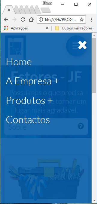
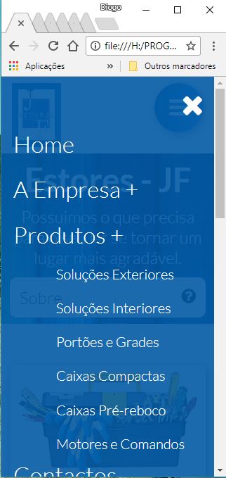
I wanted to know how to do, so that on the mobile phone does not happen and can slide the menu up to click contacts.
just put a max-height on
html,bodyof100%, after that, set up a max-height in the list, and then aoverflow:auto, if no one has posted an answer, as soon as I get home I create a fiddle to explain better :D– Murilo Melo
Thank you very much @Murilo Gamboa, still no one answered, I will wait then. Thanks again
– Diogo Sousa
That’s right. The height of the menu is greater than the browser area, so part of it is out of view on the screen. When you scroll, you will scroll the whole page and not the menu, because the menu has no scroll.
– Sam