0
You guys all right? Next I have a site I need to call the latest posts from a category id=3 within 2 rows with 3 columns in the home, something that would be very easy using bootstrap repeating 6 div with class ". col-Sm-4" for example.
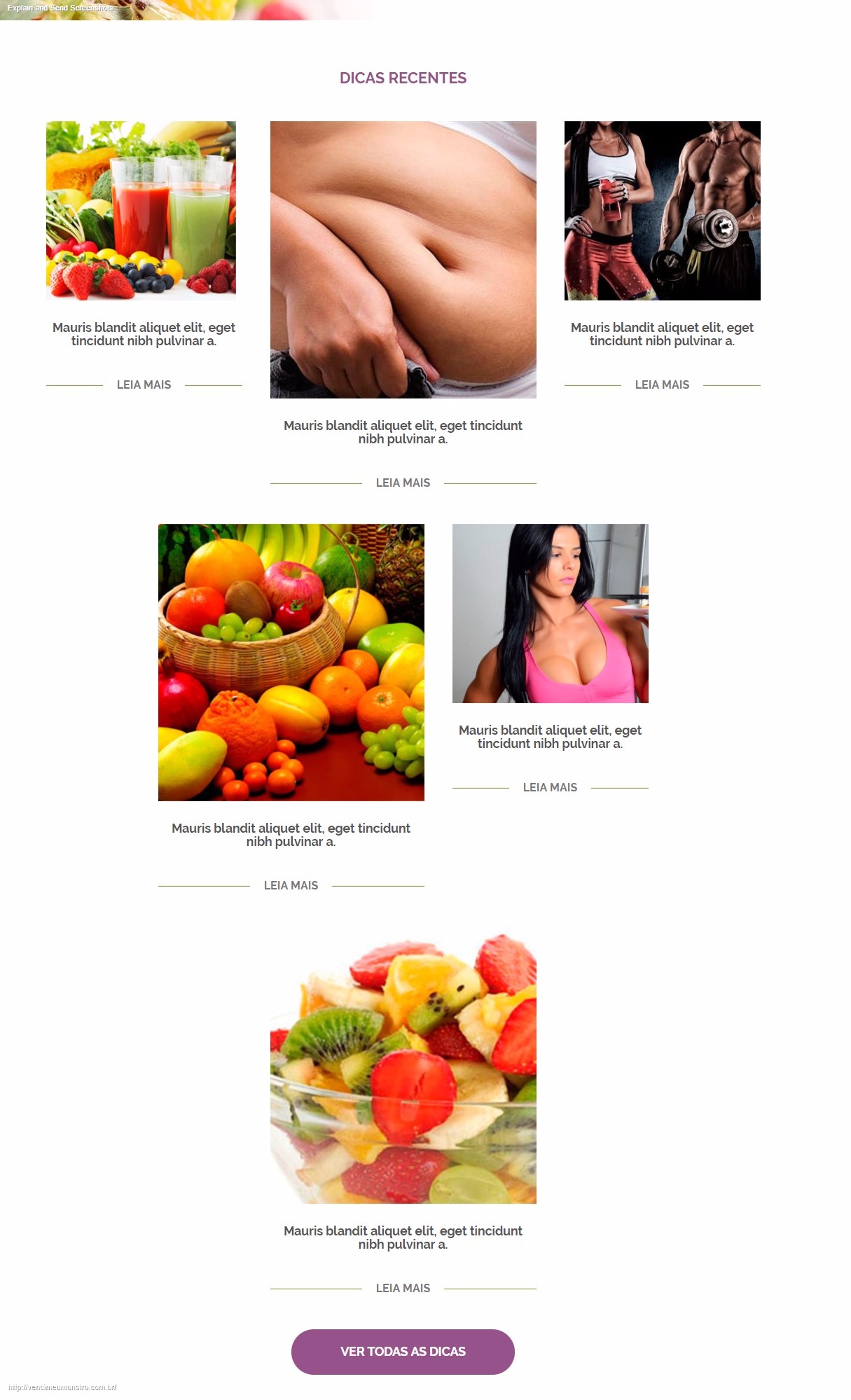
But in my case I have a div with 3 columns and each column has 2 images below each other and in the middle is bigger the height and width, only html and css I’ve done, the call is also being made but wanted to call 2 at a time in each column and in the middle would call the class that would make it increase.
It is currently as in the annex called test.jpg and wanted it to be the same in index.png!

Website link: http://vencimeumonstro.com.br
– Rudi Duarte Rudi Duarte
Hello Rudi. Put the code you already have, so we can help better than through the images.
– Ricardo Moraleida
Hello I don’t know how to do this yet, but I managed to solve it in a different way, working already, I fucked up but I discovered kkk. I do not know how to put as SOLVED here in the question or edit the question!
– Rudi Duarte Rudi Duarte
Write what your solution was in the answer, so other people can see how you solved it, then click "accept" your own answer
– Ricardo Moraleida