Dynamic multi items carousel using bootstrap

Asked

Viewed 2,898 times

0

I’m having trouble making a dynamic multi-item carousel with only two columns bootstrap, when I inform the amount of columns in the case col-Md-6 items break and are displayed in one more row below, someone could assist me?
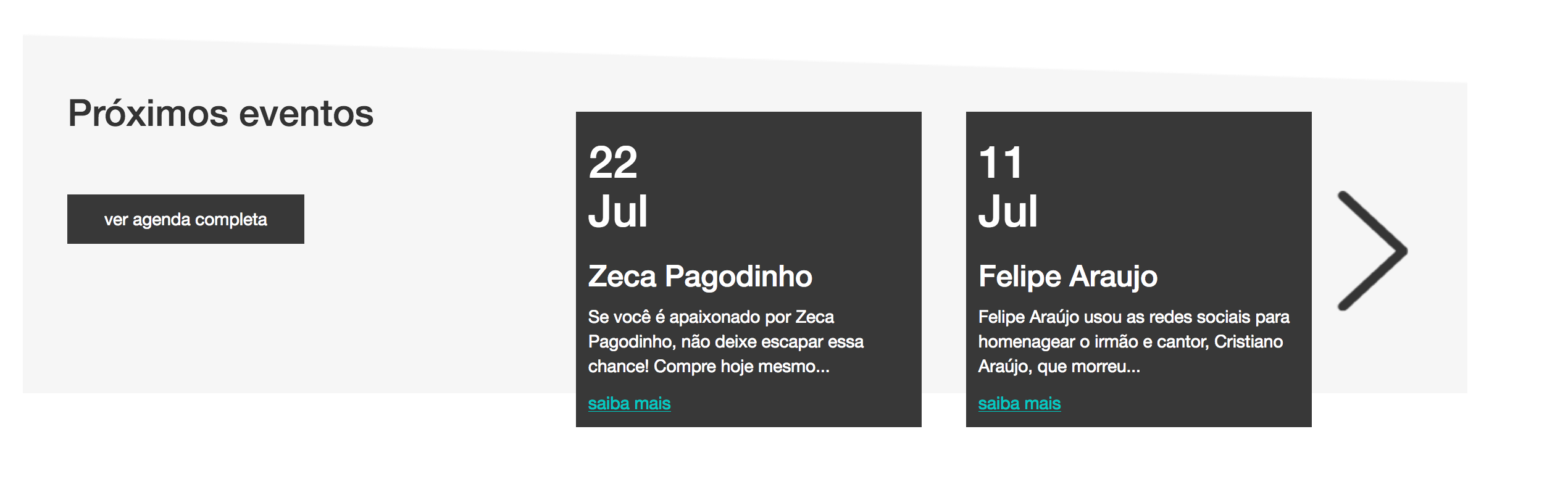
As it should be: inserir a descrição da imagem aqui

Here is an example with 3 columns: https://www.bootply.com/94444

  • You can [Edit] the question and add the code that generates this quoted behavior?

  • Hello @Andersoncarloswoss I left a link from the example below, this is with 3 columns I would like only 2 columns as in the image.

  • The link is from an example, not from your page. Put the code you did trying to leave in two columns.

  • @Andersoncarloswoss I have not yet created this part because I was just with this doubt of how to make this carousel with two columns the image attached is only the PSD, the example I passed the link is just what I need to adapt taking an arrow and instead of image the content and give a spacing in the arrow.

  • So how did you conclude that defining the columns with col-md-6 does line break occur? You didn’t make the code to test this?

  • @Andersoncarloswoss I did but I didn’t post the code that makes the columns break.

Show 1 more comment

1 answer

1


Good afternoon!

I think it could be done that way. The changes were simple.

$('#myCarousel').carousel({
  interval: 10000
})

$('.carousel .item').each(function(){
  var next = $(this).next();
  if (!next.length) {
    next = $(this).siblings(':first');
  }
  
  next.children(':first-child').clone().appendTo($(this));
});
/* override position and transform in 3.3.x */
.carousel-inner .item.left.active {
  transform: translateX(-50%);
}
.carousel-inner .item.right.active {
  transform: translateX(50%);
}

.carousel-inner .item.next {
  transform: translateX(50%)
}
.carousel-inner .item.prev {
  transform: translateX(-50%)
}

.carousel-inner .item.right,
.carousel-inner .item.left { 
  transform: translateX(0);
}


.carousel-control.left,.carousel-control.right {background-image:none;}
  <link rel="stylesheet" href="https://maxcdn.bootstrapcdn.com/bootstrap/3.3.7/css/bootstrap.min.css">
  <script src="https://ajax.googleapis.com/ajax/libs/jquery/3.2.1/jquery.min.js"></script>
  <script src="https://maxcdn.bootstrapcdn.com/bootstrap/3.3.7/js/bootstrap.min.js"></script>
  
<div class="col-md-6 col-md-offset-3">
<div class="carousel slide" id="myCarousel">
  <div class="carousel-inner">
    <div class="item active">
      <div class="col-xs-6"><a href="#"><img src="http://placehold.it/500/bbbbbb/fff&amp;text=1" class="img-responsive"></a></div>
    </div>
    <div class="item">
      <div class="col-xs-6"><a href="#"><img src="http://placehold.it/500/CCCCCC/fff&amp;text=2" class="img-responsive"></a></div>
    </div>
    <div class="item">
      <div class="col-xs-6"><a href="#"><img src="http://placehold.it/500/eeeeee/fff&amp;text=3" class="img-responsive"></a></div>
    </div>
    <div class="item">
      <div class="col-xs-6"><a href="#"><img src="http://placehold.it/500/f4f4f4/fff&amp;text=4" class="img-responsive"></a></div>
    </div>
    <div class="item">
      <div class="col-xs-6"><a href="#"><img src="http://placehold.it/500/fcfcfc/333&amp;text=5" class="img-responsive"></a></div>
    </div>
    <div class="item">
      <div class="col-xs-6"><a href="#"><img src="http://placehold.it/500/f477f4/fff&amp;text=6" class="img-responsive"></a></div>
    </div>
  </div>
  <a class="left carousel-control" href="#myCarousel" data-slide="prev"><i class="glyphicon glyphicon-chevron-left"></i></a>
  <a class="right carousel-control" href="#myCarousel" data-slide="next"><i class="glyphicon glyphicon-chevron-right"></i></a>
</div>
</div>

  • how do I add more columns instead of just two?

Browser other questions tagged

You are not signed in. Login or sign up in order to post.