3
I need to create a column layout (masonry) responsive with pure js. I’ve tried several ways, but most columns are not responsive, and CSS organizes the numbering from top to bottom.
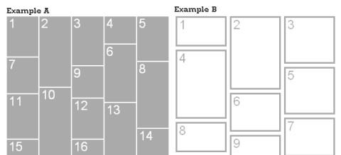
The responsiveness would be:
- On cell phones: have a horizontal column.
- On tablets: have two columns horizontally.
- On computers: have three columns horizontally.
I’m using this code, but I can’t make the layout responsive or change the widths without destroying the layout.
function renderGrid() {
    var blocks = document.getElementById("grid_container").children;
    var pad = 10,
        cols = 3,
        newleft, newtop;
    for (var i = 1; i < blocks.length; i++) {
        if (i % cols == 0) {
            newtop = (blocks[i - cols].offsetTop + blocks[i - cols].offsetHeight) + pad;
            blocks[i].style.top = newtop + "px";
        } else {
            if (blocks[i - cols]) {
                newtop = (blocks[i - cols].offsetTop + blocks[i - cols].offsetHeight) + pad;
                blocks[i].style.top = newtop + "px";
            }
            newleft = (blocks[i - 1].offsetLeft + blocks[i - 1].offsetWidth) + pad;
            blocks[i].style.left = newleft + "px";
        }
    }
}
window.addEventListener("load", renderGrid, false);
window.addEventListener("resize", renderGrid, false);
div#grid_container {
width: 900px;
margin: 0px auto;
height: 860px;
border: #999 1px dashed;
}
div#grid_container > div {
position: absolute;
width: 291px;
border: #000 1px solid;
}
div#grid_container > div:nth-child(2n+0) {
background: #FFDC64;
}
div#grid_container > div:nth-child(2n+1) {
background: #FEC910;
}
div#grid_container > div > div {
padding: 20px;
font-size: 27px;
color: #D9A800;
}<!DOCTYPE html>
<html>
<head>
<meta charset="UTF-8">
</head>
<body>
<div id="grid_container">
<div style="height:140px;"> <div>1</div> </div>
<div style="height:200px;"> <div>2</div> </div>
<div style="height:120px;"> <div>3</div> </div>
<div style="height:180px;"> <div>4</div> </div>
<div style="height:150px;"> <div>5</div> </div>
<div style="height:160px;"> <div>6</div> </div>
<div style="height:180px;"> <div>7</div> </div>
<div style="height:170px;"> <div>8</div> </div>
<div style="height:160px;"> <div>9</div> </div>
<div style="height:180px;"> <div>10</div> </div>
<div style="height:150px;"> <div>11</div> </div>
<div style="height:160px;"> <div>12</div> </div>
<div style="height:130px;"> <div>13</div> </div>
<div style="height:140px;"> <div>14</div> </div>
<div style="height:210px;"> <div>15</div> </div>
</div>
</body>
</html>
@Phanpy I will edit to be clearer!
– Victor M.
@Phanpy But my big question is how to make the code to stay in that layout!
– Victor M.
Something keeps you from using one plugin? It’s boring to have to do it from scratch, if it’s for studies I think it’s worth it.
– Renan Gomes
@Renan It is for both, I do not like to use plugins and is also for study!
– Victor M.
Flexbox will help you a lot, take a look.
– Bruno Wego
@Phanpy I want by percentage, but the code I got is static!
– Victor M.
@Phanpy Pus
– Victor M.
@Brunowego I’ll look into it!
– Victor M.
I ended up creating a draft before Edit. I’m trying to make it work yet. I totally forgot about HTML and CSS :/
– Klaider
@Phanpy already I am a beginner in js, I saw this code you made and understood little.
– Victor M.
I advise you to use only CSS to do this, I use this topic as a base: https://medium.com/@_jh3y/how-to-Pure-css-masonry-layouts-a8ede07ba31a#. bb64irsui
– MarioAleo
I recommend you use bootstrap to solve responsiveness, make it automatically for you.
– Rodrigo Scheuer