How to do repeating background with sprites?

Asked

Viewed 228 times

4

I was creating a button with background: made with a sprite, but it gets all wrong, I want it to look like this:

Botão Normal Botão com :hover

Only he’s all fucked up, like this:

Botão Bugado

My CSS:

.botao {    
    background:url(http://testetabela.esy.es/botoes.png) 0 0;
    color: #fff;
    padding:10px;
    border-bottom: 1px solid #000;
    box-shadow: 0 1px 0 transparent;
    -moz-box-shadow: 0 1px 0 transparent;
    -webkit-box-shadow: 0 1px 0 transparent;
    position:relative;
    font-family: Tahoma, Geneva, sans-serif;
    z-index:0;
}
.botao:hover {
    background:url(http://testetabela.esy.es/botoes.png) -8px 0;
}

Example

I would like to leave it as in the first two images, the first is the normal button, the second is the button with :hover.

  • Alexandre, consider putting your code on http://www.jsfiddle.net/, it’s hard to help you with just these images.

  • Friend above has an EXAMPLE link. Read my question and look for the name Example with a link.

  • http://jsfiddle.net/59YSK/

3 answers

7


I would use CSS gradients like @Sergio and @Paulomaciel suggested. But if you really want to use images, they need to be stacked in your spritesheet, which can be 2px per 100px:

inserir a descrição da imagem aqui

Then just move the image on the Y axis on the :hover:

.botao:hover {
    background-position: 0 -50px;
}

Example

  • Thanks, that’s what I wanted! VLW!!!

4

The problem here is that you’re using an image that already has this zebra effect. To use background images in this way, which in the background are small strips that repeat horizontally, then the image cannot have anything white.

To use sprites then your original image must have the two entire images, I don’t see how to have two strips/lines with space between them in the same image and repeat only the part you are looking for. Then they would have to be there as @bfavareto suggests, one on top of the other.

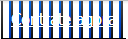
An image/Sprite with the full button would look like this (single image/file):

inserir a descrição da imagem aqui

and in the CSS:

background-image:url('http://i.stack.imgur.com/Zi14e.jpg');
background-position:-5px 0px;

and the other part of the image

background-image:url('http://i.stack.imgur.com/Zi14e.jpg');
background-position:-115px 0px;

Example


You can also use CSS only, for example use this tool to choose colors and click you can see the CSS.

Only with CSS will your image need:

gradient: to have different color at the top and bottom
border-Radius: to make the corners round

Example

.botao {
    margin-top: 40px;
    border-top: 1px solid #000000;
    background: #000000;
    background: -webkit-gradient(linear, left top, left bottom, from(#777), to(#000000));
    background: -webkit-linear-gradient(top, #777, #000000);
    background: -moz-linear-gradient(top, #777, #000000);
    background: -ms-linear-gradient(top, #777, #000000);
    background: -o-linear-gradient(top, #777, #000000);
    padding: 13px 26px;
    -webkit-border-radius: 15px;
    -moz-border-radius: 15px;
    border-radius: 15px;
    -webkit-box-shadow: rgba(0, 0, 0, 1) 0 1px 0;
    -moz-box-shadow: rgba(0, 0, 0, 1) 0 1px 0;
    box-shadow: rgba(0, 0, 0, 1) 0 1px 0;
    text-shadow: rgba(0, 0, 0, .4) 0 1px 0;
    color: white;
    font-size: 19px;
    font-family:'Lucida Grande', Helvetica, Arial, Sans-Serif;
    text-decoration: none;
    vertical-align: middle;
}
.botao:hover {
    border-top-color: #28597a;
    background: #0422ba;
    background: -webkit-gradient(linear, left top, left bottom, from(#27274f), to(#0422ba));
    background: -webkit-linear-gradient(top, #27274f, #0422ba);
    background: -moz-linear-gradient(top, #27274f, #0422ba);
    background: -ms-linear-gradient(top, #27274f, #0422ba);
    background: -o-linear-gradient(top, #27274f, #0422ba);
    color: #ccc;
}
  • No, I don’t want gradient, I only want with my Sprite, it’s in PNG!!

  • @Alexandrelopes, but its Sprite has no dark color, only blue and white.

  • I’m already doing with image because gradient does not work in internet explorer! Before it was with two images, only I wanted to join and create a Sprite.

  • This image is there: http://testetabela.esy.es/botoes.png

  • In this Sprite: http://testetabela.esy.es/botoes.png. has two black and blue stripes, each 2px wide.

  • I used the http://www.spritecow.com/ tool to get the Sprite code. Help me man!!! :/

  • @Alexandrelopes made an update of my reply.

  • thanks so much for the help, from my heart, vlw even, but the bfavaretto did as I wanted, thanks more for the strength, you have helped me a lot lately.

  • @Alexandrelopes has no problem. I also think that the answer of the bfavareto is better and I voted for her too :)

Show 4 more comments

2

You can do this using only css:

CSS

.botao {
    background: -webkit-linear-gradient(#3f3f40, #161617); /* For Safari 5.1 to 6.0 */   
    background: -o-linear-gradient(#3f3f40, #161617); /* For Opera 11.1 to 12.0 */
    background: -moz-linear-gradient(#3f3f40, #161617); /* For Firefox 3.6 to 15 */
    background: linear-gradient(#3f3f40, #161617); /* Standard syntax */
    border-radius:4px;
    text-decoration:none;
    color: #fff;
    padding:10px;
    border-bottom: 1px solid #000;      
    position:relative;
    font-family: Tahoma, Geneva, sans-serif;
    z-index:0;
}
.botao:hover {
    background: -webkit-linear-gradient(#164fda, #121fa0); /* For Safari 5.1 to 6.0 */   
    background: -o-linear-gradient(#164fda, #121fa0); /* For Opera 11.1 to 12.0 */
    background: -moz-linear-gradient(#164fda, #121fa0); /* For Firefox 3.6 to 15 */
    background: linear-gradient(#164fda, #121fa0); /* Standard syntax */
}

See on Jsfiddle

Browser other questions tagged

You are not signed in. Login or sign up in order to post.