7
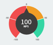
As you see in this image, inside the dark gray ball is a number. It’s 100. That means the pointer has to hit 100.
If it’s 0, it has to be in the middle of the pointer.
The issue is that this value of the NPS (Net Promoter Score) is -100 to 100.
I cannot account for this pointer to rotate according to the number inside that can range from -100 to -100.
So far:
CSS
.meter{
    position: relative;
    .round{
        content: "";
        position: absolute;
        top: 0;
        left: 0;
        right: -3px;
        bottom: -14px;
        margin: auto;
        width: 91px;
        height: 91px;
        border-radius: 50%;
        background-color: #3d3d3d;
        z-index: 1;
        &:after{
            content: "";
            position: absolute;
            top: -19px;
            left: 35px;
            z-index: 2;
            width: 0;
            height: 0;
            border-style: solid;
            border-width: 0 10px 20px 10px;
            border-color: transparent transparent #3d3d3d transparent;
        }
    }
    > img{
        vertical-align: middle;
        width: 170px;
        margin: auto;
    }

    .result{
        position: absolute;
        top: 0;
        font-size: 30px;
        color: #FFF;
        bottom: 0;
        left: 0;
        right: 0;
        width: 100%;
        z-index: 2;
        margin: auto;
        height: 45px;
        text-align: center;
        small{
            font-size: 12px;
            margin-top: -10px;
            display: block;
        }
    }
}
HTML
<div class="meter">
   <div class="round"></div>
   <img src="images/dash/meter.png">
   <span class="result">100<small>NPS</small></span>
</div>
I put on JS Fiddle for better resolution:
Why do you say -100 is worth to -140 degrees ?
– Diego Souza
@Peterparker, that’s what I found in the tests. You can see this in the jsfiddle example where
.meter:hover .round:after{ transform: -140deg);}corresponds to -100 on the pointer.– Samir Braga
@Gumball half-turn is 180, whoever drew the background left about 80 of them unfilled at the bottom, so that leaves about 40 on each side. 180-40=140 - An observation: in this case, to give a better finish, it pays to make the chart of the arrow separate, not to look ugly rotating circle (a perfect circle would not "demonstrate" rotation, but as it is an approximation, it is strange to use Transform in it)
– Bacco
You can draw a demonstrative drawing for me ?
– Diego Souza