Loop Wordpress coming out uneven!

Asked

Viewed 40 times

0

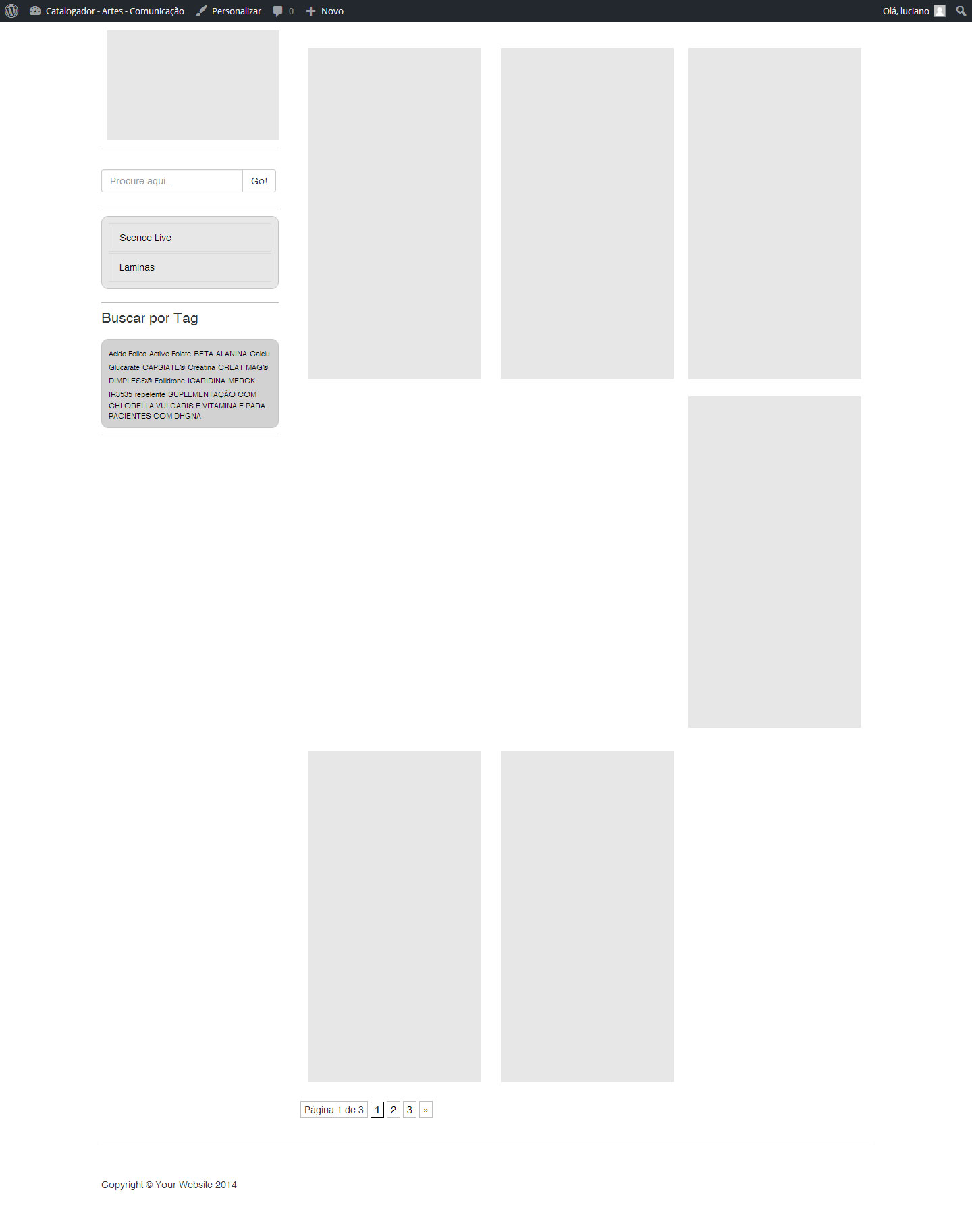
Good morning guys, I’m making the loop using wordpress + bootstrap and at the time of shows the content the loop some posts as shown in the following image:

inserir a descrição da imagem aqui

Follow the loop code:

 <div class="container">
    <div class="row">        
       <?php get_sidebar(); ?>           
        <div class="col-md-9">                 
            <?php if ( have_posts() ) : while ( have_posts() ) : the_post(); ?>
                <div class="coluna-post">
                    <div class="thumbnail">
                       <?php
                            $thumb = get_post_thumbnail_id();
                            $img_url = wp_get_attachment_url( $thumb,'full'); //get img URL
                            $image = aq_resize( $img_url, 207, 292); //resize & crop img
                        ?>
                            <img src="<?php echo $image ?>" />
                        <div class="caption">
                            <h4><a href="<?php the_permalink(); ?>"><?php the_title(); ?></a>
                            </h4>
                            <p><?php the_excerpt(); ?></p>
                        </div>

                    </div>
                </div>
                <?php endwhile; else: ?>
                <p><?php _e('Sorry, no posts matched your criteria.'); ?></p>
                <?php endif; ?>
                <?php wp_pagenavi(); wp_reset_postdata(); ?>

         </div>
    </div>

</div>

As I am using bootstrap, only the div-post column I created css.. follows the code

.coluna-post{ float:left; width:260px; padding:10px; margin:10px;}

I think this is a flaw in my loop, but I’m not able to identify the problem. It’s already happening in some sites that create loops with images.

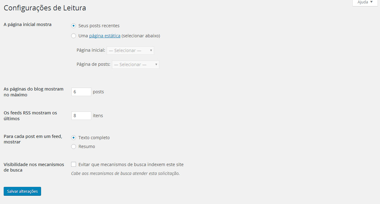
In my Wordpress settings in Reading is the following:

inserir a descrição da imagem aqui

Some light at the end of the tunnel?

1 answer

2

is not disappearing any post, what is happening is that you are using a grid poorly done, any li there is at least 1px larger than the rest, making so the li below keep hitting her, one way to solve this is by using display: flex;

How to use:

        ul#lista {
            display: flex;
            width: 100%;
            float: left;
            box-sizing: border-box;
            padding: 0;
            flex-wrap: wrap;
        }

        ul#lista:before, ul#lista:afer {
            content:" ";
            display: table;
            width: 0;
        }

That one :before and :after is not to have any error in Google Chrome, try to adapt to your css, since you did not inform the same, I do not know how to help you.

Another way to tidy up is to use the max-height: pixel fixo with the height: pixel igual ao max-height, and so it will not have mistakes, I prefer the display: flex, it is simpler and more beautiful to see the site.

But there’s still another way to solve it margin-bottom: 1.5em, maybe this will solve, try to use this last case.

Good luck on your theme.

Browser other questions tagged

You are not signed in. Login or sign up in order to post.