2
Hello, I have a layout that resembles this
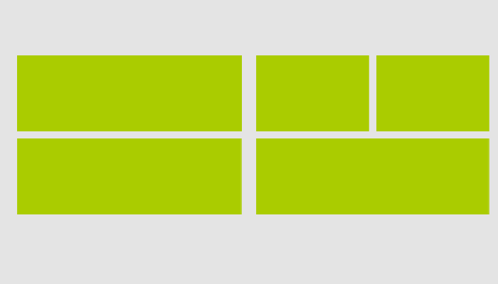
I use Bootstrap on it.. When hitting a particular breakpoint it gets a format similar to this one
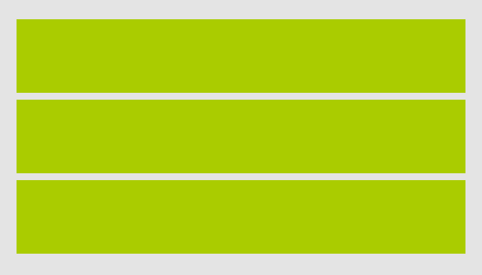
I want to do the following effect, when the layout receives the formatting shown in the second image, those green boxes should become links (in the desktop version the links are only small texts there)..
I thought of 3 possibilities, the first one would be using CSS, which would look like this: When the layout arrives at breakpoint I remove the "outside" formatting of the box (div) and apply it on this link, using media queries..
The second possibility would be using Javascript (or jQuery), where I use an if to check the . Document width() if it is of breakpoint size I use a . wrap() or something of the kind to turn the boxes into links.
The third would be using CSS too, where I add twice the same content, one for mobile (with the boxes as links) and the other for desktop (which is the pattern shown in the first image) and when I arrive at the breakpoint I hide one and show the other..
Taking into account browser compatibility (desktop and mobile), what would be the best option? You have other ideas on how to do this?