-1
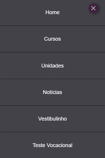
I have a problem here, I created a menu that has scrolling, but when I have to scroll, I need the background screen to be locked and just scroll as the menu... Here are the photos:

The code is as follows:: HTML (From div="content the code remains the same")
<!DOCTYPE html>
<html>
<head>
    <meta charset="utf-8" />
    <meta http-equiv="X-UA-Compatible" content="IE=edge">
    <title>Notícias</title>

    <meta charset=UTF-8> <!-- ISO-8859-1 -->
    <meta name=viewport content="width=device-width, initial-scale=1.0">
    <meta name=description content="Introdução à produção de sites responsivos">
    <meta name=keywords content=""> <!-- Opcional -->
    <meta name=author content='Equipe 05'>

    <link rel="stylesheet" media="screen and (max-width:480px)" href="css/style480/menu.css">
    <link rel="stylesheet" media="screen and (max-width:480px)" href="css/style480/carrosselPagCurso.css">
    <link rel="stylesheet" media="screen and (max-width:480px)" href="css/style480/stylePagCursos480.css">
    <link rel="stylesheet" media="screen and (max-width:480px)" href="css/style480/footer480.css">

<!--<link rel=stylesheet media="screen and (min-width:481px) and (max-width:768px)" href="css/style768.css">
    <link rel=stylesheet media="screen and (min-width:769px) and (max-width:1024px)" href="css/style1024.css">
    <link rel=stylesheet media="screen and (min-width:1025px)" href="css/style1366.css">
-->
    <link rel="shortcut icon" href="imagens/fiebIVazio.png" type="image/x-icon">
    <script src="main.js"></script>
</head>
<body>
     <div id="container">
        <header>
            <nav>
                <a href="landpageMobile.html">  <img src="imagens/fiebIVazio.png" id="iconTop" alt=""> </a>
                <input type="checkbox" id="check">
                <label id="icone" for="check"></label>
                <div id="menu">
                    <span></span>
                </div>
                    <div class="barra">
                        <nav id="navMenu">
                             <a href="landpageMobile.html"><div class="link">Home</div></a>
                             <a href="cursos480.html"><div class="link">Cursos</div></a>
                             <a href="unidades480.html"><div class="link">Unidades</div></a>
                             <a href="noticias480.html"><div class="link">Notícias</div></a>
                             <a href="vestib480.html"><div class="link">Vestibulinho</div></a>
                             <a href="test480.html"><div class="link">Teste Vocacional</div></a>
                             <a href="contat480.html"><div class="link">Contato</div></a>
                             <a href="cadastro480.html"><div class="link">Cadastrar</div></a>
                             <a href="login480.html"><div class="link">Login</div></a>
                        </nav>
                    </div>
                </nav>
         </header>
CSS of the Button (I made the button code in css)
#check{
    display:none;
}
#icone{
    position: absolute;
    z-index: 5;
    margin-left: 63.2%;
    margin-top: 4%;
}
.barra{
    width: 100%;
    position:absolute;
    text-align:  center;
    z-index: 3;
    transition: all .2s linear;
}
#navMenu{
    width: 100%;
    position:absolute;
    visibility: hidden;
}
#navMenu a{
    text-decoration:none;
}
.link{
    background-color:#494950;
    padding: 9.4%;
    font-family:"arial";
    font-size: 18pt;
    transition: .2s ease-in-out;
    color:#f4f4f9;
    border-bottom: 2px solid #222;
    opacity:0;
}
.link:hover{
    background-color:#050542;
}

#check:checked ~ .barra #navMenu a .link{
    opacity:1;
    margin-top: 0%;
    visibility: visible;
}
label{
    width: 46px;
    float: left;
    opacity:0;
    height: 44px;
    position: relative;
    float: left;
    position: absolute;
    box-shadow:5px 2px 23px;
    transition: all 0.1s linear;
    border-radius: 50%;
    cursor: pointer;
}
label:hovert + #menu{
    opacity: 1;
}
#menu{
    width: 43px;
    float: left;
    opacity: 0.6;
    height: 43px;
    position: relative;
    background-color: #4c0c3f;
    box-shadow: 5px 2px 23px;
    transition: all 0.1s linear;
    border-radius: 50%;
    position: absolute;
    margin-left: 84%;
    z-index: 4;
    margin-top: 4%;
}
#check{
    position: absolute;
    display:none;
    z-index: 4;
}
span{
    width: 59%;
    height: 7%;
    top: 47%;
    left: 21%;
    position: absolute;
    background-color: #fff;
    transition: all 0.1 linear;
}
span:before{
    content:'';
    top: 7px;
    position: absolute;
    background-color: #fff;
    transition: all 0.1s linear;
    width: 100%;
    height: 100%;
}
span:after{
    content:'';
    bottom: 7px;
    position: absolute;
    background-color: #fff;
    transition: all 0.1s linear;
    width: 100%;
    height: 100%;
}

#check:checked + label + div > span{
    background-color: transparent;
}
#check:checked + label + div > span:after{
    transform: translate(0px, 6px) rotate(45deg);
}
#check:checked + label + div > span:before{
    transform: translate(0px, -8px) rotate(-45deg);
}
#check:checked + label + div > .tent{
    border-radius: 50%;
}
If you need anything just say the word
PS: I tried to put this but it didn’t work:
body{
    overflow: hidden;
}
#check:checked > body{
    overflow: visible;
}
Dude but with the code you posted in the question the menu is very far from being the same as the picture... In fact it’s not even working to the point where we can simulate your problem to try a solution...
– hugocsl
I had given a smaller code to make it easier to understand, but I didn’t know it didn’t work, so now I posted the full code menu
– José Victor Silva