I got some interesting solutions, some "more" crossbrowser using background-attackment and others less crossbrowser with -webkit-mask-image and mix-bland-mode. It would also be possible to do with SVG, but I will not get into this merit and I will stay only in CSS.
Option 1
It is the simplest to apply and understand. The idea here is to make a mask using a radial-gradiente in -webkit-mask-image. Radial pq the image is round but works with linear-gradiente tb.
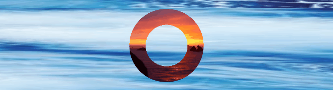
The important thing here is to know that color branca will hide everything in it and the color preta will show. How the radial-gradiente is from white up to 40% and then black the "core" of the image is hidden and only a fraction of 60% of black appears. See the result!
html, body {
    width: 100%;
    height: 100%;
    margin: 0;
    padding: 0;
    background-image: url(https://picsum.photos/200/300?image=912);
    background-size: 200% 200%;
    display: grid;
    place-items: center;
    position: relative;

    background-position: center center;
    animation: bg 10s linear infinite;
}

img {
    border-radius: 50%;
  -webkit-mask-image: radial-gradient(circle, transparent 40%, black 41%);
  object-fit: cover;
    width:auto;
    height:75%
}


@keyframes bg {
    50% {
        background-position-y: -100%;
    }
}
<img src="https://picsum.photos/300/300?image=896" alt="">
Option 2
This option will use two elements. Imagine that you have a background in Body, there you have the filho 1 and the filho 2 over that filho 1, the filho 2 will have the same properties of background that the Body.

Basically that and you’ll have the effect as if the image were leaked!
html, body {
    width: 100%;
    height: 100%;
    margin: 0;
    padding: 0;
    background-image: linear-gradient(red, blue);
    background-size: 400% 400%;
    display: grid;
    place-items: center;
    position: relative;

    background-position: center center;
    animation: bg 10s linear infinite;
}
img {
    border-radius: 50%;
  -webkit-mask-image: radial-gradient(circle, transparent 50%, black 50%);
}

.box1 {
    position: absolute;
    width: 40vh;
    height: 40vh;
    border-radius: 50%;
    background-image: url(https://placecage.com/300/300);
    background-size: cover;
}
.box2 {
    position: absolute;
    width: 20vh;
    height: 20vh;
    border-radius: 50%;
    background-image: linear-gradient(red, blue);
    background-size: 400% 400%;
    background-attachment: fixed;

    background-position: center center;
    animation: bg 10s linear infinite;
}

@keyframes bg {
    50% {
        background-position-y: -200%;
    }
}
<div class="box1"></div>
<div class="box2"></div>
See this link https://stackoverflow.com/questions/5706963/possible-to-use-border-radius-together-with-bordera-image-which-has-a-gradient
– caiocafardo
@caiocabale is it seems that the most "easy" way would be with SVG. but I’m still trying only with CSS...
– hugocsl
Yeah, I’ve been there and I’ve been there, the problem is Radius, right?
– caiocafardo
@exact caiocabale, does not apply Radius
– hugocsl