There is the CSS property clip-path which you can use to cut unwanted parts from the background of the element.
This article from CSS Tricks has some cool examples to understand how property works.
To define a Shape complex you can:
Use the path() that takes as parameter a string containing a path in the same format as the SVG path.
clip-path: path("M10 10 H 90 V 90 H 10 L 10 10");
Use a Clippath SVG and refer to the CSS.
clip-path: url("#meu-clip");
Below is the path of your vector image that I will use in the examples:
m59.533456,149.455558c-16.519209,-1.510568 -33.831918,-7.984429 -41.622636,-15.609198c-24.814882,-24.169081 -23.227884,-99.913255 2.452634,-119.694497c11.686078,-8.991474 31.018602,-13.810903 55.256394,-13.810903c19.548933,0 32.605601,2.445681 44.796633,8.344088c15.437165,7.480906 23.30002,20.140901 27.988878,45.101232c1.731271,9.423064 1.731271,33.37635 -0.072136,43.302937c-1.514862,8.559883 -5.338085,20.50056 -8.512082,26.54283c-3.390405,6.401929 -11.181124,13.882835 -18.25048,17.479425c-12.118896,6.258066 -26.257608,8.919542 -46.239359,8.703746c-7.141492,-0.071932 -14.210848,-0.215795 -15.797846,-0.359659z
Examples
path()
body {
background-color: #eedddd;
display: flex;
justify-content: center;
padding: 15px;
}
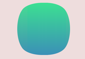
.quadrado {
display: inline-block;
width: 150px;
height: 150px;
background: linear-gradient(#3ce092, #3b91b7);
clip-path: path("m59.533456,149.455558c-16.519209,-1.510568 -33.831918,-7.984429 -41.622636,-15.609198c-24.814882,-24.169081 -23.227884,-99.913255 2.452634,-119.694497c11.686078,-8.991474 31.018602,-13.810903 55.256394,-13.810903c19.548933,0 32.605601,2.445681 44.796633,8.344088c15.437165,7.480906 23.30002,20.140901 27.988878,45.101232c1.731271,9.423064 1.731271,33.37635 -0.072136,43.302937c-1.514862,8.559883 -5.338085,20.50056 -8.512082,26.54283c-3.390405,6.401929 -11.181124,13.882835 -18.25048,17.479425c-12.118896,6.258066 -26.257608,8.919542 -46.239359,8.703746c-7.141492,-0.071932 -14.210848,-0.215795 -15.797846,-0.359659z");
}
<div class="quadrado"></div>
It is worth remembering that the clip-path is experimental, so the support is very low.
The above example works on Firefox 64 by enabling flag:
layout.css.clip-path-path.enabled
SVG
body {
  background-color: #eedddd;
  display: flex;
  justify-content: center;
  padding: 15px;
}

.quadrado {
  display: inline-block;
  width: 150px;
  height: 150px;
  background: linear-gradient(#3ce092, #3b91b7);
  clip-path: url("#tela-tv-tubo");
}
<div class="quadrado"></div>

<svg width="0" height="0">
  <defs>
    <clipPath id="tela-tv-tubo">
      <path d="m59.533456,149.455558c-16.519209,-1.510568 -33.831918,-7.984429 -41.622636,-15.609198c-24.814882,-24.169081 -23.227884,-99.913255 2.452634,-119.694497c11.686078,-8.991474 31.018602,-13.810903 55.256394,-13.810903c19.548933,0 32.605601,2.445681 44.796633,8.344088c15.437165,7.480906 23.30002,20.140901 27.988878,45.101232c1.731271,9.423064 1.731271,33.37635 -0.072136,43.302937c-1.514862,8.559883 -5.338085,20.50056 -8.512082,26.54283c-3.390405,6.401929 -11.181124,13.882835 -18.25048,17.479425c-12.118896,6.258066 -26.257608,8.919542 -46.239359,8.703746c-7.141492,-0.071932 -14.210848,-0.215795 -15.797846,-0.359659z"/>
    </clipPath>
  </defs>
</svg>
The SVG I know could solve the case, but my intention is still to achieve with CSS ... if possible...
– hugocsl
If I can convert the
<path>for csspoligonI can take it off.. update as soon as I figure out a way– fernandosavio
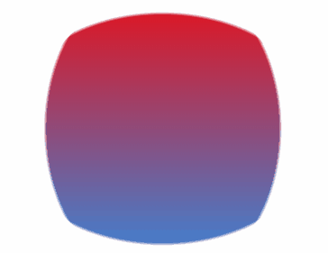
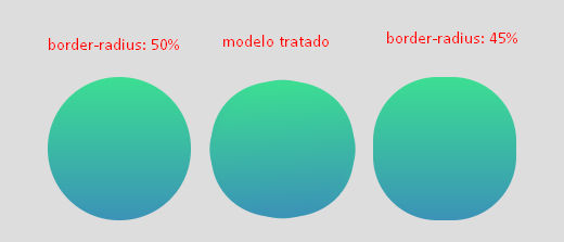
I arranged another way.... and you won’t believe :D http://prntscr.com/lx7q1u loved publishing!
– hugocsl