1
I am trying to modify the style of my Menuitems and their Submenuitems but the popup where Submenuitems are in a standard style.
Just to be clear: Popup is standard Nacor of a WPF Window component...
1
I am trying to modify the style of my Menuitems and their Submenuitems but the popup where Submenuitems are in a standard style.
Just to be clear: Popup is standard Nacor of a WPF Window component...
1
In any case, I got what I wanted and I think I should put my solution here (I do not know if it is the most suitable solution since I do not master WPF).
I was able to change the color of the popup by editing the Menuitem Template:
<Popup x:Name="PART_Popup" AllowsTransparency="True" Focusable="False" IsOpen="{Binding IsSubmenuOpen, RelativeSource={RelativeSource TemplatedParent}}" PopupAnimation="{DynamicResource {x:Static SystemParameters.MenuPopupAnimationKey}}" Placement="Bottom">
                <Border x:Name="SubMenuBorder" BorderBrush="{DynamicResource SolidPrimaryLightColor}" BorderThickness="1" Background="{DynamicResource SolidPrimaryColor}" Padding="2">
                    <ScrollViewer x:Name="SubMenuScrollViewer" Style="{DynamicResource {ComponentResourceKey ResourceId=MenuScrollViewer, TypeInTargetAssembly={x:Type FrameworkElement}}}">
                        <Grid x:Name="Grid1" RenderOptions.ClearTypeHint="Enabled">
                            <Canvas x:Name="Canvas" HorizontalAlignment="Left" Height="0" VerticalAlignment="Top" Width="0">
                                <Rectangle x:Name="OpaqueRect" Fill="{Binding Background, ElementName=SubMenuBorder}" Height="{Binding ActualHeight, ElementName=SubMenuBorder}" Width="{Binding ActualWidth, ElementName=SubMenuBorder}"/>
                            </Canvas>
                            <Rectangle x:Name="Rectangle" Fill="{DynamicResource SolidPrimaryLightColor}" HorizontalAlignment="Left" Margin="29,2,0,2" Width="1"/>
                            <ItemsPresenter x:Name="ItemsPresenter" KeyboardNavigation.DirectionalNavigation="Cycle" Grid.IsSharedSizeScope="True" SnapsToDevicePixels="{TemplateBinding SnapsToDevicePixels}" KeyboardNavigation.TabNavigation="Cycle"/>
                        </Grid>
                    </ScrollViewer>
                </Border>
            </Popup>
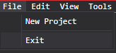
Changing the Border property from Popup to a color I wanted. The result I was hoping for was this:
Here is the full Menuitem Template:
<!-- MenuItem -->
<ControlTemplate x:Key="ModEditorMenuItem" TargetType="{x:Type MenuItem}">
    <Border x:Name="templateRoot" BorderBrush="{TemplateBinding BorderBrush}" BorderThickness="{TemplateBinding BorderThickness}" Background="{TemplateBinding Background}" SnapsToDevicePixels="True">
        <Grid x:Name="Grid" VerticalAlignment="Center">
            <Grid.ColumnDefinitions>
                <ColumnDefinition Width="Auto"/>
                <ColumnDefinition Width="Auto"/>
            </Grid.ColumnDefinitions>
            <ContentPresenter x:Name="Icon" Content="{TemplateBinding Icon}" ContentSource="Icon" HorizontalAlignment="Center" Height="16" Margin="3" SnapsToDevicePixels="{TemplateBinding SnapsToDevicePixels}" VerticalAlignment="Center" Width="16"/>
            <Path x:Name="GlyphPanel" Data="F1M10,1.2L4.7,9.1 4.5,9.1 0,5.2 1.3,3.5 4.3,6.1 8.3,0 10,1.2z" Fill="{TemplateBinding Foreground}" FlowDirection="LeftToRight" Margin="3" Visibility="Collapsed" VerticalAlignment="Center"/>
            <ContentPresenter x:Name="ContentPresenter" ContentTemplate="{TemplateBinding HeaderTemplate}" Content="{TemplateBinding Header}" Grid.Column="1" ContentStringFormat="{TemplateBinding HeaderStringFormat}" ContentSource="Header" Margin="{TemplateBinding Padding}" RecognizesAccessKey="True" SnapsToDevicePixels="{TemplateBinding SnapsToDevicePixels}"/>
            <Popup x:Name="PART_Popup" AllowsTransparency="True" Focusable="False" IsOpen="{Binding IsSubmenuOpen, RelativeSource={RelativeSource TemplatedParent}}" PopupAnimation="{DynamicResource {x:Static SystemParameters.MenuPopupAnimationKey}}" Placement="Bottom">
                <Border x:Name="SubMenuBorder" BorderBrush="{DynamicResource SolidPrimaryLightColor}" BorderThickness="1" Background="{DynamicResource SolidPrimaryColor}" Padding="2">
                    <ScrollViewer x:Name="SubMenuScrollViewer" Style="{DynamicResource {ComponentResourceKey ResourceId=MenuScrollViewer, TypeInTargetAssembly={x:Type FrameworkElement}}}">
                        <Grid x:Name="Grid1" RenderOptions.ClearTypeHint="Enabled">
                            <Canvas x:Name="Canvas" HorizontalAlignment="Left" Height="0" VerticalAlignment="Top" Width="0">
                                <Rectangle x:Name="OpaqueRect" Fill="{Binding Background, ElementName=SubMenuBorder}" Height="{Binding ActualHeight, ElementName=SubMenuBorder}" Width="{Binding ActualWidth, ElementName=SubMenuBorder}"/>
                            </Canvas>
                            <Rectangle x:Name="Rectangle" Fill="{DynamicResource SolidPrimaryLightColor}" HorizontalAlignment="Left" Margin="29,2,0,2" Width="1"/>
                            <ItemsPresenter x:Name="ItemsPresenter" KeyboardNavigation.DirectionalNavigation="Cycle" Grid.IsSharedSizeScope="True" SnapsToDevicePixels="{TemplateBinding SnapsToDevicePixels}" KeyboardNavigation.TabNavigation="Cycle"/>
                        </Grid>
                    </ScrollViewer>
                </Border>
            </Popup>
        </Grid>
    </Border>
    <ControlTemplate.Triggers>
        <Trigger Property="IsSuspendingPopupAnimation" Value="True">
            <Setter Property="PopupAnimation" TargetName="PART_Popup" Value="None"/>
        </Trigger>
        <Trigger Property="Icon" Value="{x:Null}">
            <Setter Property="Visibility" TargetName="Icon" Value="Collapsed"/>
        </Trigger>
        <Trigger Property="IsChecked" Value="True">
            <Setter Property="Visibility" TargetName="GlyphPanel" Value="Visible"/>
            <Setter Property="Visibility" TargetName="Icon" Value="Collapsed"/>
        </Trigger>
        <Trigger Property="IsHighlighted" Value="True">
            <Setter Property="Background" TargetName="templateRoot">
                <Setter.Value>
                    <SolidColorBrush Color="{StaticResource PrimaryLightColor}"/>
                </Setter.Value>
            </Setter>
            <Setter Property="BorderBrush" TargetName="templateRoot" Value="{StaticResource SolidPrimaryLightColor}" />
        </Trigger>
        <Trigger Property="IsEnabled" Value="False">
            <Setter Property="TextElement.Foreground" TargetName="templateRoot" Value="#FF707070"/>
            <Setter Property="Fill" TargetName="GlyphPanel" Value="#FF707070"/>
        </Trigger>
        <Trigger Property="CanContentScroll" SourceName="SubMenuScrollViewer" Value="False">
            <Setter Property="Canvas.Top" TargetName="OpaqueRect" Value="{Binding VerticalOffset, ElementName=SubMenuScrollViewer}"/>
            <Setter Property="Canvas.Left" TargetName="OpaqueRect" Value="{Binding HorizontalOffset, ElementName=SubMenuScrollViewer}"/>
        </Trigger>
    </ControlTemplate.Triggers>
</ControlTemplate>
Browser other questions tagged c# wpf template
You are not signed in. Login or sign up in order to post.
You can’t understand what the problem is. What do you intend to do? What stops you from doing this? Have you tried something?
– Jéf Bueno
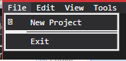
Well, maybe my question got a little confused, what I wanted was to change the Popup color of the Menu Item File (notice that the photo is in the default color of the WPF Window and the items inside the popup are with this border of different color).
– Michael Anthony Leal Costa