3
I dropdown menu and for some reason the width of the div is different in the browsers
The div class is the dropdown-content
Follow the code and prints
.header-menu {
	height: auto;
	float: right;
	font-size: 0;
	margin-right: 20px;
}

.header-menu ul {
  background: #111112;
}

.header-menu ul li {
	height: auto;
	display: inline-block;
}

.header-menu ul li a {
	padding: 20px 12px;
	text-align: center;
	color: #fff;
	font-size: 14px;
	letter-spacing: 0.2px;
	line-height: 70px;
}

.header-menu ul li:hover {
	background: #fd1616; /*Vermelho*/
}

/*Dropdown Menu*/

.dropdown-content {
	display: none;
	position: absolute;
	background: #fd1616;
	width: 119px;
}

.header-menu ul li .dropdown-content a {
	height: 50px;
	padding-left: 20px;
	font-size: 14px;
	letter-spacing: 0.2px;
	line-height: 10px;
  color: #fff;
  display: block;
  text-align: left;
  border-top: solid 1px #111112;
}

.dropdown-content a:hover {
	background: #111112;
}

.dropdown:hover .dropdown-content {
	display: block;
}
<nav class="header-menu">
<ul>
<li><a href="ps4.html">PS4</a></li>
<li><a href="xboxone.html">XBOX ONE</a></li>
<li><a href="pc.html">PC</a></li>
<li class="dropdown">
<a href="outrosconsoles.html">Outros Consoles</a>
<div class="dropdown-content">
<a href="#">PS3</a>
<a href="#">XBOX 360</a>
<a href="#">WII U</a>
<a href="#">3DS</a>
<a href="#">PS Vita</a>
</div>
</li>
<li><a href="esports.html">eSports</a></li>
<li><a href="reviews.html">Reviews</a></li>
<li><a href="videos.html">Vídeos</a></li>
</ul>
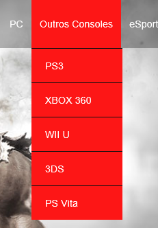
</nav>Chrome and Firefox

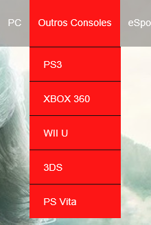
Edge
IE
Removing the position: Absolute the width problem has been solved, but this other problem arises...
box-sizingforces a different behavior for IE?– BrTkCa
No. It takes the spaces out and puts them in, so to speak. Even the default spaces that the browser has.
– Diego Souza
Unfortunately did not resolve
– Gabriel Souza
I’ve gone over your code and I see that the sub has
position:absolute, but without a father withposition:relative. This is dangerous, there is almost no cross-browser compatibility when it is so. You will have to redo your submenu.– Diego Souza
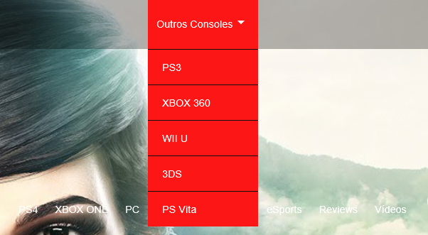
I removed the position: Absolute and solved the width problem, but now by hovering the mouse in the submenu, the main menu is positioned next to his last read. Take a look at the print I put up now to better understand
– Gabriel Souza
Look at the MENU I made there...
– Diego Souza
I made some modifications to my layout and is working perfectly, thanks!
– Gabriel Souza