I made some changes to Guilherme Nascimento’s response so that the "pseudo-element" is responsive if the banner changes in size in all possible resolutions.
var windowHeight = $(window).height();
	var pxH = 5.166666666666667;
	var pxW = 1;
	function adaptativeMainBanner(){
		var newWindowHeight = $(window).height();
		var newValueW = newWindowHeight / pxH;

		$(".pseudo-before").css({"border-top":newWindowHeight + "px solid transparent","right":"-" + (newValueW - 0.5) + "px","border-left":newValueW + "px solid #fff"});
		return windowHeight = newWindowHeight;
	}
	$(window).resize(function(){
		adaptativeMainBanner();
	});
	$(document).ready(function(){
		adaptativeMainBanner();
	});
*{
	margin:0;
	padding:0;
	box-sizing:border-box;
}
html,body{
	height:100%;
}
#main-banner-holder{
	width:100%;
	height:100%;
	display:flex;
}
#main-banner{
	position:relative;
	overflow:hidden;
	flex-grow:1;
  background-color:rgba(0,0,0,1);
}
#main-banner > img{
	min-width:100%;
	height:100%;
	position:absolute;
	left:50%;
	top:50%;
	transform:translate(-50%,-50%);
}
#main-text-banner{
	position:relative;
	background-color:#fff;
	width:46.588541666666664%;
	height:100%;
	padding:12px;
	display:flex;
	flex-direction:column;
	align-items:center;
}
#main-text-banner .pseudo-before{
	content:"";
	position:absolute;
	width:0;
	height:0;
	top:0;
	bottom:0;
	z-index:5;
	border-top:620px solid transparent;
	border-left:120px solid #fff;
	right:-120px;
	/* 620pxH - 150pxW */
	/* 4,133333333333333 */
}
#main-text-banner > div{
	flex-grow:1;
	margin-top:16px;
}
#main-text-banner > div *{
	text-align:justify;
}
@media(max-height:300px){
	#main-banner > img{
		height:auto;
		max-height:200%;
	}
}
@media(max-height:500px){
	#main-banner > img{
		height:auto;
		max-height:140%;
	}
}
<script src="https://ajax.googleapis.com/ajax/libs/jquery/2.1.1/jquery.min.js"></script>
<!DOCTYPE html>
<html>
<head>
<title></title>
</head>
<body>
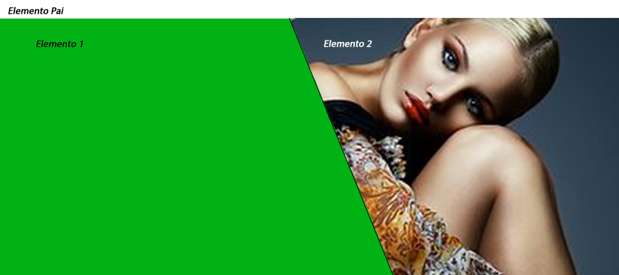
<div id="main-banner-holder">
<div id="main-text-banner">
<span class="pseudo-before"></span>
<h2>Memento Mori</h2>
<div>
<p>Lorem ipsum dolor sit amet, consectetur adipisicing elit, sed do eiusmod tempor.</p>
</div>
</div>
<div id="main-banner">
<!-- Caso queira uma imagem de fundo: <img src="img/company/banners/main-banner.jpg"> -->
</div>
</div>
</body>
</html>
Some considerations:
Well, it’s not really a pseudo-element, but some element, which follows the same behavior that the pseudo-element would receive.;
Depending on the degree of inclination of the separator line, it generates a small 0.5px separation bug from the parent div, for this, a "right":"-" + (newValueW - 0.5) in the .css();
The pxH value is equivalent to pxW as it helps to define "pseudo-element" height according to the width/height of the screen/main-banner;
Some CSS statements on the banner, and on Divs that contain content, such as the width:46...% or the flex-grow;1 were placed so that the line would divide the content in the center of the screen, without these statements, the line would start at 50% at the top, and would end up at something like 53~54% at the bottom line
For other details, leave your comment, as soon as I see, I will be responding
I think this might solve your problem. Solution
– David Fornazier
skew does not solve, so much so that in the accomplished fiddle itself, the image is distorted
– Murilo Melo