Remove "margin" of responsive website image by CSS

Asked

Viewed 3,943 times

2

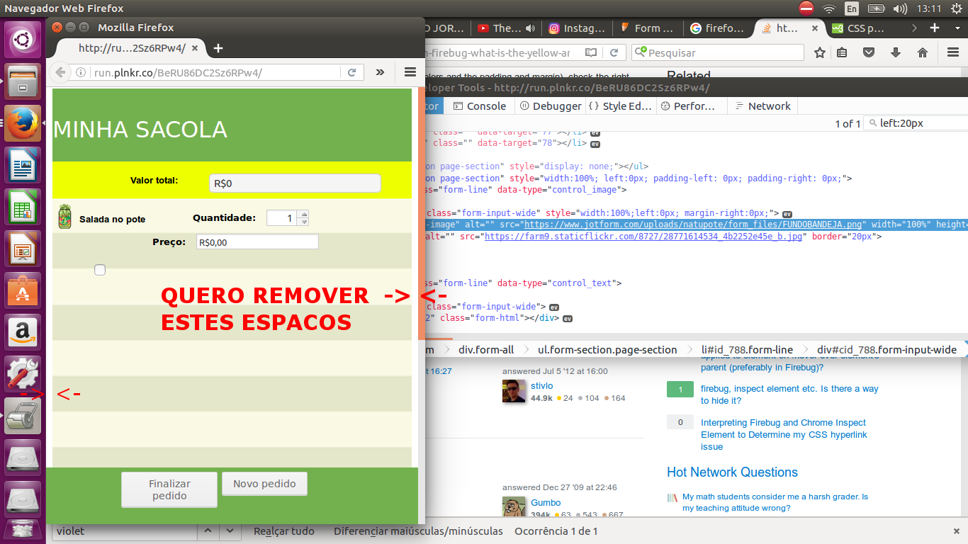
Good afternoon! I’m a beginner in web-based programming, and I’m having a hard time removing a space I call "margin" from the page’s background image, which is responsive with a width:100% (imagined that with this he should occupy the whole width of the page, but not this occupying totally, this presenting a small "margin") I wanted her to be without this "margin" I mean, totally touching the corner of the window, can give me dirt of what this problem is?

inserir a descrição da imagem aqui

3 answers

1

You tried in your own style :

*{
    margin:0;
    padding:0;
    border:0;
}

This is a form used in resets, and it means that everything will have margin:0, and then you will need to explicitly state the elements that will contain margins.

0


Use

html, body{
   margin:0px !important;
   padding: 0px !important;
}

-2

<html>
<head>
<style>
 div {
  border: 1px solid black;
  margin-left: -8px;
  margin-right: -8px;
  background-color: lightblue;
}
</style>
</head>
<body>
<h2>Margem Misteriosa</h2>

<div>Existe elementos como a div, que por padrão tem uma margem que não sei da onde vem. Porque mesmo definindo 0px para a margin, ainda existe lá a maldita margin.<br></br>
Pra resolver isso basta definir o valor da margem para negativo.<br></br> Exemplo:<br></br>
div {<br></br>
margin-right: -8px;
margin-left: -8px;
<br></br>
}
</body>
</html>

Browser other questions tagged

You are not signed in. Login or sign up in order to post.