-2
Well, nowadays every professional website should be responsive, and I doubt that. Initially, is there any offline tool to simulate this? For example: simulate access to multiple resolutions, etc? I remember seeing a video about something similar in the Opera browser, but I didn’t find such a feature.
Another question is in CSS: Which statements @media do I need to have a fully responsive website on all devices? I currently only use the @media for 768px or less than standard.
Anyway, this question is for tips on responsive design.
I hope they do not vote against it because, in my view, it is not a vague question.

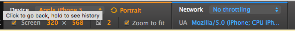
Chrome has a mobile device simulator. Press F12 on your keyboard if you’re Windows to enter Chrome Developer Mode. Then click the mobile device icon that appears in the Console header that opens.
– Diego Souza
A responsive website can be done in many ways. I particularly use the Mobile First technique. In which I make the site first for small devices and go up the resolution. Yes, using the
@media. I suggest you search for Mobile First.– Diego Souza
The npm module ripple-Emulator is an excellent option to emulate your site on various devices with different resolutions.
– Lucas Fontes Gaspareto
Thanks everyone, now yes the sites are getting responsive, I’m using this technique Mobile First, I just changed a little the queries @Media of it
– Leonardo