2
I am trying to create the following layout on my Landing page:
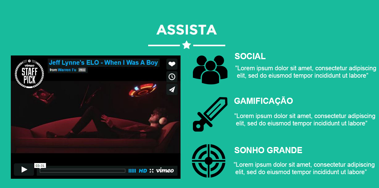
However, when trying to create this in HTML, I can’t get the images to make this list. I’m trying to use the "deck" class, unsuccessfully.
 <section class="success" id="about">
    <div class="container">
        <div class="row">
            <div class="col-lg-12 text-center">
                <h2>ASSISTA</h2>
                <hr class="star-light">
            </div>
        </div>
        <div class="row">
            <div class="col-lg-4">
               <iframe src="https://player.vimeo.com/video/143313674" width="550" height="400" frameborder="0" webkitallowfullscreen mozallowfullscreen allowfullscreen></iframe> <p><a href="https://vimeo.com/143313674"></p>
            </div>
            <div class="col-lg-6 col-md-push-2">
            <div class="deck"> <img src="img/portfolio/submarine.png" width="100" height="100" style="display:block"> <div class="figure illustration ng-isolate-scope lazy-canceled" lazy-load="figures" style="display: block;"> <div class="lyft-classic"></div> </div> <div class="body grid-center"> <h3>SOCIAL</h3> <p>Com um viés social e espírito de equipe. </p> </div> </div>
            <div class="deck"> <img src="img/portfolio/submarine.png" width="100" height="100" style="display:block"> <div class="figure illustration ng-isolate-scope lazy-canceled" lazy-load="figures" style="display: block;"> <div class="lyft-classic"></div> </div> <div class="body grid-center"> <h3>SOCIAL</h3> <p>Com um viés social e espírito de equipe. </p> </div> </div>
            </div>

        </div>
    </div>
</section>
Remembering that I would like to make this responsive, I would like to know if I am at least doing Divs nesting in the right way.
Rodrigo, when I open it in a common window, the mood is legal. The video is still a little smaller than I would like, because I want to insert 3 titles on the right side. When I test Google’s Mobile Compatibility Test, it doesn’t get responsive. You know what it can be?
– Felipe
1 - Smaller video: You must change the width by changing the class "col-Sm-4" to "col-Sm-5" or larger, according to your need.
– Rodrigo Ribeiro De Abreu
2 - Google Test: This may be happening because Jsbin uses iframes and other scripts from it. Have you tested the Jsbin link or tested a url of your own? If you are interested see some videos I created about Bootstrap on Youtube. Search for "Bootstrap from Scratch"
– Rodrigo Ribeiro De Abreu
In fact, the video is smaller vertically. How do I fix it? And yes, I tested the Jsbin link, I will try to test on mobile by local host
– Felipe
Felipe, you made it?
– Rodrigo Ribeiro De Abreu
I had filed that bill. It worked, thank you!
– Felipe