All the other answers gave very good ways of how you can do this, but here’s a functional example with a few more considerations.
First off, I made you a reset with a box-sizing: border-box;, its use is somewhat optional, however, if you wish to know more about this property, you can take a look at in that article. It would cause the size determinations of the elements to take into account by themselves margins, spacings, edges, among other things.
Would look like this:
*{
  box-sizing: border-box;
}
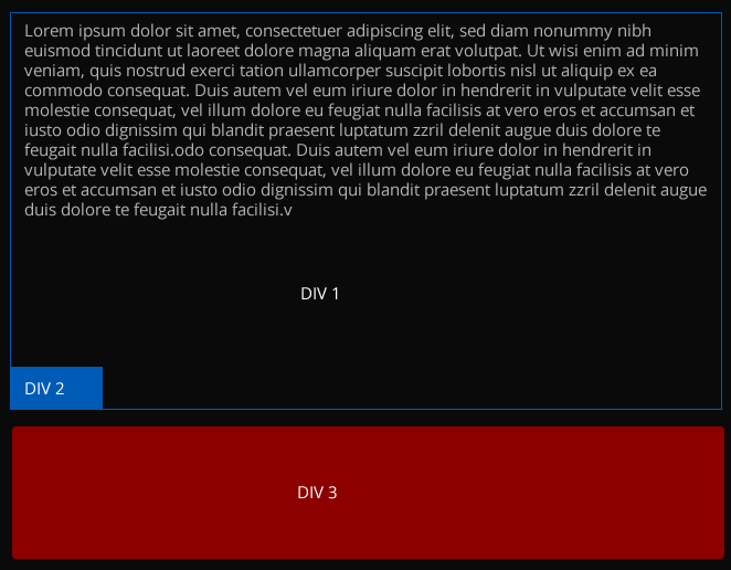
I created a div with the class="container" which will encompass all others div. It will have the following style:
.container {
  height: auto;
  width: 400px; /* Mude de acordo com o desejado */
  background: #000;
  padding: 5px;
}
In it, just change your width, and everything else will suit.
To div#div1 this style:
#div1 {
  height: auto !important;
  background: #000;
  min-height: 200px;
  position: relative !important;
  color: #fff;
  border: 1px solid #0090ff;
  padding: 10px; /* Margem interna para o texto */
  padding-bottom: 32px;
  margin-bottom: 5px; /* Espaçamento entre o rodapé e o texto*/
}
The padding-bottom is in case you want the #div2 does not rest on the text. The height: auto will cause the #div1 has a height relative to the size of the text, however the min-height will take care that this height is not less than 200px (or the value you want).
Already the div#div2 this style:
#div2 {
  width: 50px;
  height: 30px;
  background: #0090ff;
  position: absolute !important;
  bottom: 0 !important;
  left: 0 !important;
}
Thanks to bottom: 0 and left: 0 it will be attached to the lower left corner of the div#div1.
Finally to #div3:
#div3 {
   height: 100px;
   width: 100%;
   background: #cf0027;
}
This will move according to the size of the #div1. And the width: 100% will make her the size of div.container.
Complete code
* {
  box-sizing: border-box;
}

.container {
  height: auto;
  width: 400px;
  background: #000;
  padding: 5px;
}

#div1 {
  height: auto;
  background: #000;
  min-height: 200px;
  position: relative;
  color: #fff;
  border: 1px solid #0090ff;
  padding: 10px;
  padding-bottom: 32px;
  margin-bottom: 5px;
}

#div2 {
  width: 50px;
  height: 30px;
  position: absolute;
  bottom: 0;
  left: 0;
  background: #0090ff;
}

#div3 {
  height: 100px;
  width: 100%;
  background: #cf0027;
}
<div class="container">
  <div id="div1">
    Lorem ipsum dolor sit amet, consectetur adipiscing elit. Proin sed efficitur arcu, sed varius eros. Sed gravida dapibus est, ut pretium tortor dapibus id. Praesent ultrices a urna sit amet pellentesque. In at rhoncus justo. Pellentesque pellentesque a
    est quis viverra. Donec vel suscipit magna, ac pharetra augue. Vivamus magna nunc, efficitur sit amet laoreet et, porttitor eu nulla.
    <div id="div2"></div>
  </div>
  <div id="div3">
  </div>
</div>
Whether or not using Bootstrap?
– Giancarlo Abel Giulian
I put the library in header, but I’m a beginner in css, I don’t use many resources...
– Thiago
And then you got?
– Thiago