Problems creating media queries for Samsung Galaxy S4

Asked

Viewed 176 times

1

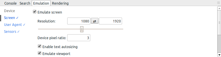
I’m developing a responsive website and in it I set some CSS tags with media queries, but I still suffer with some devices, as an example, the Samsung Galaxy S4. I believe it’s because it contains device-pixel-ratio 3. I wanted to know how to define media queries for this type of device.

Emulação do dispositivo Samsung Galaxy S4 no Chrome DevTools

Using Twitter Bootstrap the thing becomes incredibly easy, because it adapts to any device, including the S4, which has a device-pixel-ratio "different". It turns out that the site is already ready, refactoring is out of the question.

Are there other devices that can give me a headache? Should I just add a different media query to the Samsung Galaxy S4 device, or is there any way to make my CSS look similar to the Twitter Bootstrap?

1 answer

2


The ideal would be refactoring, because adjusting its layout to specific devices is considered a bad practice.

Without further information about what kind of problems you encounter, I believe you should use specific media queries. According to this list, CSS rules for S4 should be in the following media query:

@media screen and (device-width: 320px) and (device-height: 640px) and (-webkit-device-pixel-ratio: 3)

And note the fact that this rule is still limited to Webkit browsers, by the presence of the prefixed property -webkit-device-pixel-ratio.

Browser other questions tagged

You are not signed in. Login or sign up in order to post.