Margin breaking layout in Bootstrap

Asked

Viewed 4,403 times

4

I’m trying to make a Row with nested Rows but with a spacing between them, without the spacing the layout gets beauty, but when adding the margin the layout breaks!

What I’m trying to do:

inserir a descrição da imagem aqui

The result I have obtained in my attempts: http://jsfiddle.net/ywJ7k/1/

  • In his example he looks like this http://fiddle.jshell.net/ywJ7k/1/show/ ?

  • Exactly @Samirbraga !

2 answers

4


My approach to presenting tabular data is to use a table.

The grid that Bootstrap uses is suitable for the structure of a web-site so that it responds to the various devices and resolutions without great headache for the programmer.

As regards the submission of information, you should use Markup that corresponds to the type of information to be presented. We have to keep in mind the applications that collect data based on Markup in use to assist users.
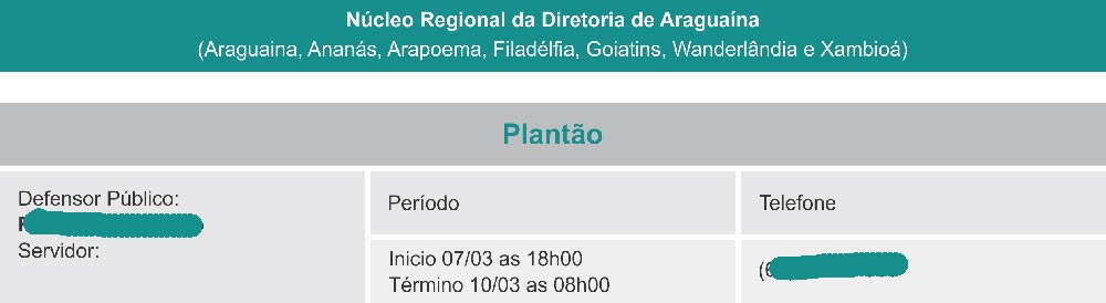
Final Result

Demonstration at Jsfiddle

You can reduce and increase the width of the window preview Jsfiddle to view the information to be adapted to the existing space.

Captura de Tela do JSFiddle

HTML

For HTML, I tried to use at least Markup possible but at the same time ensure that in the various devices we will have a homogeneous behavior.

My solution is we have a container (.container) with a line (.row) and a column occupying the entire width of the container (.col-md-12) in order to have a grid that adapts and responds to screen resolution changes.

Inside the column we then have a header and a table with the data to present:

<div class="container">
    <div class="row">
        <div class="col-md-12">

            <h5 class="app-header text-center">
                <strong>Núcleo Regional da Diretoria de Araguaína</strong>
                <br />
                (mock,  mock,  mock,  mock,  mock,  mock,  mock)
            </h5>

            <table class="app-table-info">
                <thead>
                    <tr>
                        <th colspan="3" class="text-center">
                            Plantão
                        </th>
                    </tr>
                </thead>
                <tbody>
                    <tr>
                        <td rowspan="2">
                            Defensor Público:
                            <br/>
                            <strong>Fabricio Silva Brito</strong>
                            <br/>
                            Servidor:
                        </td>
                        <td>
                            Período
                        </td>
                        <td>
                            Telefone
                        </td>
                    </tr>
                    <tr>
                        <td>
                            Início 07/03 as 18h00
                            <br/>
                            Término 07/03 as 18h00
                        </td>
                        <td>
                            (92) 3232-3232
                        </td>
                    </tr>
                </tbody>
            </table>
        </div>
    </div>
</div>

CSS

For CSS I created classes with the prefix app- so that they are perfectly distinct from any other class that Bootstrap uses. This way you know when your style is being applied or subscribed by framework:

/* Cabeçalho Verde */
.app-header{
    background: #178F8D;
    color: #fff;
    line-height:1.4em;
    padding:5px 0;
    margin-bottom:20px;
}

/* Tabela com Informações */
.app-table-info{
    background: #E6E7E9;
    color: #3A3A3A;
    width:100%;
}
.app-table-info th,
.app-table-info td{
    padding:10px;
    border-bottom:6px solid #fff;
}
.app-table-info th{
    background: #BEBFC1;
    color: #178F8D;
}
.app-table-info td{
    height:60px;
}
.app-table-info tr:first-child td:first-child{
    vertical-align:top;
    border-right:6px solid #fff;
}
.app-table-info td:last-child{
    border-left:6px solid #fff;
}
  • I imagined that I would end up using tables even! More complete answer!

0

Hello, I just didn’t insert the blank spacing, because at the moment I don’t have an editor of my own, and I really forgot how to insert them manually.

<div class="block">
        <div class="row">
            <div class="block_header">
                <b>Núcleo Regional da Diretoria de Araguaína</b><br>
                (mock,  mock,  mock,  mock,  mock,  mock,  mock)
            </div>

            <div class="block_subheader">
                <b>Plantão</b>
            </div>


            <div class="col-md-4 info">
                Defensor Público:<br>
                <b>Fabricio Silva Brito</b><br>
                Servidor:<br>

            </div>

            <div class="col-md-4 info">
                <table>
                    <tr>
                        <th>Período</th>
                        <th>Telefone</th>
                    </tr>    
                    <tr>
                        <td>Início 07/03 as 18h00<br/>
                            Término 07/03 as 18h00</td>
                        <td>(92) 3232-3232</td>
                    </tr>    
                </table>    

            </div> 

        </div>

The CSS went like this:

  .block_header{
background: #178F8D;
color: #fff;
padding: 5px;
text-align: center;
margin: 3px;

}

  .block_subheader{
background: #BEBFC1;
color: #178F8D;    
text-align: center;    
padding-bottom: 10px;
margin-top: 20px;

}

  .info{
background: #E6E7E9;
color: #3A3A3A;
margin: 0px 5px 5px 0px;
padding: 5px;
height: 100%;
float:left;

}

   .separator{
padding: 0px 0 23px;
float:left;

}

Browser other questions tagged

You are not signed in. Login or sign up in order to post.