How to fix an input within a responsive div

Asked

Viewed 2,465 times

3

I have a div with an image in background and with a input text-type. I need the input to stay in a certain position and as the resolution change, it goes down so as not to cover the title "Connect with the focus". I’m using Bootstrap(in case you need):

inserir a descrição da imagem aqui

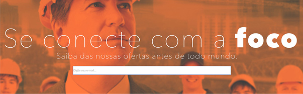
This is what I have, but the input is after the image in smaller resolutions. How to limit the div, preventing this?

<div class="conecte-se">
            <div class="caixa-email">
                <input type="text" name="email" placeholder="Digite seu e-mail..." class="input-email"/>
            </div> 
        </div>

CSS:

.conecte-se{
  width: 100%;
  background: url('../images/conect-foco.jpg');
  height: 493px;
  margin-top: 100px;
  background-repeat:no-repeat;
  background-size:contain;
  background-position:center;
}

.caixa-email{
  margin: 0 auto;
  text-align: center;
  padding-top: 348px;
}

.input-email{

  width: 52%;
  height: 45px;

}
  • Ta supporting IE < 9?

  • No need, @Renan, but can help with any hint?

2 answers

2

Set the input position to fixed:

#idinput{
    position: fixed;
 }
  • Thanks for helping Ysabelle, but we’re talking about responsiveness and fluidity. position: fixed; does not work for this case, I think! Maybe you change my opinion by citing more examples, testing your code.

  • 2

    I suggest you use the bootstrap grid concepts, probably solve your problem. Read: http://getbootstrap.com/css/#grid-options. For example, you can use a size for each column depending on the device.

2


It is not necessary to "fix", just need to treat so that other elements do not overlap the text. One option is to use flexible layout, but check the support that browsers offer.

If you need to support IE in version before 9, in that question there are some solutions to center the elements vertically, which apparently is what your question is about.

References: align items | flex | flex-flow | Justify-content.

Example of div occupying 100% horizontal/vertical document:

* { margin: 0; padding: 0 }

body, html, .container {
  width: 100%;
  height: 100%
}

.container {
  align-items: center;
  background: url(http://i.stack.imgur.com/IaTJ5.jpg) center center fixed;
  background-size: cover;
  display: flex;
  flex-flow: column wrap;
  justify-content: center
}

input {margin-top: 10% }

@media screen and (max-width: 480px) {
  h1, h4 { text-align: center }
}
<div class='container'>
  <h1>Se conecte com a <b>foco</b></h1>
  <h4>Saiba das nossas ofertas antes de todo mundo</h4>
  <form action='#'>
    <input type='email' placeholder='Digite seu e-mail...' />
  </form>
</div>


Example of fixed size div at a certain position in the document:

* { margin: 0; padding: 0 }

body, html {
  width: 100%;
  height: 100%
}

/**
 * Simulando que o div está em uma posição da página.
 **/
.container {
  margin-top: 10%;
  height: 200px;
  width: 100%
}

.container {
  align-items: center;
  background: url(http://i.stack.imgur.com/IaTJ5.jpg) center center fixed;
  background-size: cover;
  display: flex;
  flex-flow: column wrap;
  justify-content: center
}

input {margin-top: 10% }

@media screen and (max-width: 480px) {
  h1, h4 { text-align: center }
}
<div class='container'>
  <h1>Se conecte com a <b>foco</b></h1>
  <h4>Saiba das nossas ofertas antes de todo mundo</h4>
  <form action='#'>
    <input type='email' placeholder='Digite seu e-mail...' />
  </form>
</div>

The only rule applied in smaller resolutions was to horizontally centralize the text, the rest is all handled by the flexible boxes.

  • The second example was what I wanted, but at scrol time I didn’t want imgaem to be rolling in the background. Thank you very much!

Browser other questions tagged

You are not signed in. Login or sign up in order to post.